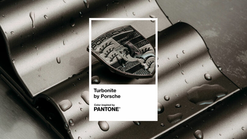
Pantone is known for being an authority on color, regularly releasing its seasonal color trend reports that highlight the latest hues influencing various industries. However, for the first time ever, the Pantone Fashion Color Trend Report for Spring/Summer 2025, unveiled at New York Fashion Week, includes a brand-specific color: Turbonite, created by Porsche’s industrial design team.
Initially crafted for Porsche Turbo models, Turbonite was prominently featured on inlays, spokes, and alloy wheels. While it might appear as a premium gray at first glance, it embodies Porsche’s sophisticated design philosophy. “For almost 50 years, the Turbo models have enjoyed an exalted position at Porsche,” said Porsche lifestyle and brand design spokesperson Nadine Toberer, in an interview with Design Milk. “They stand for a distinctively high performance and represent the epitome of every model series. To emphasize their uniqueness, Porsche is once again sharpening their look. The Turbo models are, for one, being given a particularly exclusive version of the modernized crest, which is dominated by the new Turbonite color tone instead of gold.”
An Embodiment of the Porsche Spirit
Indeed, as a fan of Porsche’s approach to design, I absolutely love the look of Turbonite. It avoids starting from scratch, which is a good thing. After all, why fix what isn’t broken? But it does add a little more personality to the already understated look of a classic-looking Porsche.
Of course, as you might have noticed, Turbonite is reserved for only the most premium Porsche models. Porsche Turbo models have long enjoyed enhanced performance, along with unique design touches that help make them stand out from other Porsche models – and a lot of effort went into its development.
“Like all of our paints, this one was very carefully composed by the Porsche Color & Trim experts. Gold elements create an elegant, metallizing effect, with the top layer in a contrasting satin finish,” continued Toberer. “The designers developed this elegant metallic gray tone especially for the Turbo. It is also being used on a number of other selected exterior and interior components, lending the Turbo models an even more unmistakable appearance. Porsche will be successively introducing this more marked differentiation to all model series.”
Turbonite Beyond Porsche
Featuring a brand-specific color in its trend report is actually a pretty big deal for Pantone, which has previously avoided those kinds of partnerships. But clearly, Pantone had good reason for doing so.
“What stood out to me most was the tawny bronze undertone that came through in the appearance and finish of this elegant gray shade,” said Pantone Color Institute Vice President Laurie Pressman. “It is this undertone that not only distinguished this gray, giving it a very distinctive look and feel that paid homage to Porsche brand tradition for craftsmanship and design, but also blended the allure and symbiotic connection we feel for materials and colors harvested from the earth and at the same time exemplified the quiet luxury, natural sophistication, and eternal style Porsche is known for.”
Given its inclusion in the Pantone Spring/Summer 2025 color report, Turbonite clearly has use outside of Porsche. Also known as PQ-2336C for Pantone lovers, Turbonite could now end up being used for all sorts of different designs. Pressman says that she could see Turbonite having relevance in all areas of design, including appliances, accents knobs, electronics, and more.
“Looking solely at the color vs. the material to which Turbonite is currently being applied, this color will also translate well into all areas of fashion apparel and activewear, beauty including hair, packaging, paint and home textiles.”
To learn more about Turbonite, visit porsche.com.
