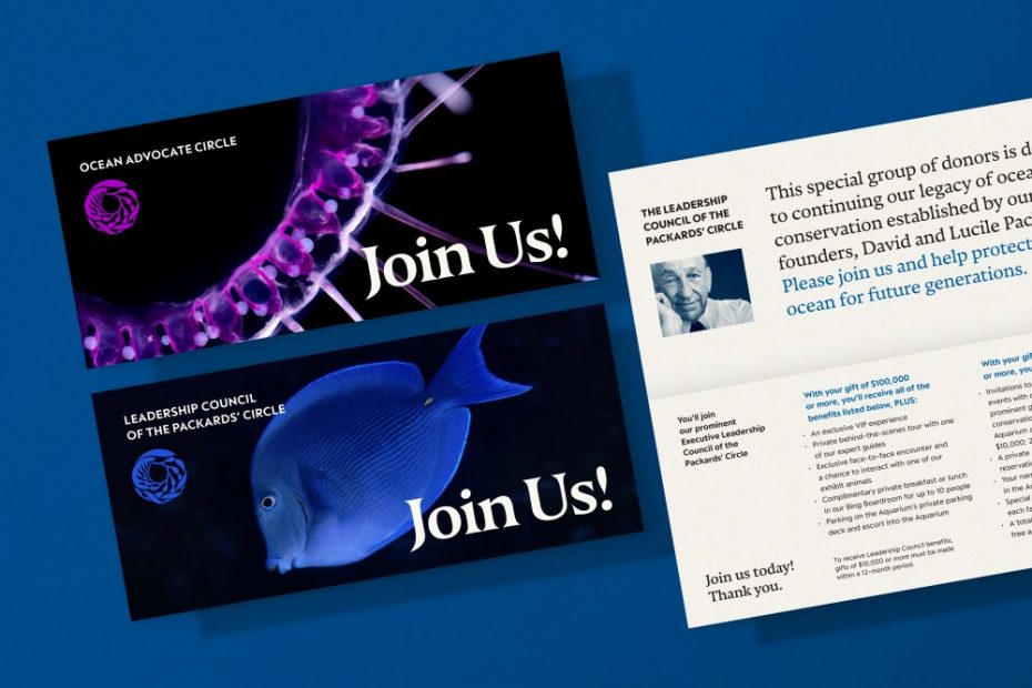
The Monterey Bay Aquarium in Monterey, California is home to 81,000 plants and animals across 771 species and has served these critters and the Monterey community since 1984. In honor of its 40th anniversary, the brilliant creative minds over at Pentagram were brought on to give the Aquarium a rebrand as impressive as these numbers. And they did not disappoint!
Led by Pentagram Partner Abbott Miller, the Pentagram team developed a new brand identity for the Aquarium that builds on its legacy while looking ahead. “This evolution of our branding embodies all the wonder and delight that connects people to the Aquarium and the living ocean,” said the Monterey Bay Aquarium’s Executive Director, Julie Packard, on Pentagram’s website. “In vibrant ways, it honors our past and aligns with all the possibilities ahead of us.”
Miller told me the Monterey Bay Aquarium turned to his crew to create cohesion amidst disparate touchpoints. “The aquarium’s brief was to update the visual identity to unify all aspects of the brand,” he said. “This included print and digital graphics, environmental graphics and exhibitions, merchandise, and advertising and social media.”
Miller and Co. met this brief by developing a strong central icon, establishing an earthy color palette, and landing on approachable yet sophisticated typography. “I think the typographic and color systems have created a really solid foundation for the whole institution,” Miller shared. But in many ways, the kelp icon is the star of the show.
“The kelp symbol was there at the founding of the Aquarium and is a beloved icon of Monterey,” explained Miller. “There are many fans of the Aquarium who have the kelp symbol tattooed on their bodies!” One of the Aquarium’s early exhibition designers, Richard Graef, created the original kelp logo, which has been in use since the Aquarium opened its doors. “The Aquarium is deeply committed to the icon; our careful redrawing of the form optimized its use and created some interesting ‘variants’ of the symbol for merchandise. We also created a beautiful translation of the symbol into a continuous pattern.”
This kelp redrawing simplifies the fronds to streamline the mark slightly and make it more scalable. The icon can be used in new and unexpected ways throughout the system, like as frames and filters for images or in variations as a halftone or multi-line drawing. The repeating pattern Miller alluded to was developed in collaboration with the illustrator Yehrin Tong and is for use on apparel, merchandise, and elsewhere.
The organic quality of the symbol thoughtfully extends into the brand typography. Pentagram collaborated with type designer Peter Bil’ak and Nikola Djurek of Typotheque to design the new wordmark. They did so by adapting their serif Nocturno, reworking it to have shorter descenders and stronger connections to the kelp symbol, as well as fluid curves that harken to the movement of the ocean. The brand typefaces include the original Nocturno and the sharp sans serifs Peak and Peak Rounded (by Xavier Erni of Neo Neo / Extraset).
“Since the project’s core was the kelp symbol, we thought the typography should take its cues from the interplay of smooth and sharp forms,” elaborated Miller. “Our goal was for the type to echo the kelp to achieve a unity between the two elements.”
Regarding the system’s color palette, Pentagram was keen to go beyond blue. “At their founding, the Aquarium used a kind of two-tone sand color, and over time, it migrated to the classic ocean blue,” said Miller. “We looked at directions in the sand realm and then in the rich yellow greens and the blue of the previous identity. While we settled on the blue, our experience with the other colors proved that a broader palette derived from the spectrum of the ocean would be really strong.” These new core colors consist of three shades of ocean blue and green, a range of neutrals, plus black and white.
When asked what the most surprising aspect of the project was for Miller, he offered an unexpected answer. “When I got a ‘behind the scenes’ tour, I was able to feed the giant red octopus, and she stretched out her tentacles, attached her suckers to my forearm, and started to pull me towards her,” he said. I’m no deep-sea expert, but I’d wager the octopus was simply showing Miller some love for a job well done!
