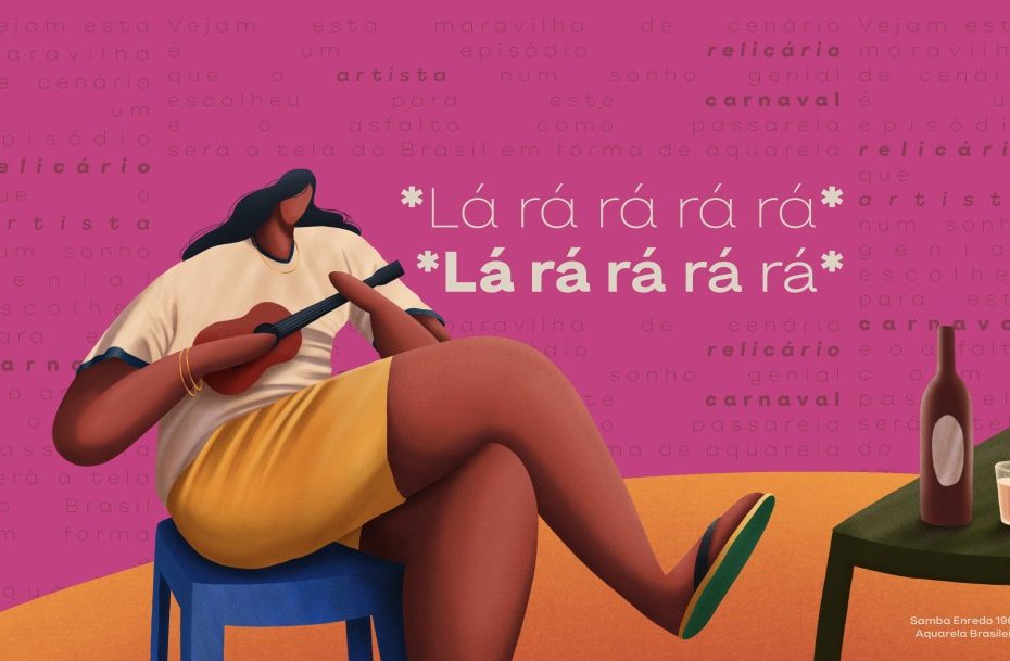
Can a country as diverse and dynamic as Brazil be embodied in a typeface? The Fabio Haag Type team, led by designer Sofia Mohr, set out to bottle their country’s cultural expression in a new typeface: Pitanga.
The letterforms are organic, demonstrative, sculptural, and spacious. Pitanga is confident but flexible with eight weights and two styles. Its open aperture makes it legible in display and smaller text sizes. Charismatic diacritics bring personality to Pitanga’s Portuguese voice, but the typeface also supports more than 200 Latin script-based languages.
The Brazilian typographic studio describes Pitanga as a kid flying a kite on the beach in the Vidigal favela of Rio, a footballer’s twisted leg, or samba’s precise yet subtle footwork. You could say that Pitanga characterizes the Brazilian idea of “bossa” (talent, creativity, a new way of doing things).
Fabio Haag Type project credits: Creative Direction & Design – Sofia Mohr; Design Critiques – Fabio Haag, Henrique Beier, Ana Laydner & Eduilson Coan; Engineering – Henrique Beier; Graphic Design – Palp Studio; Illustration – Gabriel Diogo; Copywriting – Thiago Mattar
