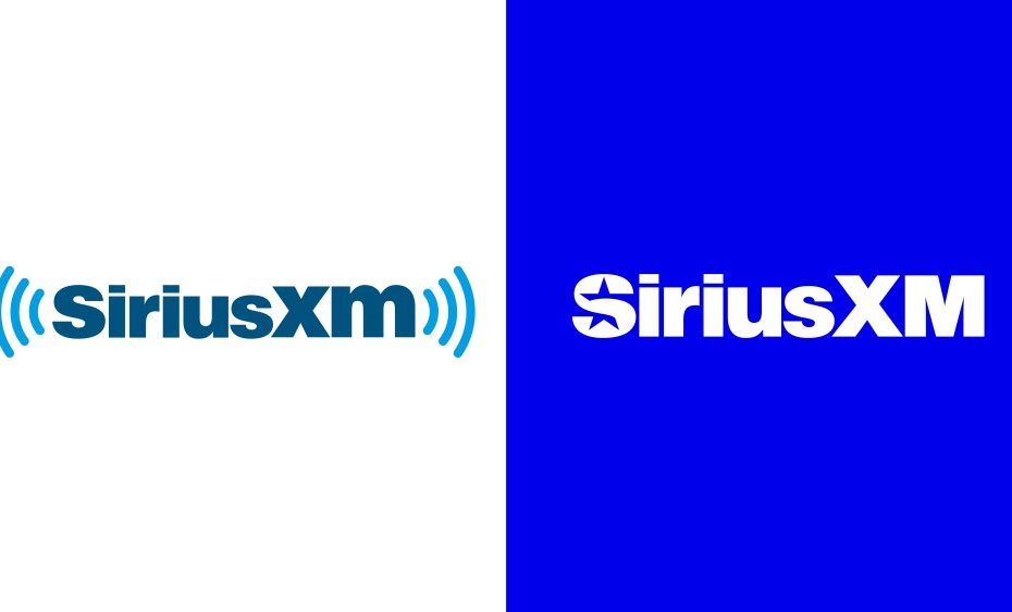
Last week, SiriusXM unveiled its latest brand refresh, executed by Uncommon Creative Studio’s newly-minted New York office. The noticeable evolution in the company’s visual identity demonstrates a strategic effort to contemporize the brand while retaining a sense of its heritage.
The updated identity showcases a shift towards a refined wordmark, incorporating a new logo, icon, and a rich color palette of vibrant jewel tones. While it represents a departure from the previous emblem, the new logo aims to balance modernity and familiarity.
The star-fueled identity builds upon SiriusXM’s rich history, originally named after the brightest star. The identity boldly takes the brand’s connection to the stars and its satellites as the core inspiration for its refreshed look and feel.
Kiki King, Uncommon Creative Studio
Along with the new wordmark, logo, and icon, imagery plays a crucial role in conveying the brand’s identity. High-quality visuals play with the star ‘S’ icon to create a more engaging and dynamic presentation. The imagery communicates the diverse range of content offered by SiriusXM, aligning with the brand’s positioning as a leader in audio entertainment.
Refreshed brand messaging emphasizes SiriusXM’s commitment to delivering top-tier content and entertainment. The narrative communicates a sense of excitement and exploration, encouraging users to discover the wealth of offerings available.
The star also nods to the service’s purpose, bringing subscribers closer to the artists, hosts, celebrities, journalists, newsmakers, and personalities they love. Interwoven into the new logo is this concept of “Closer” — a refreshed brand platform that aligns with the heart and soul of the SiriusXM brand.
Kiki King, Uncommon Creative Studio
With colors pulled from the stars and their satellites, the bright palette weaves warm hues with cool tones, creating a visual dynamic that feels energetic and refined. The clean typography embraces a modern approach while preserving legibility, showcasing a thoughtful evolution of the brand’s identity to achieve both familiar and fresh.
With an eye toward the future, the brand refresh aligns with SiriusXM’s strategic goals, such as expanding streaming services and enhancing podcast offerings. The approach acknowledges the evolving landscape of digital media consumption and how SiriusXM plans to play within it.
While I haven’t personally fallen head over heels for the new star ‘S’ icon, nor do its 3D renderings entirely convince me — there’s just something about the sharp points and the bulging center that I can’t quite put my finger on — I am intrigued by the possibility of its use cases. I certainly appreciate the fresh brand system’s rich color palette and simplicity.
In the vast cosmos of brand makeovers, time will reveal if SiriusXM’s celestial revamp by Uncommon Creative Studio is not just reaching for the stars.
All imagery via Uncommon Creative Studio.
