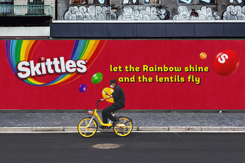
Design consultancy Elmwood has leaned into Skittles’ off-beat personality to create a global brand refresh based on nonsensical core assets to appeal to Gen Z.
There’s always been something uniquely funny and a little weird about Skittles. Whereas its candy contemporaries, M&M’s, rely on goofy mascots to attract attention, Skittles trades on the bizarre, like adverts where a man who can’t touch anything without objects turning into the sweets or a rainbow-eating giraffe who can be milked for the multi-coloured lentils.
This unusual sense of humour has been picked up by Elmwood for Skittles’ major global brand refresh. Already launched in China, with the EU set to follow, the new design system twists Skittles’ packaging, typography, and promotion into a funky new shape.
This refresh is perhaps most apparent in Skittles’ flagship, ownable quirks. Take the logo, which sees the letter’ k’ given a distinctive upward flick. Then there’s the brand’s signature upside-down rainbow icon, which has been given a more vibrant makeover. Meanwhile, the iconic lentils themselves now have a “dynamic signature layout” with matching flowing visual effects to boot.
“In the first part of our work with Skittles, we focused on evolving its master assets to make them more fluid – we let the rainbow shine and the lentils fly,” says Greg Taylor, chief provocation officer at Elmwood. “The aim is to make the Skittles brand more distinctive to consumers so that they can spot innovation and easily identify their favourite ranges on-shelf.”
Speaking of standing out from the shelves, Skittles’ new packaging also creates a sense of consistency across its brand systems. This includes using harmonious colour palettes, which leave room for fun, like the airship graphics on the Squishy Cloudz Fruits pouches.
After refreshing Skittles’ pack identity, Elmwood had the foundations in place to focus its energies on dynamic product development. This phase involved tapping into Skittles’ unique character and using it to build a brand-world experience.
“Skittles has always been associated with this very distinctive tone of voice – it’s lo-fi, quirky and DIY in style,” says Paul O’Brien, design director at Elmwood.
“In order to capture this very recognisable tenor, we developed a brand new design aesthetic. ‘Nonsensical’, as we call it, is our way of dialling up Skittles’ ability to tell a great story. It’s joyful and freeing, providing an entertaining release from common sense – while remaining true to the core feel of Skittles.”
While the brand may be nonsensical, this isn’t mindless wackiness for the sake of it. A nonsensical design aesthetic allows Skittles to stay relevant in an ever-shifting media landscape.
Flexible enough to playfully tap into emerging trends and talking points, the refresh is designed to appeal to existing customers and fans in the making, particularly that all-important Gen Z demographic.
“Nonsensical elevates the distinctive appeal of Skittles, allowing its brand voice to be deployed in a way that’s super-fun and inherently shareable,” says Paul O’Brien. “This is a tool that can be reinvented over and over, in relation to emerging cultural themes and on different digital channels. It could be used anywhere from social media posts to competitions or UGC-related content.”
According to Elmwood, this approach will form the “contours of an experience-led brand”, one that will have fun flexing its nonsensical muscles in numerous markets around the world. If you’re in the US and the UK, expect to see it roll out next year.
“The recrafted Skittles brand world really celebrates the brands’ distinctive assets,” concludes Joe Gasparetti from Mars Wrigley. “With this amplified design system, we’ve reimagined storytelling and ways to experience the rainbow.”
