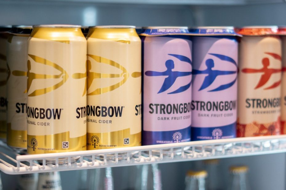
When we talk about innovation in beverage branding, our minds often jump to flashy campaigns, limited-edition packaging, or the latest influencer partnership. But Strongbow, the UK’s number one cider brand, has raised the bar in a way that’s both unexpected and quietly radical: it has become the first alcohol company in the world to integrate NaviLens codes into its packaging.
For those unfamiliar, NaviLens is an assistive technology designed to support blind and visually impaired communities. Unlike traditional QR codes, which require precise alignment, NaviLens codes can be scanned from several meters away without requiring direct focus on the camera. Once scanned, they deliver product details such as ingredients, ABV, and responsible drinking guidelines, essential information that many consumers with sight loss often struggle to access.
Partnering with Purple Goat, the world’s first disability-focused marketing agency, Strongbow conducted research with blind and visually impaired creators to rethink what its packaging could — and should — offer. Not simply a technical update; the result reframes inclusive branding as a core value rather than a compliance box. “This wasn’t just about adding a QR code,” said Rachel Holms, Strongbow’s cider brand director. “Hearing directly from blind and visually impaired creators helped us see the gaps we hadn’t considered, and that input has shaped something far more meaningful.”
Strongbow’s decision illustrates a shift we’ve been watching across industries: the move toward usability as brand equity
From a design perspective, Strongbow’s decision illustrates a shift we’ve been watching across industries: the move toward usability as brand equity. By embedding accessibility into something as simple as a cider label, the brand signals to consumers that it’s creating an experience that everyone can participate in. In branding terms, that’s powerful. It makes Strongbow not only more relevant to underserved audiences but also more resonant with younger consumers who increasingly expect brands to take meaningful stands. Accessibility is no longer a niche concept; it’s a marker of modernity and responsibility.
Packaging has always been more than a container — it’s a billboard, a storyteller, a handshake with the consumer. But what Strongbow demonstrates here is that packaging can also be an interface. With NaviLens, the physical product connects seamlessly to digital information and experiences, extending the role of design beyond aesthetics and into empowerment. As Dom Hyams of Purple Goat put it: “True brand strength comes from understanding all customers’ needs.” Strongbow’s adoption of NaviLens shows how inclusive design can move from the transport system or the supermarket aisle into categories that rarely prioritize accessibility, like alcohol.
I first encountered NaviLens not on a cider bottle, but in the New York City subway system. The brightly colored, pixelated markers seemed almost playful, and I had no idea what they were for. After reading the info panel, I still wasn’t fully comprehending the impact of these navigators — until now. It is one of those small but transformative design moments, where technology quietly removes friction from daily life. Seeing it now on Strongbow bottles, I can’t help but connect the dots: the same system that helps someone find the right train is now helping them choose the right cider. That’s the future of inclusive design, not siloed solutions, but interconnected experiences that meet people where they are.
Strongbow’s move won’t solve every accessibility challenge in the drinks aisle, but it sets a precedent. If more FMCG brands adopt tools like NaviLens, accessibility will shift from novelty to norm. And when that happens, packaging stops being just another marketing surface and becomes something far more human: a tool for participation. In a landscape where brand loyalty is fragile and consumer expectations are sky-high, Strongbow has tapped into something timeless: the universal desire to belong. And that may be the strongest brand equity of all.
The post Strongbow’s Packaging Now Speaks to Everyone appeared first on PRINT Magazine.