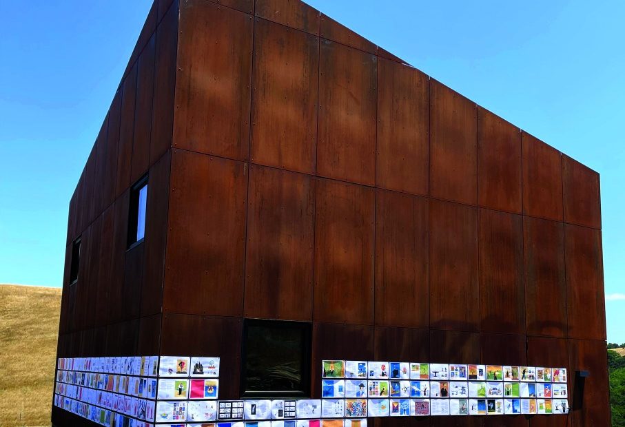
Craig Frazier, a designer and illustrator who has appeared in this column before with small book projects, is back today with an altogether different bookmaking concept. Prior to sending his forthcoming monograph Drawn (February) to press, he wanted to have a few people give their critical response to the design, flow and content. He chose a barn with rusted steel siding as his canvas and showroom. (Fortunately, it’s always sunny in California.) Here are his reflections on this unique way to check proofs.
Book meets barn. Craig! What inspired you to tack the pages of your forthcoming book to the metal siding of a literal barn?
I ’d been working on Drawn steadily and was one week from delivery to the publisher. I wanted one last review of the book. As long as I’ve been designing, I always try to look at the project in reality, off the computer. Though I had printed various spreads of Drawn during the process, I had never printed the entire book to look at in sequence, front to back. I find that the computer can deceive me. Type never looks the same, size and scale are inaccurate and of course, color isn’t the same. I wanted to view it as ink on paper as a life-size storyboard.
What were you looking for that could not be done with printouts on the floor of your studio?
I had two goals: 1) evaluate the content, sequencing, pacing and rhythm of the book and 2) get the opinion of a friend and fellow designer Michael Rylander. Up until then, no one had really seen the book other than me and my wife—and certainly not looked at it critically.
The problem was that there was no place in my studios to look at 220 linear feet of book. I knew that my friend Chip Smith had just finished a barn he designed on his property in the Petaluma (CA) hills, but I hadn’t seen it. I imagined pinning the pages on the interior wooden walls. I soon found out that the barn was steel and the exterior was the perfect surface. My calculations told me that it would take three rows over two sides of the barn, plus 600 magnets! This was barely planned; we just showed up at the barn three days later. Anticipating a spectacle, my old friend and videographer Jeff Hurn showed up with two cameras and a drone.
Did this exercise allow you to critique your pages?
It took us a couple of hours to stick up the book; the scale and contrast of paper to rust was stunning. Then we went to work critiquing the content. I invited Chip to join us, as it was his barn, and as an accomplished architect he would surely offer an objective opinion. I gave them the same criteria that I gave myself in assembling the book. Each piece had to satisfy three other requirements: be provocative in and of itself, without any explanatory text; be beautiful; and lastly, bring a smile to your mind. If something didn’t live up to all three, we would talk about it and make some decisions. Nothing was off limits.
Did you achieve what you wanted? This video certainly made this viewer take notice.
The result was just what I hoped for. Some tiny decision about folios and captions and some big decisions about pieces that didn’t need to be there, too many sketches and too many of one type of illustration. Brutal but necessary. You’ve got to kill your darlings. We made notes on the sheets that resulted in cutting the book back by 24 pages.
Are you relieved that the book was not critically decimated?
The exercise was exactly what I needed to do to feel confident in shipping the book to press. Deadline made. It was also great fun with trusted friends.
