Three major transformative chromatic changes altered my mental health during my Baby Boom childhood: the NBC peacock spreading its bright tail feathers before the first color episode of “Bonanza”; the first color cover of the defiantly iconic black-and-white Life magazine; and the moment that a Polaroid spit out it first perfect color print.
Of course, color was around since time immemorial, but to experience it for the first time in common media was like the blind seeing light and shape for the first time. It was, well, eye-opening. Colorizing heretofore black and white is something of a novelty now, but still, to see a colored version of something so familiar in greyscale has therapeutic benefits, even in this digital age of artificial stimulation.
In the exhibition and book Chromotherapia: Feel-Good Color Photography, edited by Maurizio Cattelan and Sam Stourdzé, they ask, “What if color could save us? In a world of grey where the clouds seem to be piling up, this book invites you to a chromotherapy session featuring lemon yellow, limitless blue, vibrant red and sunshine orange.” It is a history of the “world of the imagination, flirting with pop culture, Surrealism, bling, camp, kitsch and the bizarre—all associated with bad taste and extravagance,” as they write in the foreword. Their goal is to show, through 20 20th-century photogs, how “dazzling, highly colored worlds conjured up by their acid-colored gaze” transform the mind.
The selected work comes from the periodical Toiletpaper and endeavors to redefine how so-called hyperreal kitsch color imagery “sanctifies vulgarity, elevates the technical into great art and turns yellow into gold, garishness into harmony.”
I asked Stourdzé to discuss how the idea took root, and why the “feel-good effect” of their selection is, in fact, chromatically therapeutic.
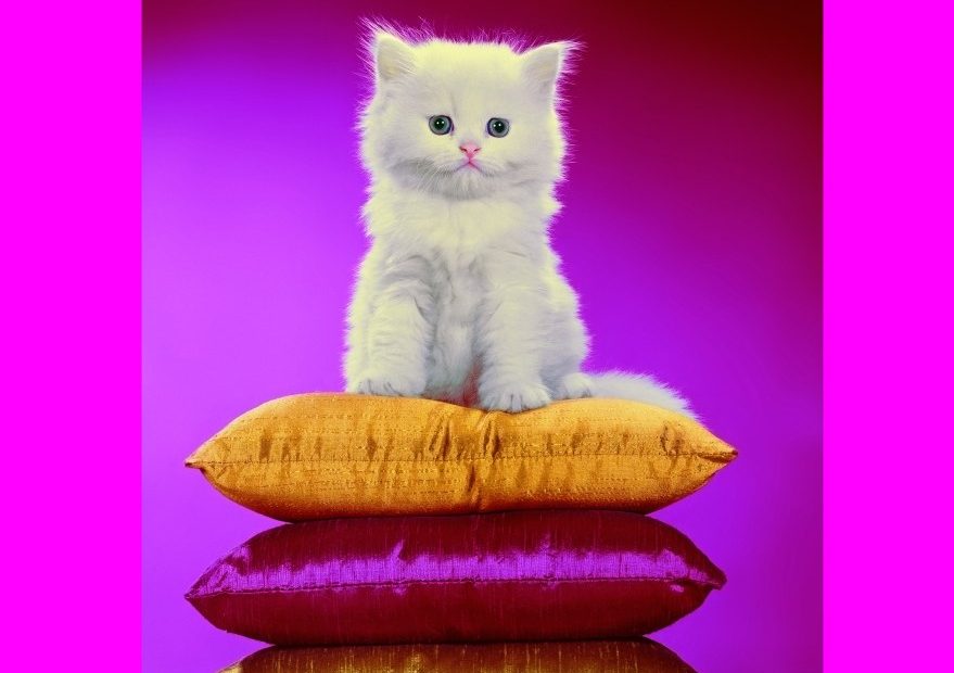
WALTER CHANDOHA, New Jersey, 1962 © Walter Chandoha Archive.
This book is fascinating for what it says about the power of color photography to massage the eyes. What prompted this project in the first place?
Actually, it is Maurizio who come up with the idea of Chromotherapia. A year-and-a-half ago, he called me to ask me if I was interested in doing the project together. I like very much the idea of reconsidering color photography through a new eye. We both acted as curators of the show, exchanging great discoveries, ideas of installation, Maurizio Cattelan with his eye of an artist.
Through the exhibition and the book, we wanted to develop a sort of history of color through chapters and the presentation for the works of 19 artists. We open the show with a first chapter called “Early Birds” about the pioneers of color photography as early as the 1920s, with people like the British female photographer Madame Yevonde, or fashion photographer Erwin Blumenfeld.
ERWIN BLUMENFELD, Sans titre, 1945. Variante de la couverture de Vogue U.S Juin 1951 (Mannequin : Anne Sainte-Marie), impression jet d’encre, Paris © The Estate of Erwin Blumenfeld 2025.
RUTH GINIKA OSSAI RUSHE. MY BOTTER SPRING SUMMER 18 MEN’S CAMPAIGN ‘Fish or Fight,‘ July 2013 © Ruth Ginika Ossai.
What criteria did you employ for selecting the images?
For the exhibition and the accompanying book, we selected the 19 photographers whose work we wanted to showcase. Each artist is represented by five to 10 photographs, allowing a deeper understanding of their work. The artists are connected by common themes, and together they cover a century of history—because the great adventure of color photography is almost as old as photography itself!
For several years now, Maurizio Cattelan and Pierpaolo Ferrari have co-[published] Toiletpaper, a magazine in which each issue consists of around 20 pop, saturated color photographs that humorously and ironically appropriate and distort the codes of advertising and consumer culture. This long-term project is the starting point and inspiration for Chromotherapia. Naturally, Toiletpaper’s photographs are interspersed throughout all the chapters of the exhibition.
WILLIAM WEGMAN, Ski patrol, 2017. Courtesy Galerie George-Philippe et Nathalie Vallois.
I have to admit, I’m drawn to the photos of animals, especially cats, even though I’m not fond of them. What does Chromotherapia say about our collective attraction for cuteness?
Cats! Yes, cat photographs are huge on the internet. It’s even said that 15% of daily internet traffic consists of cat image exchanges …
But let’s be clear—the exhibition focuses on Walter Chandoha, the true master of the genre. Already in the 1950s, he was photographing cats in every pose, set against psychedelic-colored backgrounds. His photographs have illustrated more than 300 book covers. Walter Chandoha is the king of cats. And of course, in the exhibition, he stands opposite William Wegman, the king of dogs!
ADRIENNE RAQUEL, Mirror Mirror, 2017 © Adrienne Raquel.
Some of the pictures are surreal, but many are powerful because they heighten the sense of wonder. What, if any, balance are you interested in having between content and technique?
For a long time, color photography has been perceived as vulgar; it was either for the amateurs or for the magazines, not the museums. Since the 1970s, the institutional recognition of color photography has happened. The exhibition Chromotherapia is dealing with these issues and presenting … a panorama of another color photography, a photography more pop and more glamorous. The very concept of the book and the exhibition is built around highly impactful content and the showcasing of each featured artist’s unique technique.
MILES ALDRIDGE, Five Girls in a Car #1, 2013, courtesy the artist.
The curatorial decisions keep this an engaging book, but are there any photos in particular that you believe should stop the viewer in their tracks? What are your top iconic photos in the land of Chromotherapia?
Guy Bourdin has done his career with the magazine doing amazing photos in the ’70s and ’80s, introducing a king of porn chic approach. He has been influential to many, especially Miles Aldrige. And Martin Parr is really a star of color photography. His look to modern society has a unique sense of irony.
But in the end, it’s the overall universe of the book that one must embrace to truly understand the history of color photography in the 20th century.
MAURIZIO CATTELAN & PIERPAOLO FERRARI, courtesy of Toiletpaper.
How does this collection of images make you feel?
There is a feel-good effect of seductive color photography. The title of the book, Chromotherapia, is a kind of joke—the idea that it could be a therapy through color. We don’t have actual proof of it, but it’s worth trying it! Through this explosion of colors, yes, we do believe that color photography has an effect on the mood. It makes you happy.
JUNO CALYPSO, Chicken Dogs, 2015, Archival Pigment © Courtesy the artist and TJ Boulting.
Is there a part two in the offing?
This is our third project together. It is always great to work with Maurizio. He has a free spirit. No limit. Everything is possible. It was a great discussion, chasing these 19 photographers, and then designing an exhibition that could break the rules of the classical presentation. Who knows what the future may hold!
GUY BOURDIN, Vogue Paris, May 1984 © The Guy Bourdin Estate 2025. Courtesy of Louise Alexander Gallery.
The post The Daily Heller: Feeling the Feel-Good Effects of Color Photography appeared first on PRINT Magazine.