Lynne Avadenka—whose Between Memory and the Archive: Jewish Print Culture is happening this summer—wrote to me recently about The Otachrome Project, an experimental approach to Hebrew type design inspired by the continual resurgence of Latin wood type.
With input from her Otachrome Project co-creators Shani Avni and Ryan Molloy, Avadenka has answered my questions about the genesis of this project. (All specimens printed by Avadenka on her Vandercook SP15 proof press.)
What inspired this project?
Letterpress printing and type design are where the overlapping interests of the three of us can be found (Shani Avni; RIT Cary Graphic Arts Collection Visiting Assistant Curator Ismar David; Eastern Michigan University Professor of Graphic Design Ryan Molloy; and me, artist/printmaker). Ryan and I first started talking about collaborating during Signal-Return’s Power of the Press Fest in Detroit, in 2021. Ryan was there to deliver some Hebrew letters he had cut for a participant in his Explorations and Experiments with Wood Type workshop held by Hamilton Wood Type and Printing Museum. I met Shani during COVID, when she was an online presenter at the 2020 Wayzgoose Festival of the Hamilton Wood Type and Printing Museum. At some point we decided as a group to challenge ourselves to create a chromatic Hebrew wood typeface.
How is it pronounced, and what does the suffix “Ota” mean?
Otachrome is pronounced “oat-eh-chrome.” “Ote” (אות) is the Hebrew word for “letter.” We are also playing on the word “Kodachrome.”
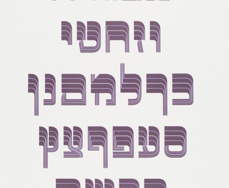
I’ve seen samples of a lot of Hebrew (and Yiddish) typefaces and lettering designs (also known by Berthold as “oriental” types), but I do not recall much in the way of color. Is there such a tradition for this (say, in Yiddish theater) or are you starting a new epoch?
The Berthold Hebrew Type Catalog from 1924 shows some chromatic type intended for printing initials. Our aim was to create a full set of Hebrew display wood type that would provide the richness and expressiveness that can be found for chromatic Latin type.
12L Mardell and Otachrome typefaces, gold ink on Plike.
What is your process of “creation” of these forms?
We built a shared online archive of images of posters, Yiddish and Hebrew language, primarily from the 1920s. We agreed upon letterforms found in a poster as a starting point. Because we were not looking at an entire alphabet, but a select group of letters, we had to create the rest of the alphabet. This process went through several steps: First, I drew (pencil on tracing paper) the complete alphabet inspired by the eight letters in the poster. Next, Shani and Ryan took those hand-drawn letters into a design program to standardize the shapes. Ryan cut the first solid version of the sorts using a CNC router, and some adjustments and decisions were made. Then Ryan cut a complete set of letters, with each letter (22 letters and five final letters) made up of three sorts.
The original letterforms suggested methods in which the typeface could be made chromatic. Ryan developed a handful of options, and ultimately we settled on the simple use of varying sizes of inlines. This created a unique approach to chromatic letterforms and also allowed each version of the letterforms to be used in single color as well as multi-colored applications. Prior to finalizing the design, a handful of prototypes were made and tested through printing.
I presume there is a standard for Hebrew letterforms. Is this true, or are you and your colleagues improvising?
Type design is never improvised, and the same is true for Hebrew letterforms. Authentic ductus and correct proportions must be maintained, and when it comes to designing display type, designers must also balance visual expressiveness with readability and legibility. An added challenge is the lack of letter differentiation inherent to the Hebrew script. Our creation of Otachrome is an exciting search for the “sweet spot” for each glyph: How far can you take the design without it losing its recognizability as a letterform?
12L Otachrome, three-color example, detail.
Is there any prohibition in terms of how Hebrew letters can or should be designed?
Hebrew letters can convey both secular and sacred language. This typeface will be used for secular purposes, so there are no design prohibitions.
The post The Daily Heller: Hebrew Letters Made in Wood for Today appeared first on PRINT Magazine.