Inque is a rare breed of magazine that comes along every generation or so. It is without ads and full of surprising content, wrapped in covers that lean nearer to art than most other indies on the racks. In fact, Inque, edited by Dan Crowe with art direction by Matt Willey, is printed only once a year in such a limited run it barely stays on said racks before being scooped up by fans and collectors.
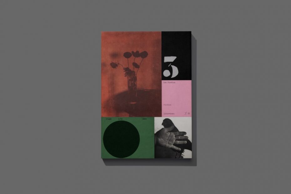
Each issue is truly a surprise of thought and forethought. The type, illustration and layout decisions may not be experimental in an avant-garde sense, but the entire ethos is rife with nontraditional details. In issue No. 3, for example, the number “3” is painted by hand, not typeset, contributing to the look and feel of a handmade work.
There are various influences at play in the design, most notably a freewheeling Eastern European Modernist aesthetic. But Willey is not mimicking or paying homage to past eras. His excellence as a typographer and type designer is an exploration of text and texture. In this issue his page designs tend to emphasize light and dark. The body type is mostly typewriter-style, while the headlines are graphic and bold, offsetting each other in the most pleasing way.
Willey, the 2025 recipient of the Smithsonian National Design Award, shows that ingenuity thrives in a print magazine when design rules.
The post The Daily Heller: ‘Inque’ is Worth the Paper and Ink It’s Printed On appeared first on PRINT Magazine.