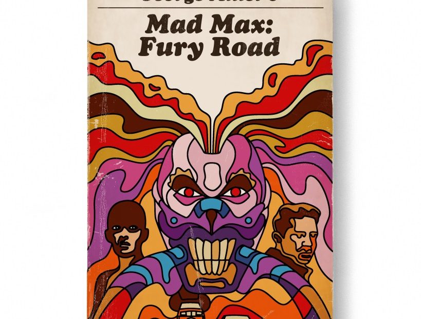
With AI, everyone can be Samantha Stevens from the 1960s sitcom “Bewitched,” who—if she so desired—could tranform a movie into a book cover with the twitch of her nose. Coincidentally, that is virtually what the designer Matt Stevens (no relation to Samantha) does without resorting to a brew of prompts and codes. Using talent and imagination, he playfully melds various graphic styles and typography into book covers of well-known and lesser-acknowledged films. He began this project in 2023, and published the results in a limited-edition collection dubbed Good Movies as Old Books—and now is back with a trade version from Chronicle. Below he discusses the method and fun of finding the right forms for the flicks.
Are you more of a book fan than a film fan?
I wish I was a better, more consistent reader, but I’m definitely more of a film fan. This project for me is about putting the films I love in a new context.
Where did the idea of repurposing films into jackets emerge?
I do a lot of work for a production company that a friend and client of mine started called Mortal Media. I had done their identity originally, and now I do a lot of pitch work for them to sell their projects and properties to studios, directors, lead actors, etc. I had done a project as a book cover and just really enjoyed it and decided to take it on as a side project, with no big plan other than to enjoy the process.
Do you have a fondness for book-to-film adaptations?
If it’s well done, I think it can be great. It’s a really tough thing to do well, though.
How long did it take you to decide on a style for a jacket? And did the style always line up with the film’s content?
My goal with the style was to try new things and create interesting combinations. Oftentimes, I was trying to do something that had not been done for a particular film. So many of these more known films have so much visual imagery already associated with them, I really focused on doing something that hadn’t been done before, or where the style created a really interesting combination of style and film. I would keep a list of films and a big Pinterest board of styles I liked or wanted to try. Often keeping those things both going at the same time, the combinations would just reveal themselves as I worked.
Who are some of your favorite illustrators/designers to model covers after? I see Glaser, Lustig, Rand, Kauffer, and a lot of Penguin influences.
You are hitting on most of my favorites. Penguin is a huge influence and I love striving for simplicity and using limited color palettes, which is what the Penguin work did so well.
I can get lost in trying to figure out who and what you are spoofing, but one that stands out as brilliant is PeeWee’s Big Adventure. Why the Constructivist references?
That was really more of a style choice. I thought it would be an interesting style that allowed me to create these minimalist references to the film and create a unique composition.
The ones I find the most alluring are those that would have worked well as film posters, Rocky being one such. What determines whether you’d turn stylistically to mass-market vs. trade paperback?
I really prefer the low-fi down and dirty feel of the paperbacks. Some of the titles lent themselves more to a hardcover approach or an older era. It was really a case-by-case basis and was more of a gut feeling.
Have you seen all these films? And at the time, did you conjure them in your mind as covers?
I have seen all of these. Some of them I watched in order to do them as covers and some I rewatched. When I knew that I was watching a film I would do a cover of, I would look for key impactful frames or the big ideas in the film as I watched. I don’t normally do that when just watching movies in general. It’s kind of a distracted way to try to enjoy a film, so I don’t think about those things unless there’s a purpose.
Did you make them by hand or as computer renderings?
All of this work was done digitally. From sketch to digital drawing to vectors. When I composited the final art together to make the cover on the book rendering, I used a lot of found and scanned textures so things would have more of a real-world feel.
What’s next?
I really enjoy hearing from people that are enjoying the book and the postcards and it has led to some new and interesting work—someone get Criterion on the phone!
The post The Daily Heller: Now Playing at a Bookstore Near You appeared first on PRINT Magazine.