Artist book maker Daniel Mellis has committed to an ambitious act of historic preservation: a facsimile and translation (with commentary) edition of the Russian Futurist classic Tango With Cows. I am breaking a house rule not to promote Kickstarters in progress (lest I be inundated with requests), so I waited until the funding goal was met.
This project holds a special place for me as a quintessential artist’s book. I’ve asked Mellis to tell us more about the endeavor.
This 1914 artifact written by Vasily Kamensky (featuring two illustrations by David Burliuk and one by his brother Vladimir), represents the ingenuity of those involved with Russian Futurism, graphic design, visual poetry and artist’s books prior to the Russian Revolution. Most designers may know the Constructivist period, but how is this era different from it?
Russian Futurism is—as Vladimir Markov put it—a “complex, varied, diffuse and exasperatingly self-contradictory movement,” and in the context of Tango With Cows, much more of a literary movement, though many of its participants were also visual artists. Tango With Cows in particular is representative of the Futurists’ embrace of the city and modern technology and their rejection of their recent literary and artistic past—the Russian Symbolists and their refined and luxurious publications. It contains poems about powered flight (Kamensky was the first ever poet-aviator), the movies, the telephone, nightlife, modern art, and roller skating. Constructivism was much more of a visual movement, one focused on abstraction and the materiality of its mediums, and after the Russian Revolution became very heavily committed to the Bolshevik cause. The Futurists were more concerned with shocking the bourgeoisie than overthrowing capitalism.

I’ve known this masterpiece of revolutionary typography and book design since MoMA’s wonderful Russian Literature exhibition in 2002, but never knew it was titled Tango With Cows. What does the curiously comic reference signify?
Tango With Cows is the title poem of the book, and one that Kamensky often recited on the famous Russian Futurist tour of the Russian provinces in early 1914, when the book was released. With its mention of the latest dance craze, modern technology—the gramophone—and insulting language, Kamensky is showing off just how cool he is. Interestingly, the tango was associated with the color orange-yellow, and this helps explain the specific wallpaper that Kamensky chose to print the book on.

You began a Kickstarter to get Tango With Cows published as a facsimile with an accompanying translation. How and why did you become so impassioned (or just plain interested) in this volume?
I started work on this project (too) many years ago because I wanted to be able to both read it and own a copy. It is a really fascinating object in its typography, design and materiality, and is one of the very first works of literature to use typography as an expressive means. It is, I think, the very first to take full advantage of the spatial possibilities of the printed page with its non-linear ferroconcrete poems. I also thought it would be a fun challenge to precisely recreate the typography and materiality of the book; it’s something like legal forgery.
We know the consequence of Constructivism on art and design and its ultimate destruction under Stalin. How did the Czar’s censors respond to this, if at all?
After the 1905 revolution, books only had to be submitted to the censor after publication, rather than before. Because the book has no political content and was only printed in an edition of 300, I don’t think it raised any issues. The censor was probably just completely baffled by its appearance and language; a police inspector reporting on a lecture by Kamensky in 1914 wrote that it was “sprinkled with such astounding comparisons that it is positively impossible to grasp its idea.”
The book includes six “ferroconcrete poems.” How do you define this method?
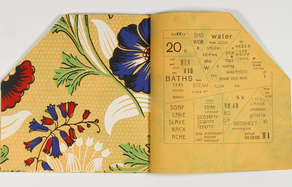
The ferroconcrete (or reinforced concrete) poems in the book are the spatial ones with no linear order. Words are laid out on the page in autonomous clusters separated by lines of rule into separate compartments. They are all squares with the top-right corner running off the cut edge of the book. The rule defining the edge of the poems can be seen as a concrete form and the interior rule as rebar. The poems are spatial not only in form but also in content; they are all about places: Constantinople, cabarets and dance halls, an art collection, a circus, a roller-skating rink, and a baths.
Your Kickstarter is asking a modest overall sum, although your ask is rather high. What are you doing to make this a faithful facsimile?
My goal for this project was to recreate the typography, design and materiality of the original as closely as possible, while translating the text into English.
For the translation I worked with the fantastic poet and translator, Eugene Ostashevsky; he also contributed two amazing essays for the commentary volume: one is a capsule biography of Kamensky and his times, and the other is a thorough analysis of each of the poems along with a surprising amount of detail about their cultural sources. For instance, he not only discovered which movie is the basis for the “Cinematograph” poem, but also postcards with stills and the timing of its run in Moscow theaters.
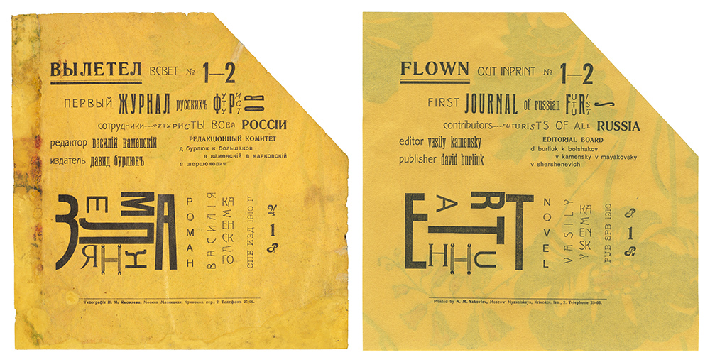
For the typography, I was aided by the fact that essentially all of the Cyrillic typefaces were based on Latin ones, so I was able to find them in contemporary specimen books before finding, modifying or completely redrawing digital versions. I also spent a lot of time making optical sizes of the digital fonts to match the often significant variations of design, proportion and weight of the different sizes of the metal originals. With the typesetting, I wanted to move away from the insistent regularity that is the default of digital design, so I manually adjusted the letter and word spacing and orientation of all the type in the book, and even digitally damaged some of the type if it was damaged in the original.
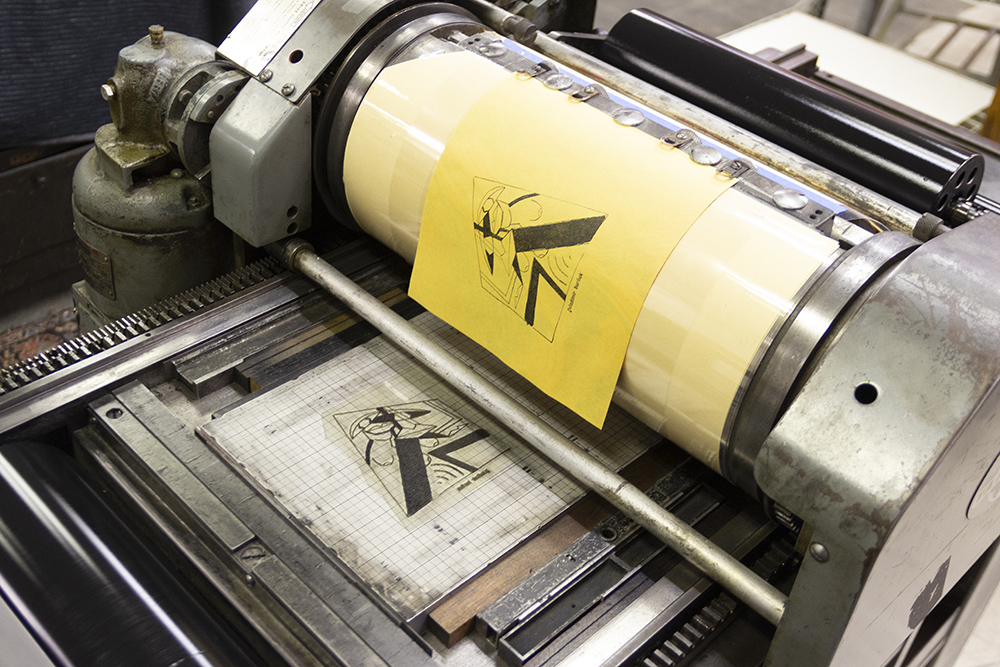
I letterpress printed the book to match the subtle printing textures of the original, including its occasional weak and inconsistent printing. This is especially noticeable in the three illustrations, and there I used a laser cutter to etch paper to three different depths for the makeready.
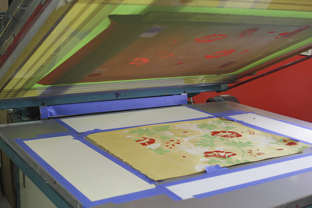
The wallpaper of the original was also carefully recreated. I started with a thin custom-made Japanese paper because that allowed me to both match the color of the original paper and to use screenprinting to reproduce the design. Screenprinting was the best process to not only match the intensely saturated colors of the original inks, but also their texture on the page. I was fortunate that I live near the Art Institute of Chicago, which owns an original, and while they didn’t let me take it to the screenprinter (Baker Prints), with repeated visits I was able to get pretty precise color matches. The original wallpaper was produced rather cheaply and had many printing issues, and so these I replicated page for page with the copy at the Getty Research Institute, which is the source of the facsimile of the original that accompanies the project.
Fortunately, the binding was easier to recreate, as the interior pages are just stapled twice and the covers glued on, although for my edition I used staples made from Monel, a highly corrosion-resistant cupronickel alloy.
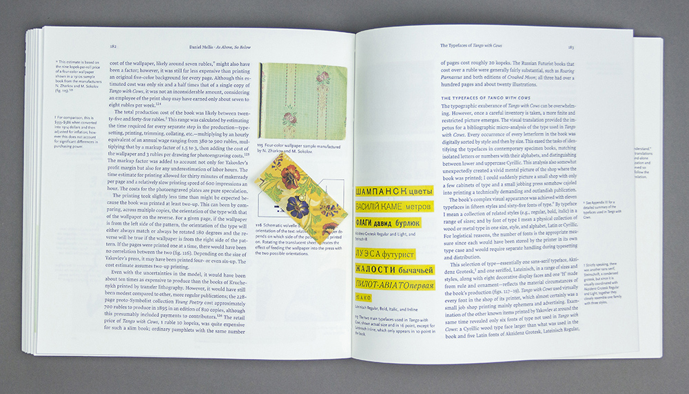
The project on Kickstarter also includes a facsimile of the original; a 308-page commentary book with over 300 images, one double gatefold, seven overlays and a rotating volvelle; and a portfolio of large-format reproductions of Un coup de dés by Stéphane Mallarmé, La Prose du Transsibérien by Blaise Cendrars and Sonia Delaunay, a poster for the Russian Futurists’ performance in February 1914 in Kazan, a Russian circus poster, and a full-scale recreation of the wallpaper pattern.
What are your views of reproductions and/versus facsimiles? What is their ultimate value to scholarship and to you?
Reproductions, i.e., images in a book or online, are useful to a point. They make one aware of the existence and general idea of a work, but they are too small, incomplete, and cannot express the phenomenological experience of turning pages, folding and unfolding them, etc. Facsimiles, i.e., bound actual-size reproductions of every page of a work, make the originals both accessible and available. Even when one has the opportunity to look at an original in a library or museum reading room, they are difficult to access and not available for at-will comparison, study, or inspiration.
Very few facsimiles attempt to recreate the materiality of the original; when this is done it increases the fidelity to the original but at the expense of making the facsimile much less accessible. I am certainly aware of the irony with regards to my own project, totally unlike the original in both cost and the time spent on producing it. Since it makes the original accessible only to a point, I would also like to find a publisher that would produce an affordable trade version.
