intro
Shifting Symphonies
Q: You’ve used typography to explore themes of transition, change, and transformation. What inspired this piece?
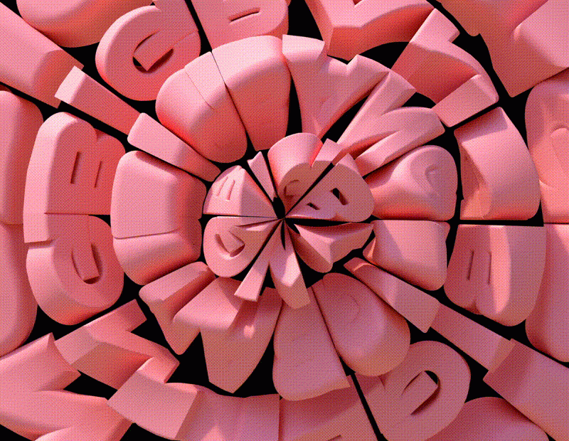
The kinetic typography series dives into the essence of change and transformation. From the balance of Yin Yang to the explosive power of the Big Bang, the progress of Come and Go, the ups and downs in Up/Down We Go, and the all-encompassing Here, There, Everywhere—each piece emphasizes the pivotal role of transition in our lives. The world today faces major challenges like digital transformation and the pursuit of climate, energy, and environmental sustainability. Transition highlights the need to embrace change, strive for balance, and accelerate digital transformation for society’s collective benefit. Visualising this universal process in impactful ways underscores its importance.
Q: How does this relate to the idea of the Big Bang?
The Big Bang theory represents the ultimate transition—from nothing to the beginning of everything! The Big Bang artwork illustrates this explosive force, symbolising new beginnings and endless possibilities. It captures the essence of transformation, showing how change drives us forward through space and time.
Q: What response are you hoping to evoke from the viewer?
Shifting Symphonies aims to showcase the power of words in motion, highlighting how transition affects us all. Each piece, from the balance of Yin Yang to the expansiveness of the Big Bang, underscores the need for harmony and balance within these transitions for a sustainable future.
Q: What outcome were you seeking for yourself?
This project was about gaining a deeper understanding and expression of transition, pushing creative boundaries, and conveying the importance of change in our lives. The goal was to inspire reflection and encourage viewers to embrace transitions in their own lives with a positive outlook.
Love Me Not
Q: As a child, you played the “Love me, Love me not” game and believed it could come true. Tell us about this project.
‘Love Me, Love Me Not’ represents the endless cycle of falling in and out of love with ourselves, others, and the world. Inspired by the French game of picking flower petals, this artwork creates an infinite loop of possibilities, intertwining fate and luck. The loop’s shape, reminiscent of infinity symbols, forms two reflecting hearts, symbolising endless love. It’s a nostalgic nod to childhood innocence, allowing for a moment of dreaming and wandering.
Q: This is another typographic-kinetic experience made for yourself, not a client. What outcome did you desire?
Although the original draft was for a client who chose a different proposal, the idea felt compelling enough to pursue personally. The goal was to explore the theme of love in a creative way and share a piece that resonates emotionally. The aim was to create a mesmerizing loop that lets people take a break, get lost in it, and reflect on their own love journeys.
Q: Do you believe in luck?
Absolutely! Luck plays an intriguing role alongside hard work and decision-making in shaping our experiences and outcomes. It adds unpredictability and excitement, influencing—but not necessarily defining—the paths we take and the connections we make.
Fuck This Shit
Q: ‘Fuck This Shit’ seems to be exactly as it sounds. Why?
‘Fuck This Shit’ captures those moments of sheer frustration when you want to shout it from the rooftops. This phrase, with its emphatic tone, can either release tension or draw attention, making it a versatile expression of exasperation, it embodies the raw emotion of wanting to let go.
(Inspired by Simenone)
Q: It’s whimsical and sarcastic. How did you tame the type to convey your message, or is it all random?
There are countless ways to convey the same words—whether playful, nostalgic, straightforward, or whimsical. Different textured typography was created to reflect various interpretations of the same message. The blend of whimsical design with varied backgrounds transforms the message, sometimes offering a lighter tone, other times a more sarcastic one. Ultimately, it’s open to the viewer’s mood and thoughts at the moment to define the exact interpretation of the message.
Q: Did you teach yourself these typographic tricks?
Creating custom typography in the 2D space has been a passion for a while, but the goal was to push those skills further. This piece started as a simple exercise to bring 2D typography skills into the 3D world. It was never intended to be a finished project but rather an exploration and experimentation driven by a love for learning new techniques and challenging oneself.
Q: What do you think the role of kinetic typography is, and what is your role in it?
Kinetic typography brings words to life through motion, adding a dynamic dimension to textual communication. It enhances the emotional and conceptual impact of the message. The role here is to push the boundaries of how typography can convey complex ideas and emotions, engaging viewers in a visually and intellectually stimulating experience.
