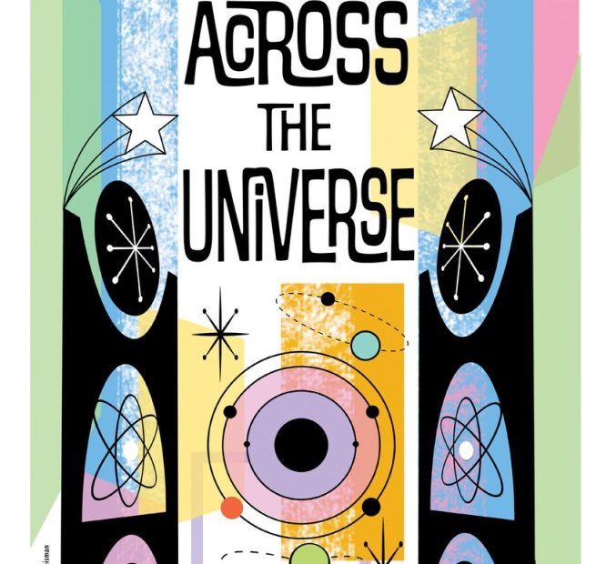
Wednesday marks the 60-year anniversary of that epic airport arrival. On February 7, 1964, Pan Am Yankee Clipper flight 101 from London Heathrow lands at New York’s Kennedy Airport triggering the arrival of “Beatlemania” (and simple times). New York will be celebrating their invasion at the refurbished the Eero Saarinen-designed TWA Hotel from February 9 to 11. To commemorate the commemoration designer and artist Marlene Weisman created a series of parody Beatles Air travel posters, combining references to song titles and lyrics with hints of TWA typography.
Yeah, yeah! I know! The plane was Pan Am, but that defunct airline did not refurbish their former terminal, did they?
Weisman gave me a surprise pick-me-up this Beatles homage that she talks more about in our conversation below.
What prompted you to make these Beatles homage posters and why reference TWA?
Last summer, I was thrilled to hear the next Beatles convention (more about that to follow) was going to take place at the TWA Hotel at JFK to commemorate their February 1964 US arrival. I absolutely love the redone TWA Hotel— they did an amazing job with the historic restoration. The iconic vintage TWA posters are nicely featured around the hotel, along with that gorgeous red and white mid-century modern decor and architectural details.
So I thought it would be a cool idea and perfect opportunity to parody the style of those posters (beautifully designed by David Klein) using Beatles lyrics as destinations.
As a freelance graphic designer & collage artist, I’m drawn to the incredibly rich visual history and design of 20th century pop culture, especially of the ’60s and ‘70s era. I’m particularly interested in fonts, especially ones used in the vernacular like signage, supermarket packaging, and logos.
Graphic design parody mash-up work is a part of my career history: from the late 1980s through mid 1990s I had a fantastic job working in-house in the NBC art department at 30 Rock. I created on-air graphics and props for seven seasons of Saturday Night Live and worked on Late Night (Letterman & Conan eras) as well. So graphic design with a sense of humor comes quite naturally to me.
Where you a screaming Beatles fan back in the day?
As a little kid who grew up in Queens in the shadow of the 1964 World’s Fair, my parents often took me to JFK airport just to ogle the Jet Set travelers and marvel at the jets. (Free entertainment!) Those early ‘60s Space Age days felt so modern and full of optimism.
And at the same time, the Beatles arrived with fresh new music—which as we all know grew into a global phenomenon. I’ve been a huge fan since I was a kid, trusty transistor radio always at my side. That expanded into a love of all kinds of rock music. (Before my NBC days, I designed music industry graphics right after getting out of college.)
How did you make them…?
After making my list of destinations mentioned in Beatles lyrics, I sketched out some layout ideas by hand for each poster. Then I scoured digital public domain sites for location visuals, also snagging some PD vintage WPA era illustrations to possibly use as well—you can see I adapted one for Blue Jay Way. To “up” the vintage factor with an illustrative look, I played around with my finds in Photoshop & Illustrator. And all my type design is done in Illustrator. Of course, I made a deep study of the TWA logo, too—to get FLY Beatles Air just right.
I then prepped them for production, as these are printed as physical 11 x17 posters, and will be on display at next weekend’s Fest for Beatles Fans (Feb 9 -11).
… and for whom did you make them?
A few years ago, I began attending, with my husband Mike, the Fest for Beatles Fans—which is what you might imagine: a sort of ComicCon for Beatles fans. It’s a crazy wonderful experience, lots of panels discussing Beatles history, tribute cover bands, guest appearances by Swinging London-era luminaries, Beatles cosplay, but most of all, a lovely community of attendees and staff. The Fest started back in 1974, so they are also celebrating a big anniversary this year.
There is always a Fan Art room, run for decades by Deco, a fellow collage artist. Attendees bring their homemade art there, and it’s very sweet— all levels accepted. I made a few wacky contributions to display there over the years: Victorian cabinet cards reimagined with the Beatles, a psychedelic-style painted guitar among them.
Over the past couple of years, I collaborated with Deco by designing a multi-media presentation about the artists, gallerists, illustrators and fashion designers who were in the Beatles trajectory in the late 60s. This included people like Peter Blake, Jann Haworth, Robert Fraser, Richard Hamilton, Alan Aldridge, John Van Hammersveld, Peter Max, Hapshash and the Coloured Coat (Michael English & Nigel Weymouth), The Fool design collective, and others. We presented it at the Fest over the past couple of years.
I can’t believe, being such a Beatles fan, that I allowed such a major historical moment almost fly by . . . but I’m glad you were on the case. What’s next on the drawing board? Oh excuse me, the screen?
I do lots of book cover design, logo design and also media packaging for a wonderful company, Undercrank Productions, which restores and releases silent films, often by partnering with the Library of Congress.
I’m also preparing one of my collage series to be displayed at a big UK festival this summer. And most exciting, I’m working on a book that will be a visual memoir of my experiences designing graphics for NYC’s music industry and rock clubs during the gritty, rollicking early ‘80s post-punk period. It will feature material from my archives, all designed in that pre-computer Xerox aesthetic. I have a real New York story to tell, X-Acto knife in hand.
