Over the past two years, there has been a significant increase in the number of people shopping online. Due to the COVID-19 pandemic, a lot of businesses had to shift online which also led to a boom in the ecommerce industry. While brick-and-mortar stores are slowly opening up again, there are a lot of people who prefer a digital shopping experience. Given the ecommerce boom, most companies are investing in ways to attract consumers to their e-stores.
By collaborating with professional designers, they can come up with effective branding strategies which focus on establishing credibility through well-designed ecommerce logos. Consumers prefer to purchase products and goods from e-stores that are credible and have a memorable brand identity design. With an appealing and relevant ecommerce logo, businesses can make a strong impact. It can convince people to look through the listings and creates brand recognition as well.
For designers, there are a lot of elements to focus on while creating such symbols. To make this easier, we explore the dos and don’ts of designing ecommerce logos.
Let’s start with what you should do in the beginning.
Dos – Creating An Ecommerce Logo
During the process of designing, there are quite a few things to focus on. With an e-commerce logo, you want to make sure that the logo connects with the audience and earns their trust.
Clarity
If you take a look at some of the most famous ecommerce logo designs such as Amazon or eBay, you will realize how a clear design can instantly make an impact. With minimalist elements, clean typography and Sans Serif fonts, both the brand symbols tell the viewer about the companies and highlight their core values.

Image Source: Wikimedia

Image Source: Wikimedia
When creating an ecommerce logo, it is important to add and maintain clarity. This way, you can avoid confusing or overwhelming the target audience with numerous elements or colors. The clearer your logo design is, the easier it is to convey the right message and connect with the customer.
In the brand identity designs below, you can see how the clarity and use of a bold color palette creates a positive perception of the ecommerce store. People can immediately know what they are offering and find out more information. Both the furniture and the name in the first one tells you that the platform sells household items. In the other one, the color palette is similar to the eBay logo, so the store might be listed or associated with the platform and have a range of different products.
Explore: 10 Reasons Why Brands Are Making Flat Logo Designs

Image Source: Zilliondesigns.com

Image Source: Zilliondesigns.com
Add One Unique Element
It is important for a brand symbol to be unique to the business and relevant as well. When you brainstorm ideas, make sure that you shortlist the elements which can make the logo design stand out among competition. There are quite a few things that you can consider here, such as abstract icons or symbols that could represent the ecommerce business or reflect its history.
Before starting with the logo design process, it is a good idea to research extensively and get as much information about the brand as possible. You can also look through popular logos or the ones being used by competitors. Take a look at the example below for a moment. The brand identity design of Port of Mokha, one of the most exclusive coffee manufacturers across the globe, has quite a unique symbol which is recognized easily now.
Image Source: blendincoffeeclub
It shows a person going away in a boat which reflects the history or origins of the brand where the founder went to Yemen for the coffee beans. By using such elements or symbols in the logo design, you can make it easier for the audience to relate to the business.
Include Images Or Icons
It has been proven in an earlier report that people are able to process images or visuals almost 60,000 faster than chunks of text. So with a logo design that has an image or icon, there is a higher chance of catching the eye of the consumer instantly. You can include a shopping cart or an icon such as a shopping bag to showcase what your brand is about and spread awareness.
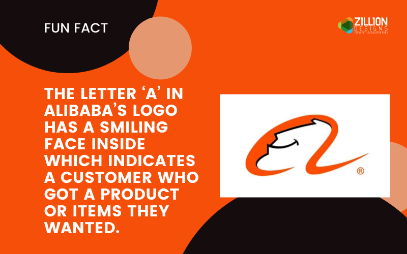
If you take a look at the logos of Alibaba or Flipkart, you will see how an image or an icon can increase the appeal of the design. As a designer, it is important to make sure that the elements work well with the text and typography or it could look cluttered and confuse the viewer.

Image Source: Wikimedia

Image Source: Wikimedia
Keep It Horizontal
Ecommerce logos are usually placed or positioned in the top left corner of the website. It is usually the first thing that consumers may see on the header or navigation bar. By placing the brand symbol horizontally, you can make good use of the space and avoid clutter.
Take a look at most ecommerce platforms and you may come across logos that are placed horizontally. This allows the consumer to get a close look at it and clearly identify all the elements. It also creates flexibility for designers to make adjustments or scale it according to the website design. A horizontal logo also adds to the space on a navigation bar or header, making it appear clean and easy to browse.
Image Source: dribbble.com

Image Source: Zillion Designs.com
Include A Slogan Or Tagline
While it’s a good idea to keep the logo minimalistic, adding a tagline or slogan can immediately catch the viewer’s eye. This can make it easier for them to figure out what the ecommerce store is about and also become familiar with the brand voice. With a catchy tagline, you can create a memorable ecommerce logo that might help people relate to the brand.

Image Source: techradar.com
Don’ts – Creating An Ecommerce Logo
Just as you should focus on doing a few things while designing the logo, it is important to know what to avoid as well.
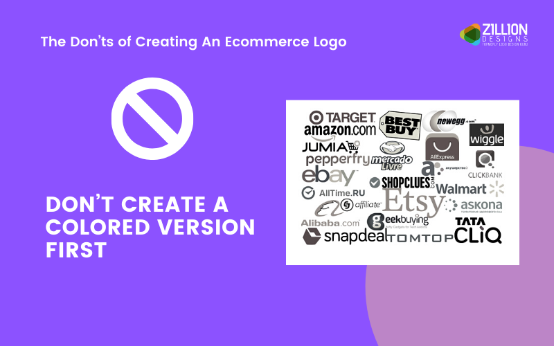
Don’t Create A Colored Version First
Since the ecommerce brand identity design will be featured on the website or platform and for the application, you should create a black and white version before anything else. This will allow you to get an idea of its scalability and how the final results will appear on different digital mediums. By designing it in color first, you may not be able to detect mistakes or errors and improve the logo.
The white and black version can also help you visualize it in various contrasts or combinations so you can pick out a relevant and appealing color palette.
Explore: 10 Forbidden Web Design Techniques For UI Designers
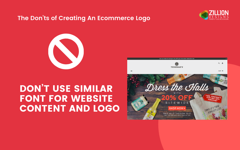
Don’t Use Similar Font For Website Content And Logo
You want to make sure that the typography and the typeface of the logo is unique and conveys the brand’s message effectively. Sometimes, designers can use the same font or typography which is used for the website content. This should be avoided as viewers may get the wrong idea about the tone of voice or what it represents.
Do extensive research and pick font styles that match the characteristics of the brand. It is also important to consider typography that makes the design engaging and can make an impression on the target consumer. Many ecommerce logos have customized fonts so you could consider that as well.
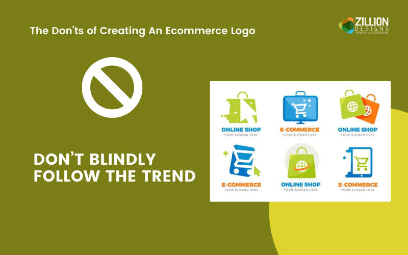
Don’t Follow The Trend
While staying on trend is a good idea, you want to avoid creating a logo that appears similar to all the others or reminds consumers of a competitor. So before starting the process, look through the designs which are being used and draw inspiration from them. However, pick elements or colors that are different and can make the brand symbol stand out.
Explore: The Truth About Logo Design Trends [Ebook]
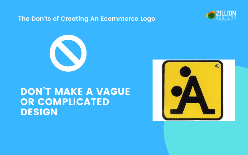
Don’t Make A Vague Or Complicated Design
Having too many elements or colors can complicate the design or overwhelm the viewer. You want to be as clear as possible and make sure that all the elements work well together. If there is a lot going on, you could end up confusing people about the ecommerce store. So the color palette, typography and fonts should clearly represent the brand and showcase your unique selling point as well.
Explore: Which Type Of Logo Design Should You Choose For Your Brand?
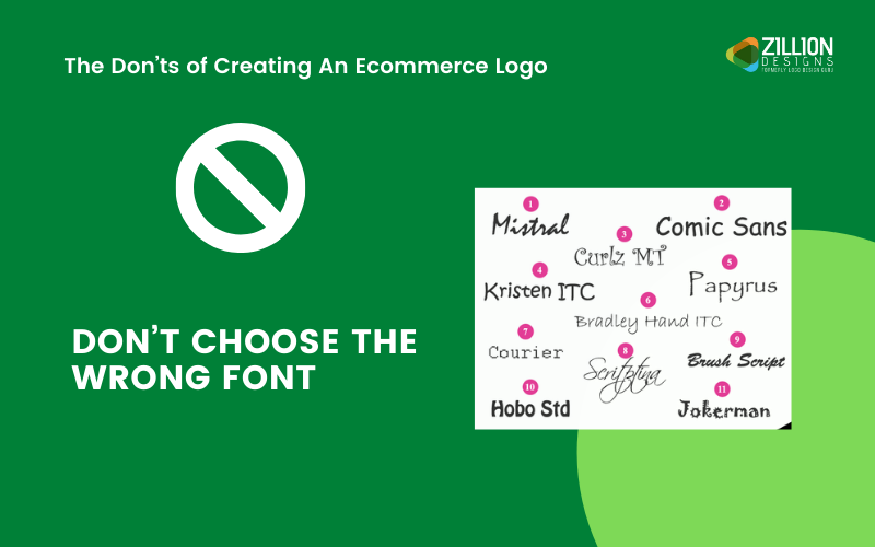
Don’t Choose The Wrong Font
If there is a tagline or slogan in the logo, make sure that you choose a similar or relevant font. Sometimes, designers can make the mistake of using various styles and lose the message.The font for your brand symbol should be consistent across all mediums and any other one you pick needs to complement it.
Explore: 20 Free Fonts Typography Lovers Must Have
Let’s take a look at some creative ecommerce logos.
Image Source: Wikimedia

Image Source: Wikimedia

Image Source: 1000logos.net

Image Source: Wikimedia
Image Source: ZillionDesigns

Image Source: Zillion Designs

Image Source: Zillion Designs

Image Source: Zillion Designs

Image Source: Zillion Designs

Image Source: Zillion Designs
Image Source: Dribbble.com
