There’s something enchanting about Aspen, Colorado—preserved Victorian architecture, an array of cultural offerings, majestic nature around every corner, and plenty of glitz and glamour if that’s your thing. Herbert Bayer is one of the people we can thank for Aspen’s modern charm. The polymathic Austrian-born artist moved to Aspen in 1946, significantly impacting the town’s post-war revitalization and preservation.
Understanding Bayer’s connection to Aspen and honoring his legacy is the singular mission behind The Resnick Center for Herbert Bayer Studies (The Bayer Center). In the three years since it opened, the center has put on two deeply researched exhibitions (the inaugural retrospective showcased Bayer as a fine artist, and the second, in 2023, explored a particular moment in Bayer’s career and life after he moved to Aspen until 1953, and his work on the World Geographic Atlas).
Exhibition photography by Tony Prykryl
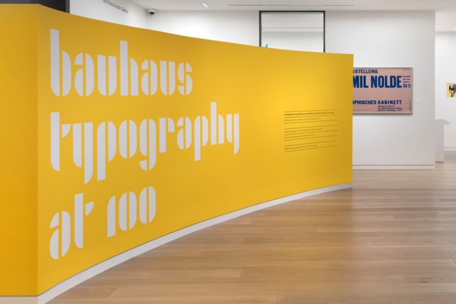
The Bayer Center’s third exhibition covers new ground, putting Bayer in context with fellow artists and contemporaries. Bauhaus Typography at 100 (open June 2024 through April 2025) is the center’s first collaborative show and the first traveling exhibition for Letterform Archive (the original was in the archive’s San Francisco gallery in 2021). Lissa Ballinger, The Bayer Center’s executive director, worked with James Williams of Common Ground, one of Letterform Archive’s original exhibition designers, to help the center translate the exhibition into a much larger space. While keeping to its intent, Williams helped The Bayer Center create a unique flow specific to its space while expanding the scope and size of the original exhibition. “It seemed like a wonderful opportunity to collaborate with another organization,” says Ballinger. “The Bayer Center and Letterform Archive are both very young organizations. We’re learning a lot through this process.”
We are so happy to collaborate with Letterform Archive to explore what Bayer is most known for—his graphic design, typographic contributions, and his work with the Bauhaus.
Lissa Ballinger
Bauhaus Typography at 100 spans the center’s lower galleries, flowing from its expressionist origins to the singular aesthetic we most associate with the school to conversations far beyond the mid-20th century. Following the organization of the book of the same name, the exhibition’s five curated sections detail “Early Visions,” “The First Exhibition,” “Bauhaus Publications,” “Typographic Masters,” “Toward a New Typography,” and “Beyond the Bauhaus.” In addition to chatting with Ballinger, I was delighted to chat with Letterform Archive’s executive director, Rob Saunders, to get his perspective on this expanded celebration of Bauhaus typography.
New Acquisitions in the Exhibition
New Letterform Archive acquisitions in the exhibition. On the left: Herbert Bayer’s original boards for Universal Type lettering, 1925, Ink on paperboard, which Saunders describes as “fucking amazing.” Center: Work from László Moholy-Nagy’s preliminary course, 1926 by Erich Comeriner, Collage on board; Right: Letterhead for Das Bauhaus in Dessau, 1926 by Herbert Bayer, Letterpress
When we think of the Bauhaus, we tend to think of the later work: asymmetrical, photo montage, stark layouts with lots of white space, and the distinct aesthetic of internal documents, publications, and books. But, Saunders explains, “The Bauhaus encompasses two very significant and different bodies of work. Both have had echoes in time.” In the early years, as the school had no typographic master, the design was all produced without type. Johannes Itten’s Utopia is one incredible work of the early Bauhaus. In the exhibition, you’ll see a full breadth of this work, including a dozen letterpress compositions by Friedl Dicker and Itten’s interpretations of old master paintings. Saunders believes the early expressionist output is worth a larger conversation, calling it “bizarre and magical.” He explains that we can see its influence in punk, counterculture, and digital work.
Bauhaus’ Expressionist Beginnings
Beyond the Bauhaus
Left top: The Igarashi ABC Book, 1988 by Takenobu Igarashi, Offset lithograph; Left bottom: Emigre #19: Starting from Zero, 1991, by Rudy VanderLans, Offset lithograph; Right: Waimiaku Kakarmari, Transmission of Knowledge, from Ecuador, the Land of the Shuar poster series, 2020 by Vanessa Alexandra Zúñiga Tinizaray, Digital printing
Herbert Bayer is well-represented, and it makes sense. Bayer had a long, illustrious career. His two fellow Bauhaus typographic masters had their careers cut short. László Moholy-Nagy died young, while Joost Schmidt stayed in Germany. As the Bauhaus fell fowl of the Nazi idealogy, Schmidt’s career was truncated in a different way.
In addition to the main exhibition, the upper galleries feature Herbert Bayer’s original artwork, paintings, works on paper, and photographs with text embedded in them. “The alphabet became part of his visual vernacular, and it’s fascinating to see how he integrated it into his fine art practice,” says Ballinger.
The Bayer Center sits on the campus of the Aspen Institute, a nonprofit dedicated to solving the greatest challenges of our time through dialog and leadership. It’s an apt environment to explore the Bauhaus because of the school’s similar principles centered around open dialog. “The Bauhaus was about using experimentation and collaboration between resources, mediums, and people to solve the design problems of the day,” explains Ballinger.
The [Bauhaus’] pedagogical openness is where the juice is still.
Rob Saunders
As to the Bauhaus’ continued resonance (though not without a fair share of “let’s throw Bauhaus under the bus”), Saunders explains, “There are things that will endure forever, and there are things that have become tropes. But, it was influential because it had a unified pedagogical purpose. It espoused one core knowledge of art and design, and while specialization was encouraged, so was cross-disciplinary exploration. It’s still the right idea, I think.” He continues, “The pedagogical openness is where the juice is still.”
Saunder’s advice? Lose the tropes. Get to know more about the early work—the expressionistic stuff is worth a deep dive. While existing literature on Bauhaus focuses heavily on the later work, both Bauhaus Typography at 100, the exhibition, and the book are unusual in that they underscore the entirety of the work.
This collaboration between The Bayer Center and Letterform Archive is a testament to the Bauhaus’s ability to still surprise.
At the 2024 Aspen Ideas Festival in late June, Debbie Millman interviewed Paula Scher and Rob Saunders. Watch and listen in as they trace the roots of typography from Gutenberg to Bauhaus and beyond, drawing on how innovation in design is always in conversation with the past.
Header image: exhibition photograph by Tony Prykryl.
All other imagery from the Collection of Letterform Archive, San Francisco, CA, except where specifically noted.