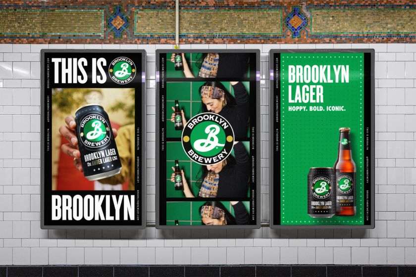
Thirst unveils a new masterbrand identity for the New York craft brewery, honouring Glaser’s design legacy while unifying its popular drink products and enhancing its global presence.
It feels like it’s only been around for a short while, perhaps marking the dizzy heights of the craft beer revolution, but Brooklyn Brewery was actually founded in New York in 1988 by friends Steve Hindy and Tom Potter. Since then, it’s become a leading brand in the drinks space, perhaps owing much of its early success to Milton Glaser, who created its iconic logo and identity.
Now, global agency Thirst has built on that legacy by creating a masterbrand identity for the brewery, bringing consistency and cohesion to its expanding range of products while retaining much of what Glaser did so beautifully.
It’s part of Thirst’s ongoing creative partnership with Brooklyn Brewery, alongside partner Carlsberg Group. It follows the agency’s recent work for Brooklyn Pilsner and Pulp Art and refreshing the existing identities of many other sub-brands. But with each drink enjoying its own strong personality, Brooklyn Brewery wanted to consolidate its assets while adding some consistency to its visual identity worldwide.
As you can see, the masterbrand strategy was built around evolution, not revolution, as the brand is globally recognised and already successful. No, this was about honouring the original creative idea alongside a new central concept that everything Brooklyn Brewery does and makes is reflected in its home borough of Brooklyn, which “isn’t just a place, but a mindset”, as it explains, hence the strapline: ‘The Brooklyn State of Mind’.
“Thirst identified an opportunity to create a bold, culturally iconic and instantly recognisable masterbrand to unify our image globally while staying true to our Brooklyn heritage,” Karli Bainbridge from Brooklyn Brewery explains.
How would they do that? “Achieving consistency while retaining the distinct soul of a brand is the challenge and delight with any new design iteration,” says Matt Burns from Thirst. “This was especially true for Brooklyn Brewery, where we feel a genuine connection with the brand. Our deep understanding of what Brooklyn Brewery stands for was a core strategic strength that helped us guide the client through the development of the masterbrand to its deployment across markets.”
Of course, anyone could get carried away with such a fascinating challenge and well-loved brand. As Thirst had to tread carefully, the branding exercise proved complex, particularly with so many people involved. According to Thirst, it was also an “exercise in restraint and simplicity”. Therefore, the goal was to develop a visual system that would allow the Brooklyn brand to shine while celebrating its existing sub-brand identities.
How Thirst achieved this was through a black frame device featuring the Brooklyn Brewery brand mark – this is the unifying backdrop for capturing and sharing the unique spirit of the borough, with different taglines for global use – such as ‘This is Brooklyn’ internationally, and in the States, ‘Always in the Making’. The frame can also showcase brand campaigns, a single sub-brand, or what Thirst describes as endless combinations of multiple sub-brands as needed – all while maintaining consistency.
Thirst revisited and refined all core and sub-brand assets as part of the work, simplifying how they coexist and come to life beyond the brand’s packaging. Then, to build recognition of the masterbrand, the design system uses the iconic primary logo, originally designed by Glaser in the late eighties (for his effort, Glaser received a share in the company in return), wherever possible. A bigger difference is seen in Thirst’s adjustment of the secondary logo, the horizontal wordmark, which aims to add impact while retaining strong visual links with the primary logo.
Elsewhere, Thirst has introduced some lovely-looking off-pack patterns for each sub-brand. These patterns act as distilled versions of the character and personality of each drink, which could allow any combination of beers to coexist together, complementing the primary packs without visually competing with one another.
Thirst explains, “Its flexible layout system lends the masterbrand versatility, energy and cohesion, ensuring visuals can be scaled for all media requirements and enabling local teams in every market to showcase the brand.”
“This isn’t design for design’s sake,” adds Burns. “It takes patience, time and several rounds of iteration to arrive at the right solution that is satisfying, seamless and above all, easily applicable everywhere.”
The new masterbrand is now rolling out globally.
