The stage has been set for the 96th Academy Awards this Sunday, with the silver screen’s shiniest stars preening in preparation. Awards show season is always an entertaining time of year, ramping up to the Oscars, where the most prestigious accolades are awarded. Best Picture is the culminating category of the night, which the entirety of the awards show season has been building up to. This year, the Best Picture nominees include a range of 10 films across a breadth of genres. The assortment represents an eclectic array of tones, themes, looks, and textures, much like the offerings of a font foundry. To get in on the Oscars fun, we’ve created a thorough round-up of each of the 10 Best Picture nominees as typefaces. We lay out our analysis below!
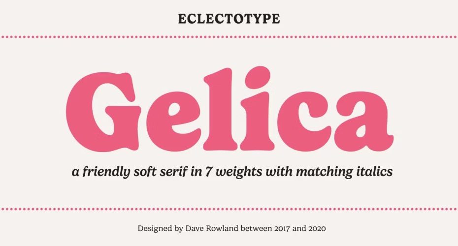
The Holdovers – Gelica
The Holdovers, directed by Alexander Payne and starring national treasure Paul Giamatti, is a dramedy set in 1970 about a group of kids at a prep school with no families to go home to over their holiday break. As a result, they stay behind with their curmudgeonly teacher (Giamatti), and heartwarming antics ensue. The film’s time period, the retro prep-school setting, and overarching feel-good warmth all ladder up to the Gelica typeface. Designed by Dave Rowland and published by Eclectotype Fonts, Gelica is an approachable, soft serif imbued with a classic and cheerful effect.
Anatomy of a Fall – Vienna Woodtype
In sharp contrast to The Holdovers’s feel-good, family-friendly vibe is the French film Anatomy of a Fall. Directed by Justine Triet, the film depicts the story of a woman attempting to prove her innocence in the death of her husband, who has fallen from their home’s attic window. The tone of the film is intensely suspenseful and gripping, which Vienna Woodtype (designed by Christoph Zeugswetter and published by xtoph) taps into with its ghostly wood-block printed effect. The designer used real prints made from a linocut to create the font, with each glyph handprinted, scanned, and then converted into a computer font.
Barbie – Belinda New
A film that has taken each facet of the design industry and every corner of our visual culture by storm, Barbie from Greta Gerwig, starring Margot Robbie, is high femme with a powerful backbone. Belinda New by Melvastype strikes this same chord as a classic brush script with strength and elegance in equal measure.
American Fiction – Typewriter 1950 Tech Mono
American Fiction, directed by Cord Jefferson and starring Jeffrey Wright, portrays the ridiculousness of our society’s obsession with a stereotypical concept of “Black” culture and entertainment through the story of a Black novelist at the end of his rope in the publishing industry. After penning a satire of a “Black” book that publishers and the public mistake as earnest literature, he finds himself at the center of a web of lies and social critique. Typewriter 1950 Tech Mono (designed by Manuel Viergutz and published by Typo Graphic Design) takes the style of a traditional Courier typewriter font that’s long been a visual shorthand for books and book publishing. Then, it subverts tradition with loose treatment of each letterform, harkening to the imperfections of screen-printing and protest signs.
Killers of the Flower Moon – Mesquite
Martin Scorsese’s Western crime drama Killers of the Flower Moon recounts the true story of the systematic serial murders of the Osage Indian tribe in Oklahoma in the 1920s once oil was discovered on their land. Starring (who but!) Leonardo DiCaprio, along with breakout star Lily Gladstone, the period piece harnesses a traditional Western visual language with a sinister, bloody twist. Mesquite is a Tuscan-style typeface from designer Joy Redick that elicits this same tone. It has a clear Western typographic foundation, dramatized by exaggerated sharp serifs.
Past Lives – Voyage
The romantic drama Past Lives by Celine Song, starring Greta Lee with Teo Yoo, encompasses a decades-long love story between two childhood friends from South Korea. The elegance and inherent romance of the typeface Voyage from VJ Type exudes the same tone. There’s a sentimentality to this display typeface, with delicate hairlines that loop backward and forward gracefully, connecting letters romantically like the characters in the film.
Maestro – Magnet
Bradley Cooper directs and stars in Maestro, which chronicles the lifelong relationship between Leonard Bernstein and Felicia Montealegre Cohn Bernstein (Carey Mulligan). The ambitious, sweeping drama explores the complicated beauty and pain of a long-term relationship, which is not unlike the story behind the typeface Magnet by Inga Plönnigs for Frere-Jones.
Oppenheimer – Territory
A period thriller from Christopher Nolan starring Cillian Murphy, Oppenheimer tells the true story of the invention of the atomic bomb during World War II. Territory by Reygraphic is a frenetic, experimental typeface based on graphic elements inspired by sound waves. The distorted energy and illegibility of Territory speaks to the disorientation of an explosion and the impact of the atomic bomb on society and the lives of the people who brought it into being.
Poor Things – Onyxia
Poor Things, starring Emma Stone, comes from the other-worldly mind of director Yorgos Lanthimos. The magical-realistic drama, with a dark comedic twist, spins the outrageous tale of the endlessly captivating Bella Baxter, who has been brought back to life by a mad scientist after her suicide. Much of the film is visually grotesque and unsettling while simultaneously gorgeous and ornate. The highly contrasted display font Onyxia from Pixel Surplus portrays this same juxtaposition, with funky, overlapping characters and bendy letterforms that are at once wonky and elegant.
The Zone of Interest – Lombok Typeface
A period drama from director Jonathan Glazer, The Zone of Interest tells the story of Rudolf Hess, a Nazi officer and Auschwitz commandant, and his family, who build an idealized life beside the camp. Glazer uses absence as a tool throughout the film, never revealing the imagery of the camp. Lombok from Alexandre Pietra similarly harnesses the power of absence and negative space by alluding to strategically removed aspects of letters.
