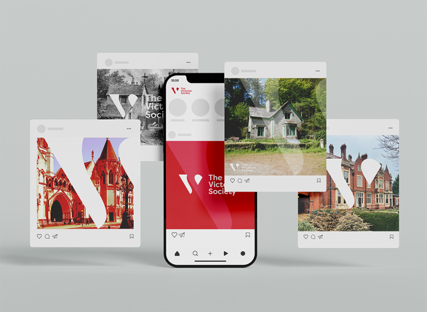
The agency restored the charity’s 20-year-old website to make it a better resource for members and refined the brand identity to make it more “modern, integrated and coherent”.
Banbury-based integrated agency Toast Design has developed a new identity and bespoke website for national charity The Victorian Society, which is looking to attract new and younger members and become a better resource for its stakeholders.
The charity campaigns to conserve and reuse historic Victorian and Edwardian buildings, using donations to protect them from demolition and destruction. Toast Design, according to its director, Mark Williams, saw it as a great opportunity to collaborate with an organisation that values the impact of design.
The first port of call was to enhance The Victorian Society’s visibility and create a cohesive, modern brand that resonates across all media platforms. Then, the agency devised a website that could be augmented over time with new content while retaining a virtual archive of its campaigning history through past posts.
It also worked with the charity’s staff and volunteer project lead Jesse Freedman, who brought web and marketing experience from Apple and Google.
Regarding strategy, Toast Design wanted to create a functional, visually appealing, future-proof platform while paying homage to the Society’s rich history. “This project highlights the importance of blending tradition with innovation, ensuring the Society can effectively reach and engage with a broader audience demographic”, says Williams.
With the logo, the agency took the ‘VS’ letters and utilised the negative space to form a distinctive logo mark. A shortened version is used where the full logo is unsuitable, acting as a visual shorthand. It is also used as a watermark or graphic device for promotional materials.
Toast Design director Dave Foreman defines the brand’s tone of voice as “modern, integrated, coherent and expressive of the positive, celebratory nature of the Society’s work”.
One thing retained from the previous identity was the rich blood-red hue, which is favoured by the Society’s members. The agency also opted to use black in various tones to complement this.
While the charity’s website was “much loved”, it was launched two decades ago and The Victorian Society’s director James Hughes described it as “visually dull and technically antiquated”. Toast Designs approach began with a thorough consultation, which helped them define goals, target audience, and desired features with the client.
The Victorian Society’s key objectives included modernising the appearance, improving user experience, enhancing accessibility, and ensuring mobile responsiveness, according to Foreman.
The next phase – research and planning – involved competitive analysis and technical audit before the agency moved on to information architecture and wireframing. In addition to evaluating existing content, Toast Design found a way to organise content logically and designed basic layouts for key pages.
During design and prototyping, the team created mood boards, style tiles and detailed user interface designs. Other efforts included content strategy, editing and media integration before moving on to the final stages of development, testing and launch.
Foreman says: “Collaborating with the Victorian Society on this project has been an incredibly rewarding experience.
“We are proud of the new brand identity and website, which reflect both the Society’s heritage and forward-thinking approach. This project highlights the importance of blending tradition with innovation, ensuring the Society can effectively reach and engage with a broader audience demographic.”
