Norman Vincent Peale’s adage, “Shoot for the Moon. Even if you miss, you’ll land among the stars,” is taken to heart with True Anomaly’s stellar new brand identity.
Denver-based True Anomaly, a pioneer in integrating spacecraft, software, and AI to enhance national security and ensure space access for allies and commercial partners, has launched a new brand identity. This transformation, executed in collaboration with Danish strategic brand agency Kontrapunkt, showcases True Anomaly’s innovative edge in space security technologies.
Central to the new identity is the logo, inspired by the Greek letter Nu (ν), symbolizing the ‘true anomaly’—a measure of an object’s position in its orbit. The logo combines a triangle with an elliptical orbit, representing sleek modernity and the assertiveness essential in the security industry.
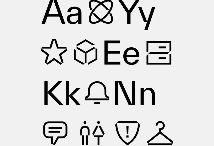
The brand’s new typeface, TWK Everett by Nolan Paparelli, offers edgy simplicity and precise details that shine across text and display.
Kontrapunkt also helped develop distinct visual identities for True Anomaly’s expanding product suite, including customized color schemes, 3D renders, motion principles, and a custom pattern generator, all seamlessly integrated into the brand’s new website.
The rebranding effort contributed to True Anomaly’s successful Series B fundraising, which aimed to better equip the company for its expanding range of digital and physical products. The fundraising attracted $100 million in investments, solidifying True Anomaly as a leader in space security technology.
The rebrand underscores True Anomaly’s out-of-this-world solutions and reinforces the critical intersection of advanced branding and robust space security in today’s rapidly evolving technological landscape.
