Even if you aren’t a TikTok user, it’s impossible to ignore the social media juggernaut’s prominent spot in the recent news cycle. Being used as a political ping-pong, however, is not the only TikTok news on the docket; today, there’s a little tidbit for the design world.
TikTok has seen meteoric growth since the launch of TikTok Sans in 2023, so the company was due for a strategic type reset. It enlisted Type Network and its partners, Contrast Foundry and engineer Aaron Bell. Working closely with the company over a nine-month period, TN’s ensemble team transformed the brand identity into a global typographic system.
As a final step in the expansion of TikTok Sans, the company made it open source, and it is now available on Google Fonts. For a brand to go open-source on something so central to its visual identity is a bold move, but however uncommon, it is a boon to design. “By open-sourcing TikTok Sans, TikTok demonstrates a forward-thinking commitment to the design world, ” said Type Network’s director of technology, Guido Ferreyra. “It shows an understanding that a corporate font can live a rich life outside the company—inspiring creators, allowing adaptation, and even improving through communal input.”
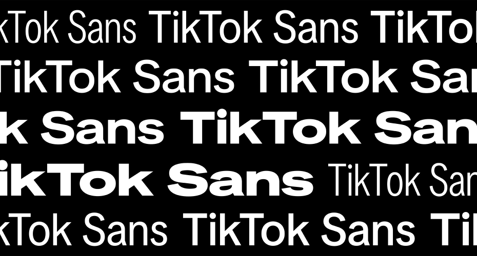
TikTok Sans, the original, has only been a reality for less than two years. The social media platform’s explosive growth had produced a grab bag of fonts, and the company needed consistency in its presence. So, in 2023, it enlisted the celebrated Swiss foundry Grilli Type to develop a custom font, and TikTok Sans was born. It brought clean lines, an open and playful presence, and legibility to the brand. But as with anything in tech, things move fast, and TikTok’s team wanted to build in even more testing, variability, and clarity.
Working alongside TikTok’s design team, the Type Network and its partner team brought open-source experience and type expertise (native-speaking designers, technical engineers, and even hinting specialists, aka code whisperers). This close working relationship enabled the TN team to cycle quickly and iteratively through versions, while the TikTok team tested in production environments and offered real-time feedback.
There’s a level of forensics or archaeology involved when you’re cracking open a typeface made by someone else. It was a delight to explore what existed, refine it with fresh eyes, and expand it into an even more versatile type family.
Maria Doreuli, Contrast Foundry
The original TikTok Sans launched with support for Latin, Greek, and Cyrillic scripts and various variable axes. However, as the teams delved deeper into the typeface’s next chapter, width became a critical point of evolution. The sheer number of type uses across the TikTok universe—calls-to-action, buttons, display, and advertising, as well as the dreaded fine print—called for a new width axis to enable greater compression and expansion of the letterforms. TN partner Contrast Foundry drew new masters, enabling TikTok sans to go much narrower or wider (Display Condensed Light, Display Condensed Black, Display Expanded Light, and Display Expanded Black).
The slant axis and glyphs posed additional challenges, and the TN team devised an approach using generated and manually drawn shapes to deliver high-quality solutions that increase variability while maintaining a light and agile file size.
The most interesting aspect of the collaboration might be the work to make the typeface pixel-perfect. For a technology-centric company, ensuring the beautifully drawn letters render across myriad devices, screens, and resolutions becomes its own mammoth project, especially for a typeface released as open-source. TN partnered with Aaron Bell, founder of Seattle-based foundry Saja Typeworks (and formerly a font project manager at Microsoft), whose scripted type hints achieve impressive sharpness and readability that everyone from designers to end-users can appreciate.
“To some, hinting a typeface like this might seem antiquated,” said Lucas Czarnecki, Type Network’s creative director, “however, TikTok and TN agreed that no matter what device a user has, she should enjoy the same, high-quality standard of design and experience.”
To read more about Type Network’s collaboration with TikTok’s design team on the open-source version of TikTok Sans, read the full case study at typenetwork.com.
The post Type Network Expands TikTok Sans from Brand Typeface to Open-Source appeared first on PRINT Magazine.