Searching for the perfect type pair can be a fun challenge, but it can quickly morph into a vortex of time-suck. Selecting typefaces is a subjective process, not unlike dating. Fonts might go together “on paper,” but in practice, they might not be quite right for each other, i.e., the timing is off (not suitable for this project), or there’s a slight quirk whose incompatibility isn’t apparent until they sit across the table from you at dinner.
Like love, you just know when you find the right font pairing.
Monotype recently launched an A.I. font-pairing tool to help designers streamline this process. Regarding A.I.-driven assistance for designers, we love the potential for this tool to speed up the selection process and expose us to possibilities outside our personal frames of reference. Read more about the tool.
Font pairings are extremely valuable; they provide variety, functionality, and tone of voice, sparking a new brand or breathing life into an old one.
Monotype, on the release of the A.I. font-pairing tool
Even if Valentine’s Day is our least-favorite holiday, we can all get behind fantastic typeface duos. So, we asked several designers about their favorite type pairs. Their responses are below.
Giuseppe Salerno & Paco González @ Resistenza
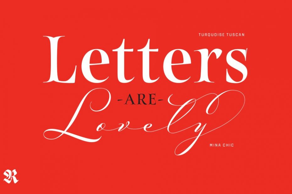
Giuseppe Salerno: Turquoise Tuscan and Mina Chic
Mina Chic and Turquoise Tuscan designed and published by Resistenza.
“This pairing is perfect for its captivating contrast. [Mina Chic] introduces a sense of personality and warmth with its handwritten charm, while the Roman [Turquoise Tuscan] imparts structure and readability through its classic letterforms and the Tuscan serifs. This combination creates a timeless choreography, perfect for evoking a classic romantic essence. Together, they strike a harmonious balance between tradition and modernity, crafting a visual symphony that leaves a lasting impression. What a delightful fusion!”
A tip from Giuseppe: “Dive into the OpenType features to uncover a wide array of alternate letters and swashes, empowering you to fashion a unique composition tailored to your creative vision.”
Paco González: Norman and Nautica
Norman and Nautica designed and published by Resistenza.
“Norman, a condensed serif font, and Nautica, a classic script font with a romantic flair, offer a delightful fusion of styles. Both fonts boast an extensive array of alternate letters and swashes, allowing for easy customization through OpenType. Nautica injects personality and whimsy, while Norman provides a solid foundation of structure and clarity combined with an elegant sense of style. This unexpected pairing creates a lovely synergy that seamlessly blends modernity with timeless elegance, making it exceptionally versatile for various applications. Together, Norman and Nautica form a perfect match, a harmonious duet that ensures every glance becomes an unforgettable experience.”
Resistenza is a type foundry consisting of Giuseppe Salerno, a trained calligrapher who gained his graphic design skills in Torino, Italy, and Paco González, a self-taught Spanish-born designer from Valencia. Working mostly by hand, a bold, humanistic quality comes through in their graphic design, emphasizing a connection with the places and people that use a particular product or service.
Marie Boulanger, Design Team Lead @ Monotype
Juana and Cooper BT
Juana, designed by Eli Hernández and published by Latinotype.
Cooper BT, designed by Oswald Bruce Cooper and published by Bitstream.
“Love means something different to everyone, but I am going to go with my current definition and experience of romantic love. You need a mix of friction and compatibility for good results, and I guess that applies to type choices too! It’s boring when things are too smooth. You can engineer and craft the perfect hypothetical pair, but sometimes you need a little bit of weirdness for it to work. Think of the best couples you know! My own perfect pair of fonts for Love-themed designs would be something like Juana, a sharp and refined serif, with Cooper BT. Everyone knows Cooper Black, but it looks beautiful in lighter weights two.
While this pairing is more instinctive than based on algorithm, I like the effect of using sharp and soft letters in such close proximity. Love is never boring, and things are always changing.”
French-British Type designer Marie Boulanger leads the Design Team at Monotype, creating compelling visual assets and design-led campaigns that push the cultural conversation around linguistics and type design.
Joana Correia @ Nova Type
Lemongrass and Brandon Grotesque
Lemongrass, designed by Joana Correia and published by Nova Type Foundry.
Brandon Grotesque, designed by Hannes von Döhren and published by HVD Fonts.
“As the perfect pair I have chosen my font Lemongrass because I love script fonts and this was a love affair when designing it. It shows sweetness but also vibrant and energetic. I paired it with Brandon Grotesque because of the contrast and complementary aspect to them. Brandon Grotesque was one of my first loves in typography. I love the round corners and old school design. I think it matches great with Lemongrass and brings balance but still keeping a sweet look. Lemongrass is part of Nova Type Foundry library and Brandon Grotesque from HVD fonts that I admire and have inspired me to be a type designer.
For me love language is humor and playfulness. I think it’s important in Love to keep humor and playfulness as part of the relationship to make it last with compassion and kindness. These two typefaces mean kindness and openness to live life. These two typefaces connect to what I like to bring to live in my designs, kindness, a warm look and openness. They show a bit of who I am as well.
I like the old school and decorative aspect to the fonts relating it to the 90’s when I was a teenager and finding out what love is.”
Joana Correia is a multi-award winning type designer, speaker, and founder of Nova Type, an independent font foundry specializing in original fonts and infusing content with emotion.
