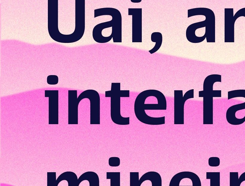
Uai is a new typeface by Naipe Foundry, designed specifically for our expanding digital world, from editorial UI to apps to multi-environment digital platforms. The independent Rio-based type design studio is known for character-rich and culturally significant typefaces, such as Pacaembú, a sans-serif typeface with roots in Brazilian football and the Art Deco Estadio Pacaembú.
The team behind Uai, led by Felipe Casaprima and Álvaro Franca, drew inspiration from Minas Gerais, a Brazilian state known for its unique dialect and rich cultural heritage.
Experience Minas Gerais’ music, language, and history, all while taking Uai for a spin in different digital use cases on the excellent microsite. Cadu Carvalho, a Brazilian UI/UX designer and author of the type-focused Substack, Tipo Aquilo, created the site.
Throughout Uai’s two-year development, the team worked closely with over 100 UI designers, leaning heavily on focus groups to ensure that Uai could address complex design challenges while also maintaining the warmth and personality of the Minas Gerais region. The name comes from a common Portuguese interjection serendipitously pronounced “UI.”
Uai’s design wasn’t driven by intuition alone: over the course of 45 days, we spoke with more than a hundred UI designers in focus groups to understand what they expect and need from a typeface.
Felipe Casaprima, Uai design lead and partner at Naipe
Available in 14 styles and seven widths, with language support for 200+ Latin-based scripts, Uai’s design features make it ideal for use in digital environments. Dark mode optimization is the first of these, with contrast and detail adjustments ensuring better legibility and reducing the halo effect. Uai is also a multiplexed family, meaning that at any weight, the width remains constant, thereby reducing the need for layout changes.
Uai draws from a calligraphic foundation, giving it a personable, organic personality despite its digital-first conception. Visual clarity between characters, such as the lowercase ‘l’ and the uppercase ‘I,’ supports further legibility and accessibility.
Finally, automatic centering streamlines the alignment of text in buttons and input fields, and two sets of arrows (uppercase and lowercase) for next-level interface navigation.
Learn more about Uai and Naipe Foundry.
Visuals by Tobia Hallak.
The post Uai Is a Humanist Sans Serif Designed for Digital Environments appeared first on PRINT Magazine.