India was never inherently homophobic. As a land deeply rooted in tradition, the country is often cast as culturally conservative. However, this portrayal conceals layers of history and evolution that include an ancient openness towards diverse identities. In the early 2000s, India witnessed a quiet yet powerful transformation in its social fabric—an emergence of underground queer magazines that have, against considerable odds, carved a legacy of resilience and creativity.
India’s underground queer magazines transformed resistance into an art form, quietly asserting a truth long buried yet unbreakable. These publications, birthed from necessity and defiance, speak not only to the LGBTQ+ community but also to India’s shifting identity and visual culture. They are a testament to the fact that India’s relationship with LGBTQ+ identities is far more nuanced than the image of homophobia typically associated with it.
Despite the false narratives portrayed by the Modi government and modern-day stigmas, historical Indian art and texts tell a different story. Temple carvings, cultural traditions, and even ancient manuscripts reflect an acceptance, even celebration, of queer identities. However, British colonialism imposed a rigid Victorian morality on Indian society, codified by Section 377 of the Indian Penal Code, which criminalized same-sex relationships. This colonial-era law fueled taboos that persist today. In the face of this repression, the early 2000s saw the quiet emergence of underground queer magazines. These publications represented both a rejection of colonial influence and a reassertion of India’s original diversity in sexual and gender expression.
India’s underground queer magazines were revolutionary despite their limited reach. Publications such as Samraat, Astitva, and Gay Bombay bypassed societal norms with a subversive and careful design. Inspired by India’s rich cultural heritage, such as the intricate, erotic carvings of the Khajuraho temples, these zines celebrated queerness through subtle but unmistakable references. The groundbreaking Bombay Dost — India’s first registered LGBTQ+ magazine founded by Ashok Row Kavi in 1990, emerged as an icon. Originally circulated discreetly, wrapped in brown paper, and distributed by word of mouth, the magazine provided a sanctuary—offering a candid space for discussing taboo topics like sex and romance. Over time, Bombay Dost built an essential network for queer expression in India, and its commercialization helped expand its reach, eventually becoming available in bookstores and online and more openly reaching upper-class audiences who sought connection.
Resiliency through graphic design in these magazines became an act of quiet rebellion and necessary caution. Each creative decision had to consider not only the readers but also the potential scrutiny from outsiders. Design choices thus served as tools for both subtle visibility and self-protection.
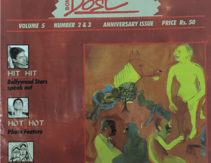
Left: Masala Mix Double Issue Cover, Bombay Dost Volume 5, No 2 & 3 (1996); Right: A Poster of Maddox’’s Solo Drag Performance
Coded Imagery
Visuals in these magazines became their own language. Illustrations employed symbolic imagery, like intertwined hands or muted rainbows, to convey queerness without explicitly stating it. Coded visuals were not a mere aesthetic choice; they allowed creators to sidestep censorship and to reach readers on a deeper, resonant level.
Typography as Resistance
The type choices were not neutral. Often bold and unconventional, the chosen fonts captured a sense of urgency, rebellion, or empowerment. The typography became a statement, challenging traditional design norms and capturing the daring spirit of the movement it represented.
Monochromatic Aesthetics
Due to budget constraints and limited access to color printing, many publications relied on monochromatic designs, often black and white. The starkness of the magazines’ visuals added a layer of underground, grassroots nature.
Left: Akshay Khanna’ ’s Opinion on Homosexuality, Bombay Dost cover, Volume 4 No 1 (1995); Right: Bollywood actors offering their opinions on homosexuality, Bombay Dost, Vol 5 No 2 & 3 (1996)
The impact of Bombay Dost stretched far beyond Indian borders. Row Kavi, the editor-in-chief of the magazine, recounts receiving letters from readers across Afghanistan, Dubai, and Iran, evidence of a hunger for connection that transcended national and cultural boundaries. Letters flooded into the magazine’s Khush Khat (Happy Letters) section from around the world, including neighboring Pakistan and various Central Asian republics, each voice resonating with the shared human desire for recognition and support.
These magazines contributed significantly to India’s design and cultural landscape. They were more than community bulletins; they became sites of experimentation where new typographic styles, symbolic color schemes, and innovative visual metaphors flourished and paved the way for new forms of self-expression that continue to influence contemporary designers and artists. Although the magazines are no longer in business, the legacy of these underground publications lives on. Today, the medium has largely transitioned to digital, but the message and impact remain potent, representing a significant chapter in both LGBTQ+ activism and Indian visual culture.
Jyothi Hiremath is a New York-based architect with a background in design writing, editorial, and communications. Currently pursuing a master’s in design research at the School of Visual Arts, she has nearly two years of experience at Epistle, South Asia’s leading consultancy for architecture, design, and product communications. Jyothi’s passions blend design research, trend analysis, human behavior, social impact, and storytelling.
The post Underground Ink: A Short History of India’s Queer Magazines appeared first on PRINT Magazine.
