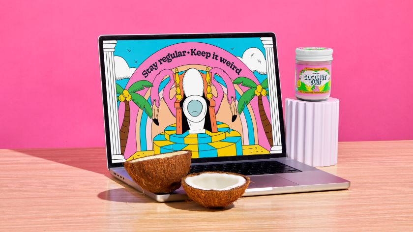
Probiotic brand Coconut Cult isn’t just trying to sell yoghurt; it’s trying to change the world. &Walsh founder Jessica Walsh explains how her design team supported that mission.
Coconut Cult is a brand of fermented coconut yoghurt known for its unique taste and high probiotic content. Made from organic coconut milk, it’s free of dairy, soy, and gluten. While it’s not the cheapest on the market, its taste and health benefits have made it popular, and it’s amassed a significant following on social media, particularly TikTok.
The brand needed to create a cohesive identity that would enhance its visibility as it expanded its product offerings. They turned to New York agency &Walsh, and the result is a visually captivating brand that balances Coconut Cult’s quirky charm with a more unified brand presence.
Read on as &Walsh founder Jessica Walsh gives us an exclusive behind-the-scenes look at the creative process and vision behind the redesign.
Main challenges
The main challenge, Jessica says, was to convey the brand’s lighthearted personality while simultaneously highlighting its earnest mission: making gut health simpler, more accessible, and utterly delicious.
There was also a need to formalise the design system. “Before the rebrand, Coconut Cult used a changing wordmark,” she explains. “While this approach was very playful and true to their creative nature, it made brand consistency a challenge.”
The team’s goal when rebranding Coconut Cult was to preserve this playful essence while developing a more unified brand system. “At the heart of this effort was creating a consistent wordmark and illustration style to be prominently featured across all packaging,” says Jessica.
Unusual inspiration
Their inspiration was an unusual one. The Holy Mountain is a 1973 Mexican surrealist film directed, written, produced, co-scored, and co-edited by and starring Alejandro Jodorowsky. The movie, partly funded by John Lennon and Yoko Ono, follows a mysterious alchemist who gathers a group of individuals representing the seven deadly sins. Together, they embark on a quest to ascend the Holy Mountain, a place of ultimate power and enlightenment.
“The set design in Holy Mountain really stuck out to me,” says Jessica. “When we started talking about cults, I wanted to find a way to weave them into the work without overpowering what makes the products so great. At the end of the day, the identity still needs to communicate the deliciousness of the products, not just the culty stuff. It mostly inspired the illustrated environments and geometrical shapes you can see in the imagery.”
Retaining Coconut Cult’s playful essence while creating a more unified brand system was a tricky balance to strike. “Capturing the right tone was a challenge,” recalls Jessica. “People really loved the brand’s lo-fi vibe and the creative, playful energy the founders brought to it. We wanted to avoid making it feel corporate.
“At the same time, there were significant issues with shelf visibility, so we focused on creating a fun system that would stand out but also prioritise brand recognition and clear information hierarchy.”
Brand consistency
Previously, the company had used different versions of the wordmark across its various flavours. “We loved the concept, but it was undermining brand recognition,” Jessica notes. “We advocated for a consistent wordmark to strengthen brand identity while using illustrations to reflect the unique personality of each flavour.”
The latter was created using what she refers to as “a unique illustration style inspired by mystical, cult-like motifs. Additionally, we introduced a framing system on the packaging to guide attention to key information, which we extended to brand identity applications like picture frames, tarot cards, and the framing of product videos. Other assets include the coconut-inspired wordmark and a vibrant colour palette.”
Passion project
It was a project the team were highly motivated to get right because Coconut Cult was a company they were passionate about getting behind. “Many brands cut corners for financial reasons,” Jessica explains. “But Coconut Cult is deeply committed to the idea of ‘food as medicine’ and to delivering probiotics as ‘living food’. This method is far more expensive than the pasteurised process used by other brands.
“They also believe in educating consumers about the hidden, harmful ingredients in processed foods, and their founder is outspoken about these issues,” she adds. “It was refreshing—even a bit radical—to see a brand prioritise people over profits, and that commitment inspired the bold, unconventional style of the graphics.”
This was another reason why &Walsh felt the reference to Holy Mountain was a good fit. “Unlike other brands, Coconut Cult is very vocal about the challenges they face within the food system here,” explains Jessica. “They are determined to strip away the illusions that so many ‘healthy-marketed’ brands want us to buy into. Similarly, Alejandro Jodorowsky criticises the use of power for exploitation within the Holy Mountain film.”
In conclusion, Coconut Cult’s renewed brand identity captures the spirit of a super-live probiotic that’s unapologetically weird and deeply committed to gut health. Walsh’s work here brings refined clarity to the company’s message, enhancing its cult-worthy allure for a wider audience while staying true to its lively, irreverent personality.
