As we move further into the new decade and continue navigating a world that’s learned how to cope with a global pandemic, designers are playing with a new set of color trends. The color trends of 2022 are largely a response to the eye-grabbing, in-your-face trends we’ve seen over the past few years. To put it bluntly…we’re a bit burnt out and we collectively need some simplicity.
So this year we’re opting for toned-down, muted shades that feel softer and gentler than the loud colors that dominated 2020’s designs. Don’t mistake these color trends for boring or washed-out, though—as you’ll see, many are modern and creative takes on color trends that revitalize and recontextualize them for today.
Ready to see the colors you’ll be seeing everywhere in 2022 and beyond? Check out 2022’s up-and-coming color trends.
Here are the top 8 color trends of 2022:
—
-
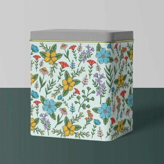
- Adventurous pastels
- Rustic, earthy muted tones
- Light and airy
- Colorful Memphis design
- Vintage flower power
- Jewel tones with neutrals
- Retro 70s and 80s color schemes
- Hyper-saturated color contrast
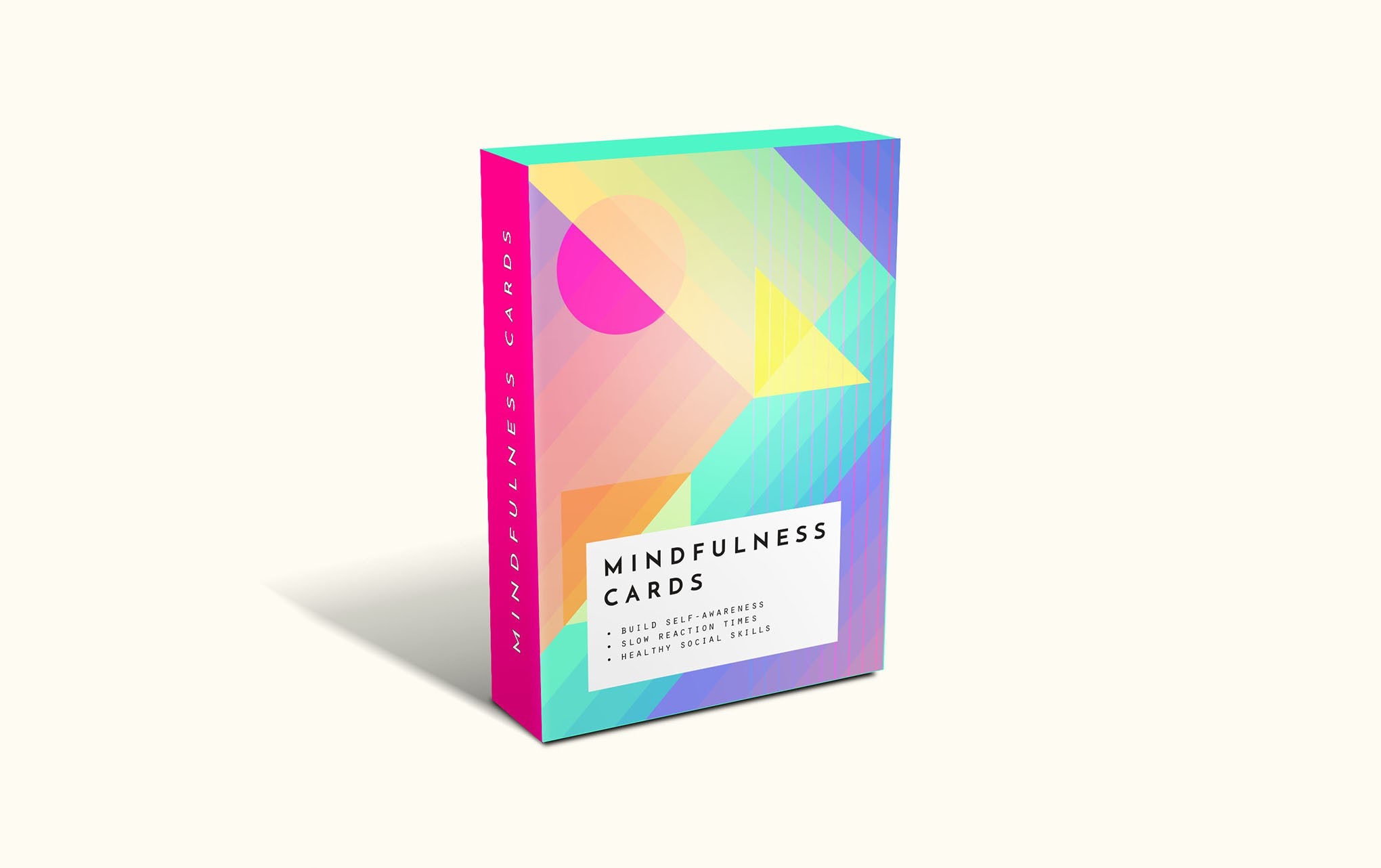
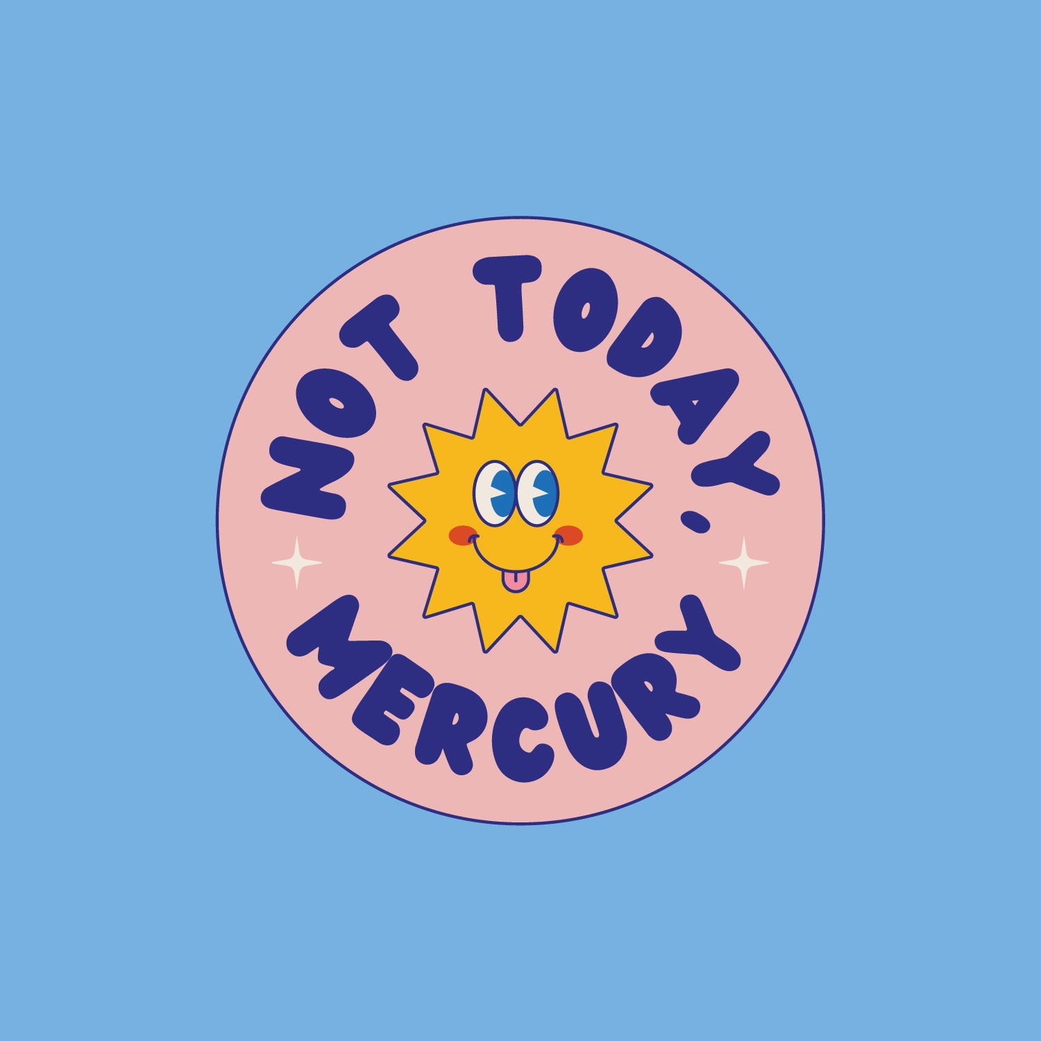
1. Adventurous pastels
—
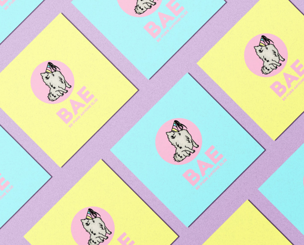
Pastels are pretty. They’re soft, they’re sweet, they’re the perfect palette for springtime. But you might not call pastels adventurous…until now.
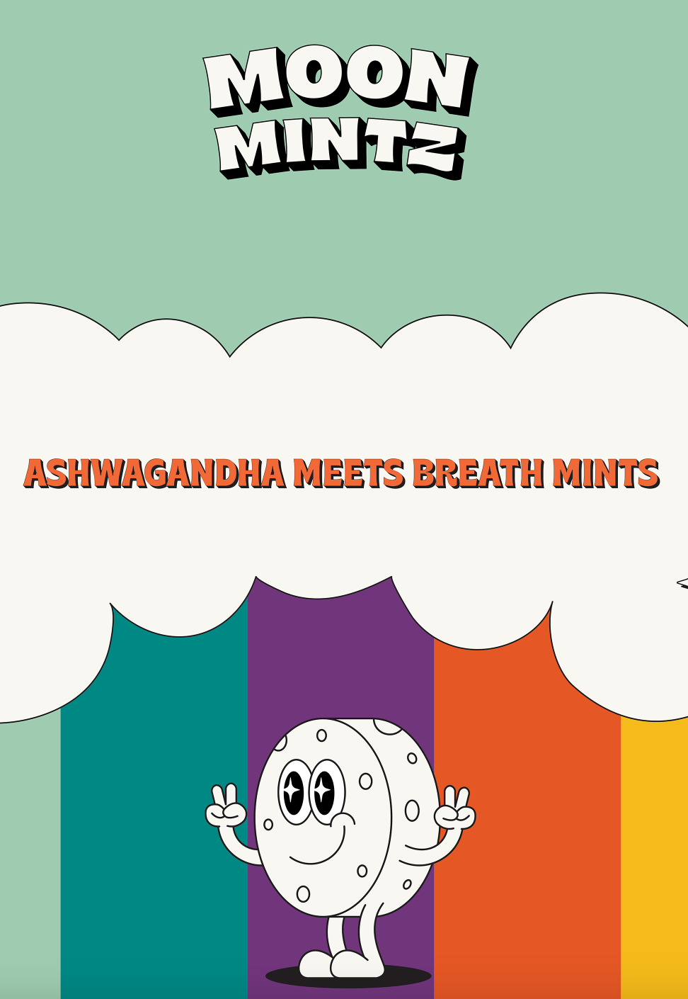
In 2022, expect to see more designs that give pastels a twist. That twist could be pairing them with geometric shapes, line illustrations, or displaying them in full-on, funky patterns that are going for a maximalism design style by filling space with objects, colors and patterns that mirror the whim of the artists, as you see below.
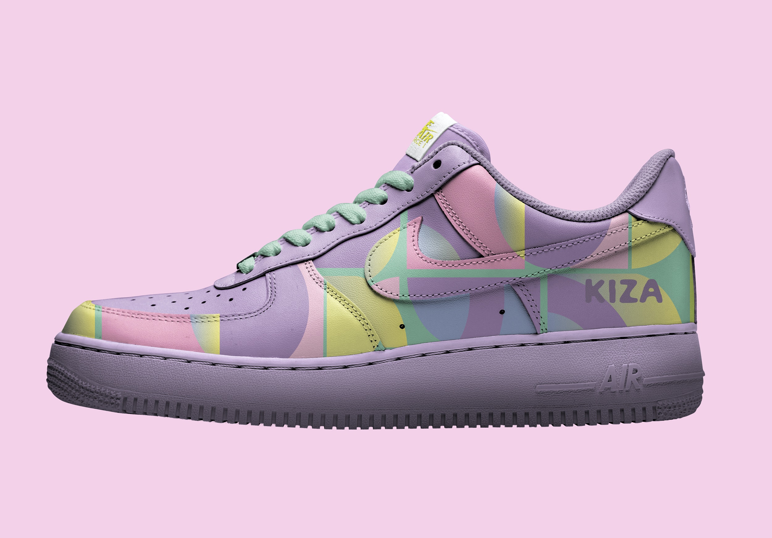
By using pastels in unconventional and creative ways, designers are twisting expectations to create disharmony or edgy-ness. They’re playing with saturation to create bolder pastels, or pairing them with neons or intricate patterns. The result is the soothing feel of pastel but the more vibrant colors and patterns give it some energy. It’s unexpected, yet not totally bizarre. It’s soft, yet spiky. It’s a fun way to reimagine familiar colors while pushing boundaries by reinventing something we all thought we were familiar with.
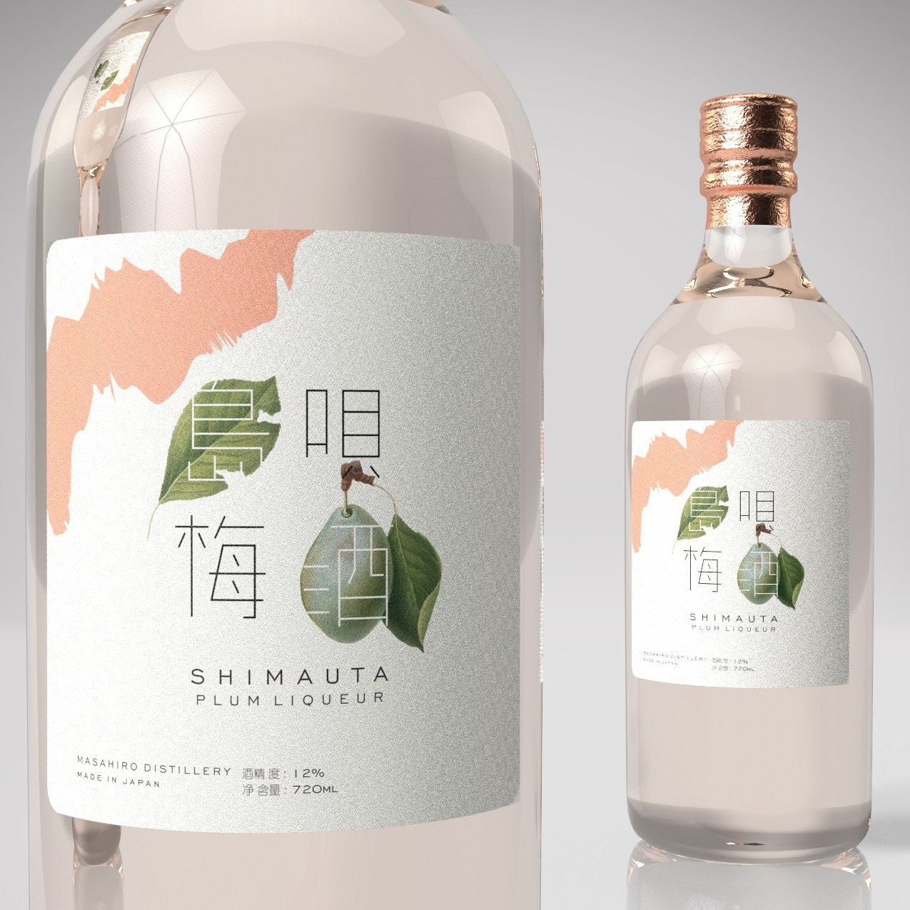
2. Rustic, earthy muted tones
—
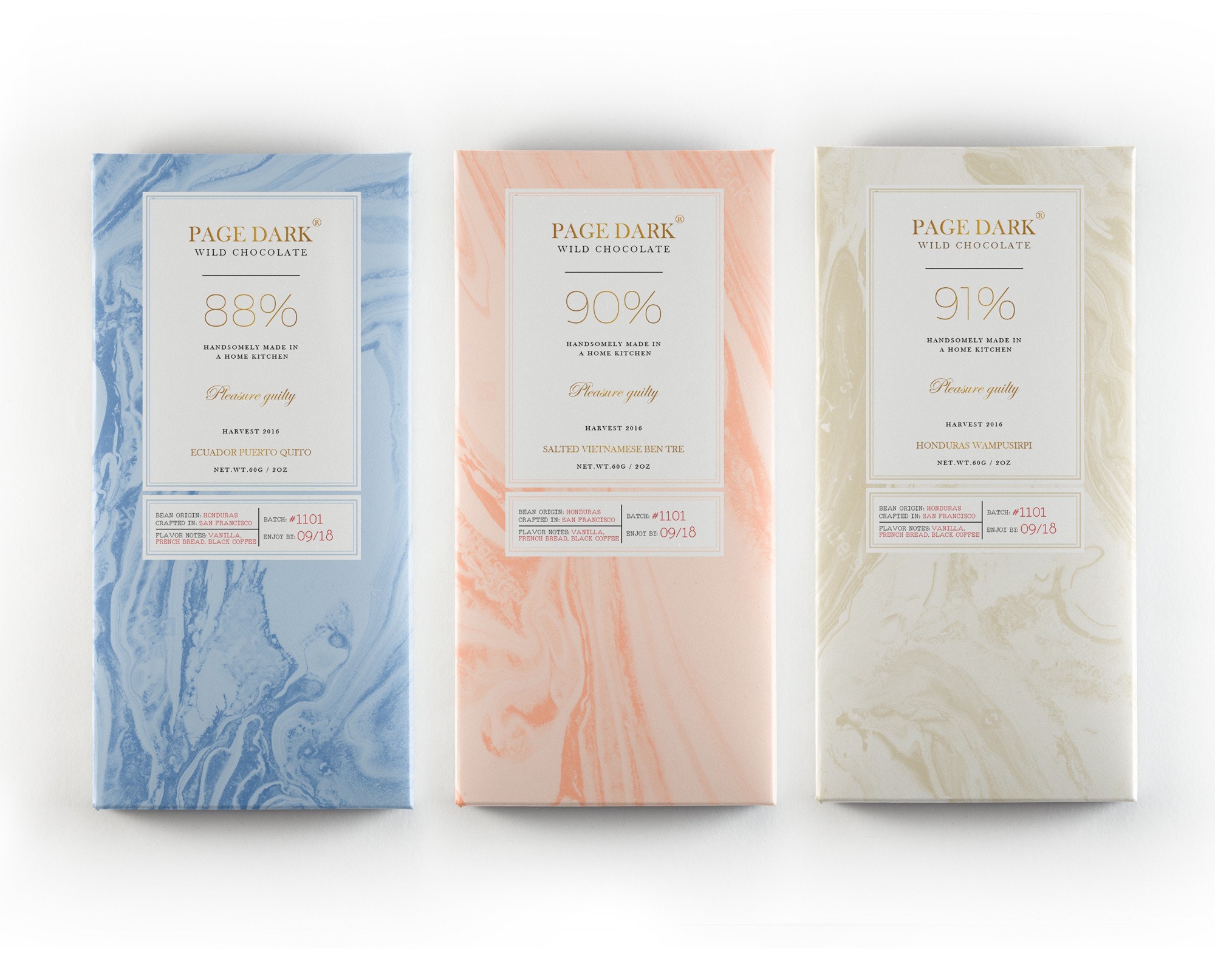
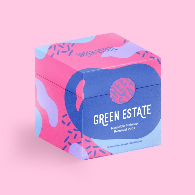
Pastels aren’t the only soft colors we’ll be seeing a whole lot more of in 2022. Expect to see designers embracing a wide spectrum of muted colors.
If you’ve been following color trends for the past few years, you’ll notice that this is a bold contrast to the neons and bold colors that dominated the last few years’ designs. This could be because we’re collectively feeling overstimulated and exhausted by our brash, bold, bright world. Many of these colors drive their designs into a rustic territory, creating a back-to-nature vibe that feels calming and refreshing.
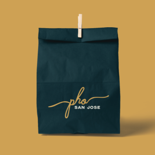
Muted colors tone a brand down, so if you’re in an industry where everybody’s using bright colors, going with a muted look can help you stand out. Similarly, any brand that wants to communicate that they’re slower paced and perhaps more thoughtful, natural and organic than others can use muted earth tones to communicate these values.
![poster in muted colors with Polish text]](https://glossingdress.com/lib/img/all/212/df47b4acb0fc07d7189add3b45dbaeddbdc9fce9e534a62c0c159a271bb80426/3682742835c9c9826d775fa3de42438180b92da9bf662f6d2bf514333646ac65.png)
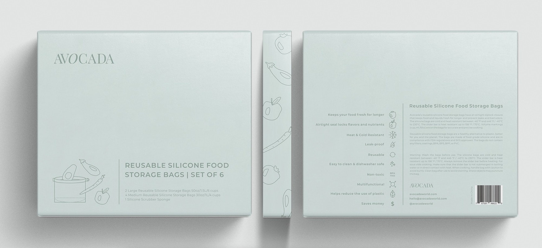
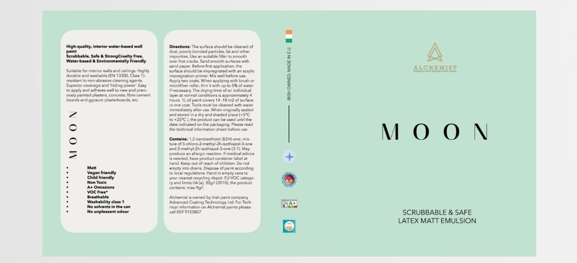
3. Light and airy
—
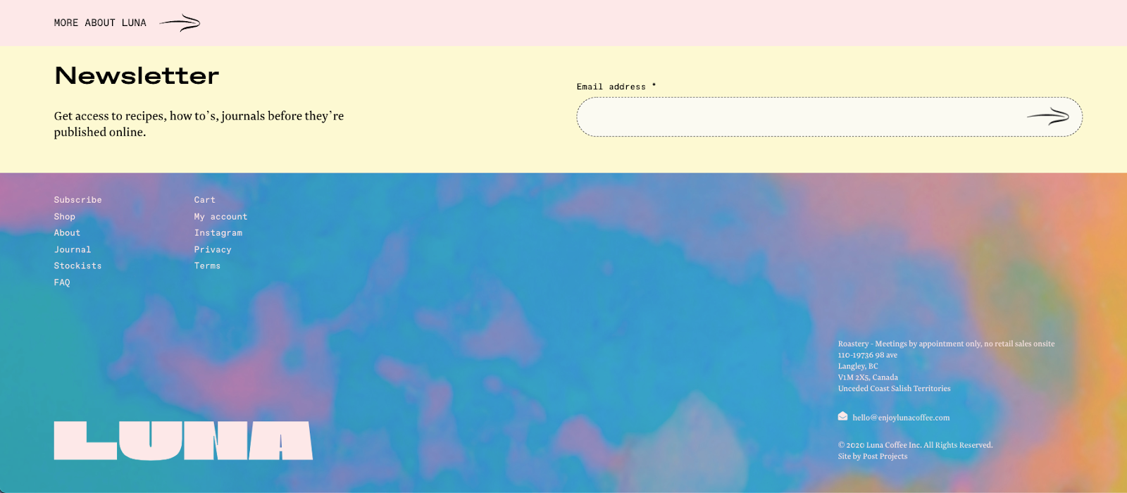
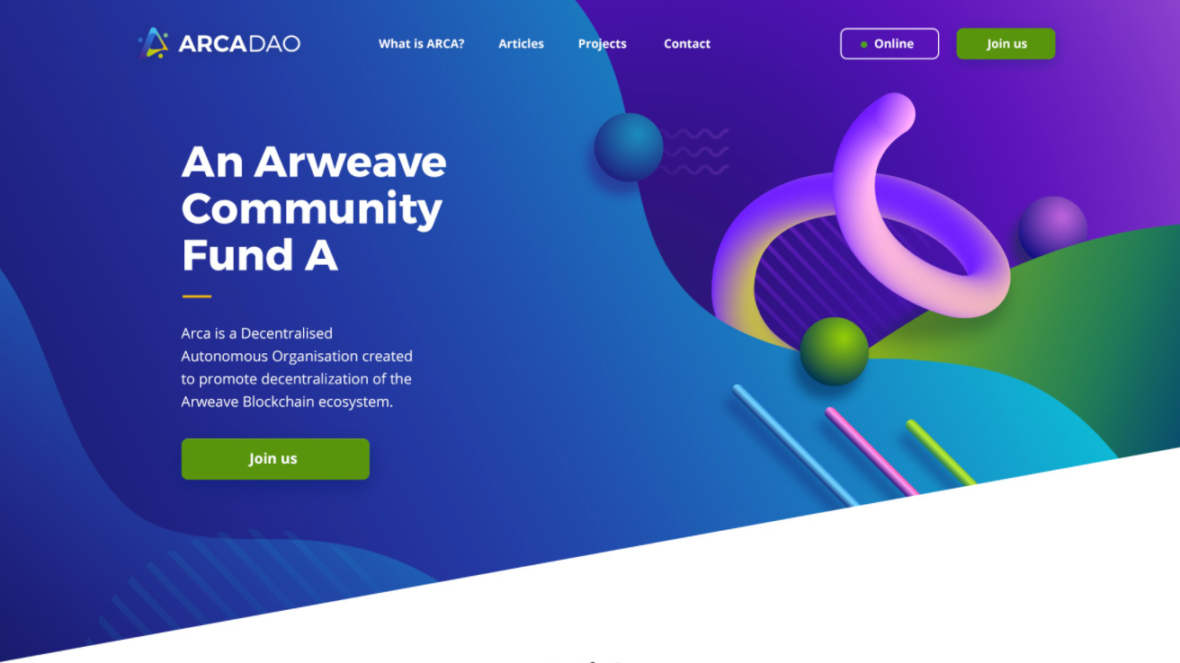
The year 2022 is shaping up to be the year of calm colors. Beyond pastels and other muted hues, we’re going to see minty shades, eggshell finishes and watercolor designs—all designs that evoke a feeling of light airy, calm and gentle, almost as if you were floating or resting on a cloud.
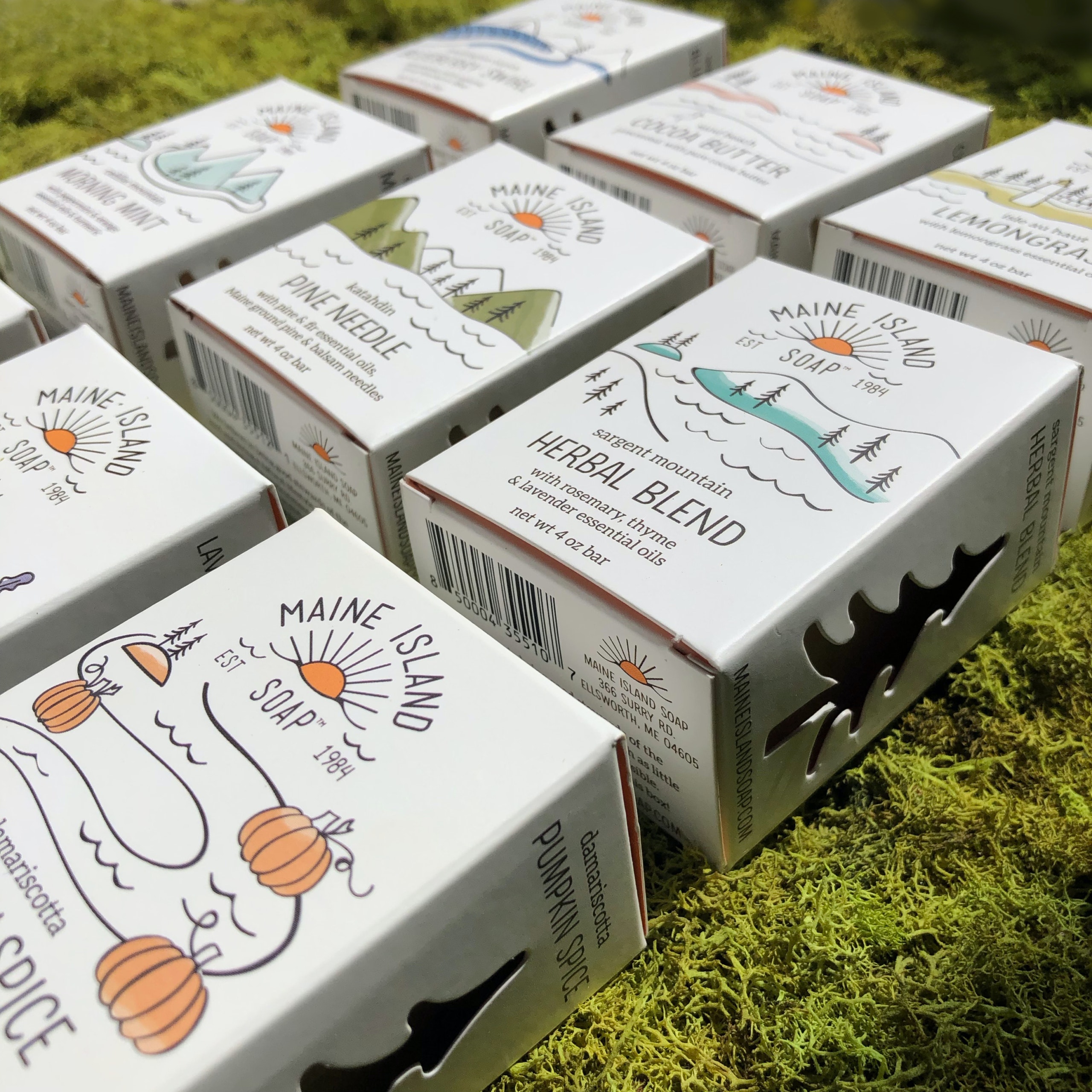
Take a look at the different ways designers are creating that airy feeling by using soft colors in uncluttered designs, pairing them with simple, calm typography. After the year we’ve all had, people are craving calm. They’re craving comfort…and not the same kind of comfort their sweatpants provided when they spent a year in lockdown. In 2022, we’re craving the psychological comfort that comes from simple colors that evoke a light and airy feeling.
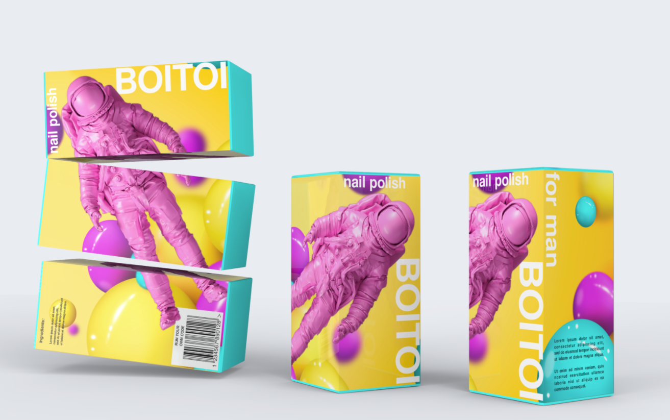
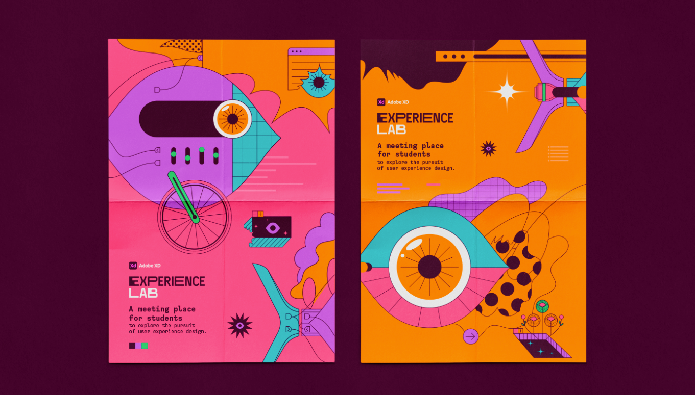
4. Colorful Memphis design
—
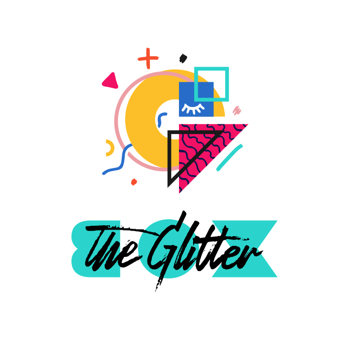
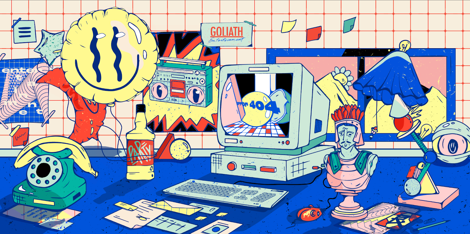
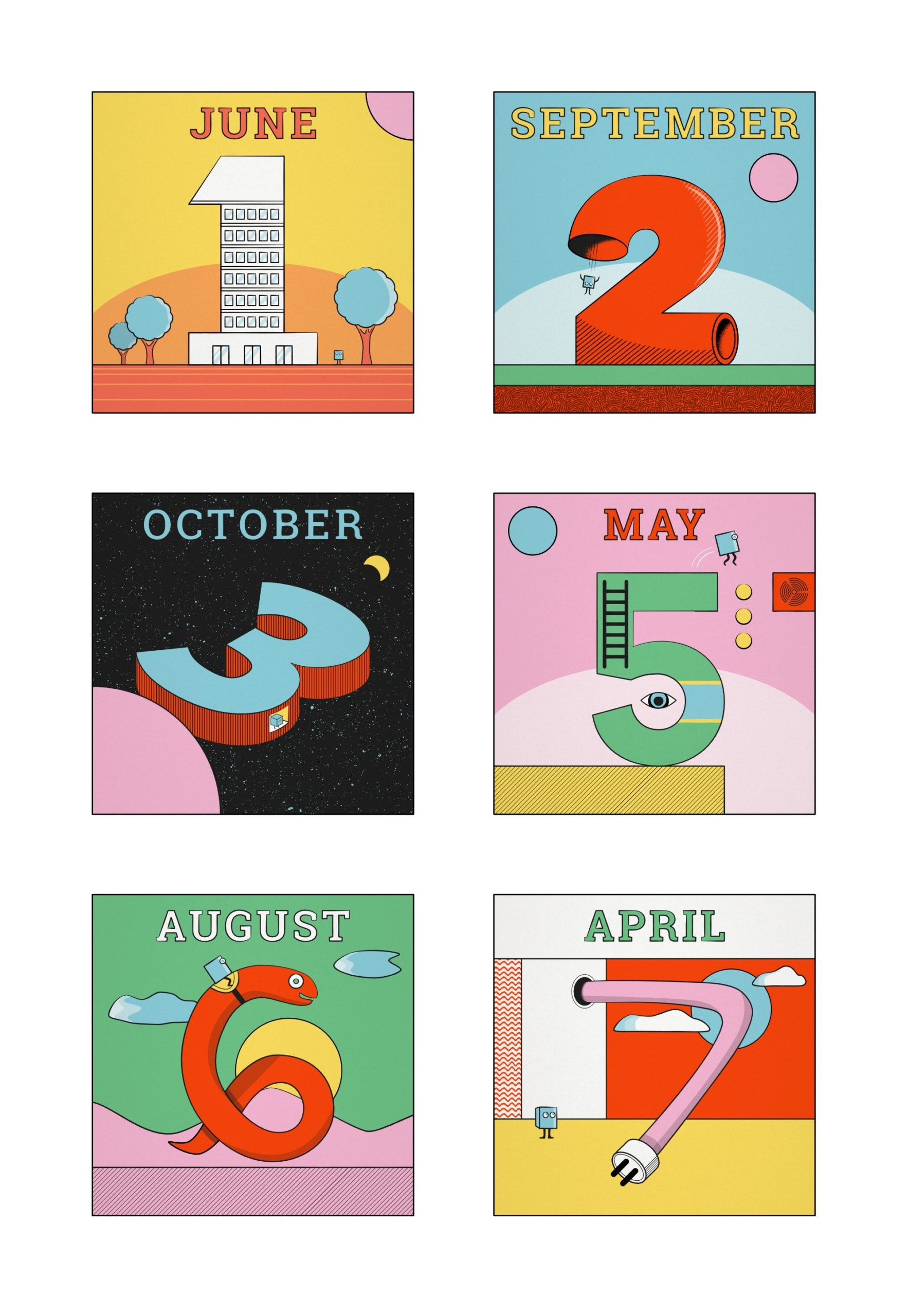
Memphis design is one of the defining design styles from the 1980s. Its aesthetic is characterized by colorful, abstract, geometric shapes and squiggles. It rejected the high art and minimalism that dominated over the previous decades.
And now, after years of polished, minimal color palettes, the abstract shapes and color combinations from Memphis design are reemerging to bring vibrant quirkiness back into the mainstream. What we get are colors combinations that are playful, fun and most importantly, don’t take themselves too seriously—which is exactly why it’s making a big comeback in 2022’s color trends.
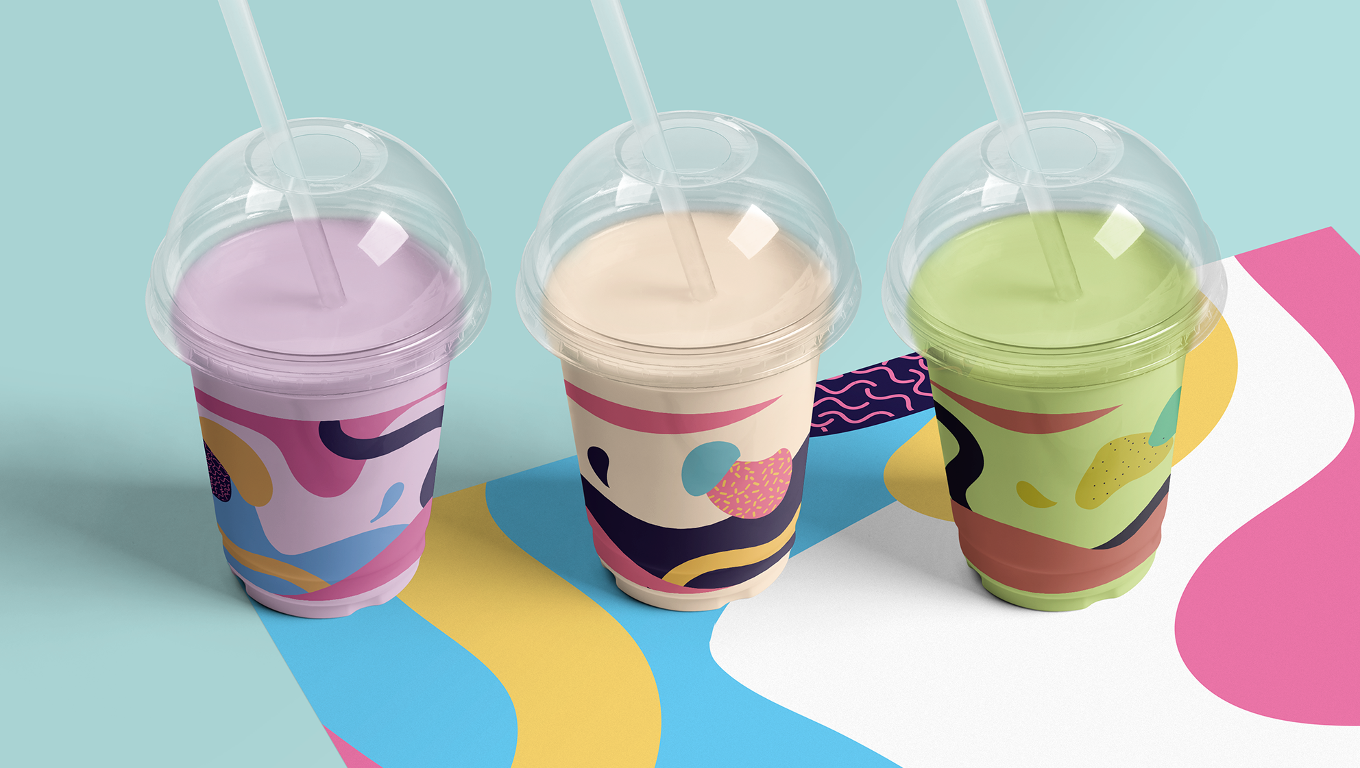
These designs and colors play with Memphis design’s core tenets, bold, vibrant colors and overlaid contrasting shapes, in a way that feels more modern. It’s most notable for bright neon, primary and pastel colors.
Take a look at two vastly different examples that both embrace the color palette of Memphis design: mundroid’s design with closely related vibrant shades of purple and blue and highlighted with a pop of pink, and then next to it, the primary color palette Jay Jackson went with for their design.
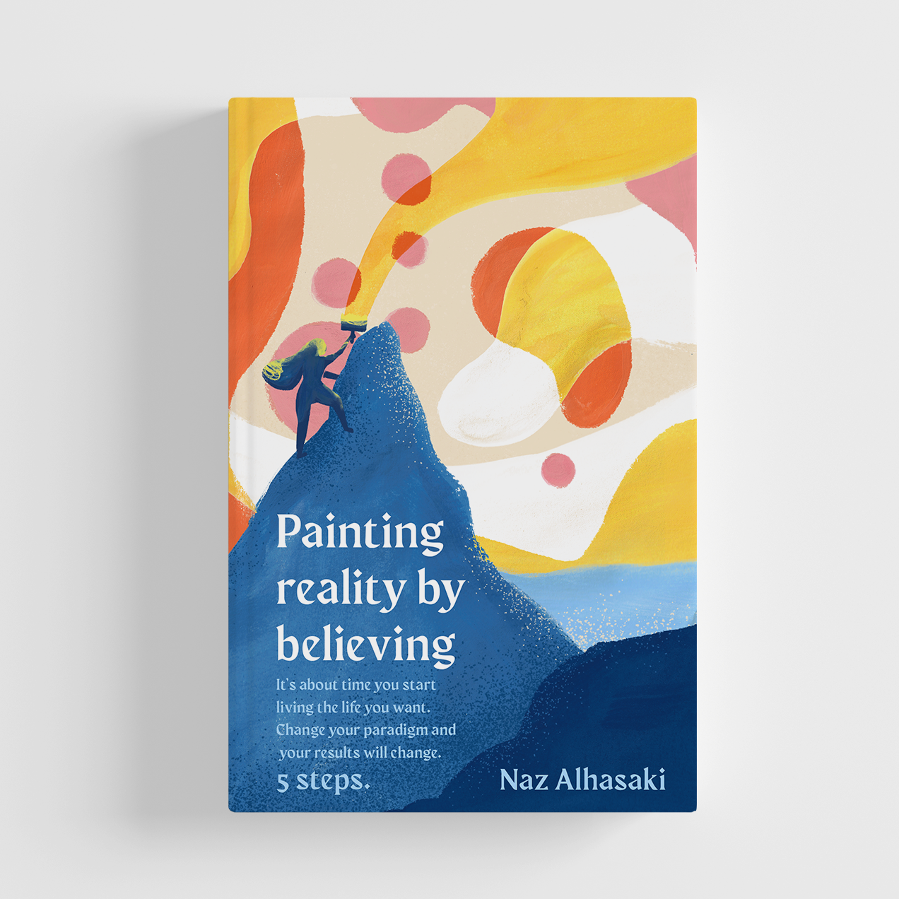
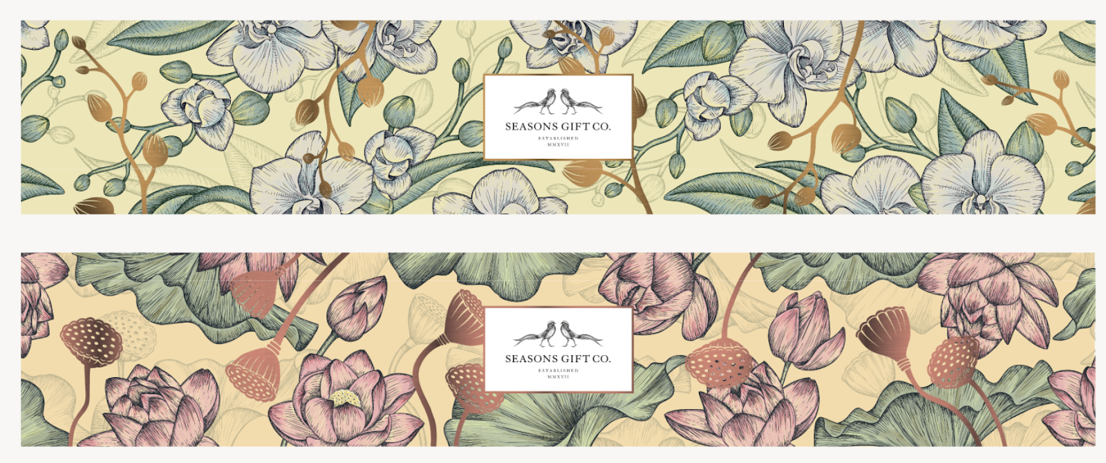
5. Vintage flower power
—
One of the color trends that’s projected to take up the spotlight in 2022 are floral hues in toned-down, desaturated color palettes, often used in floral patterns. In these designs, muted colors are used to give the flowers a dried-out, yellowed look. By opting for these kinds of palettes, designers are creating floral patterns that feel earthy, old-school and comfortably worn in.
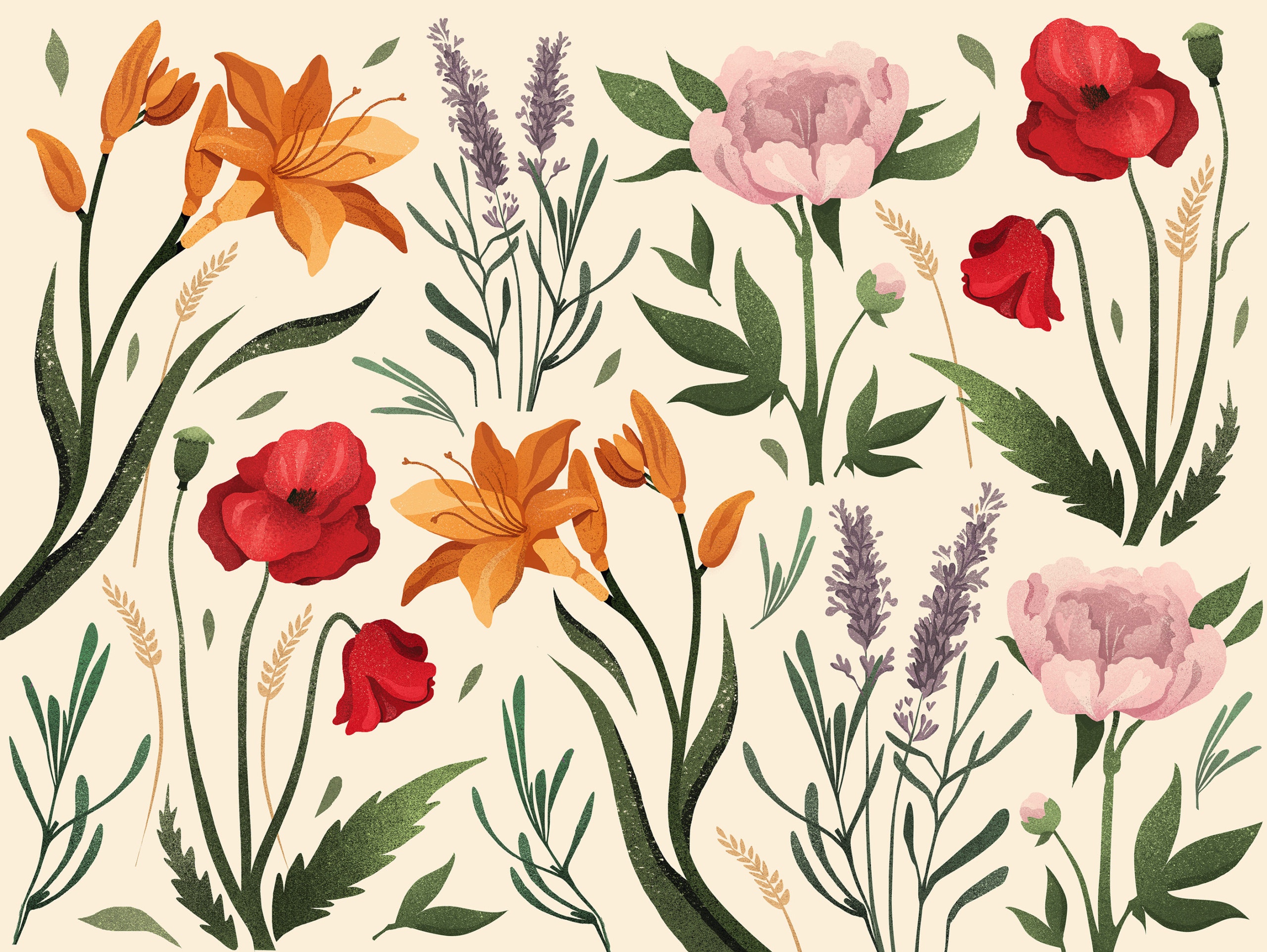
By desaturating and toning down the colors, designers give these floral designs a retro vibe—retro as in, time has passed and these flowers have dried out. The message is this: these flowers are delicate and intricate, so handle them with care.
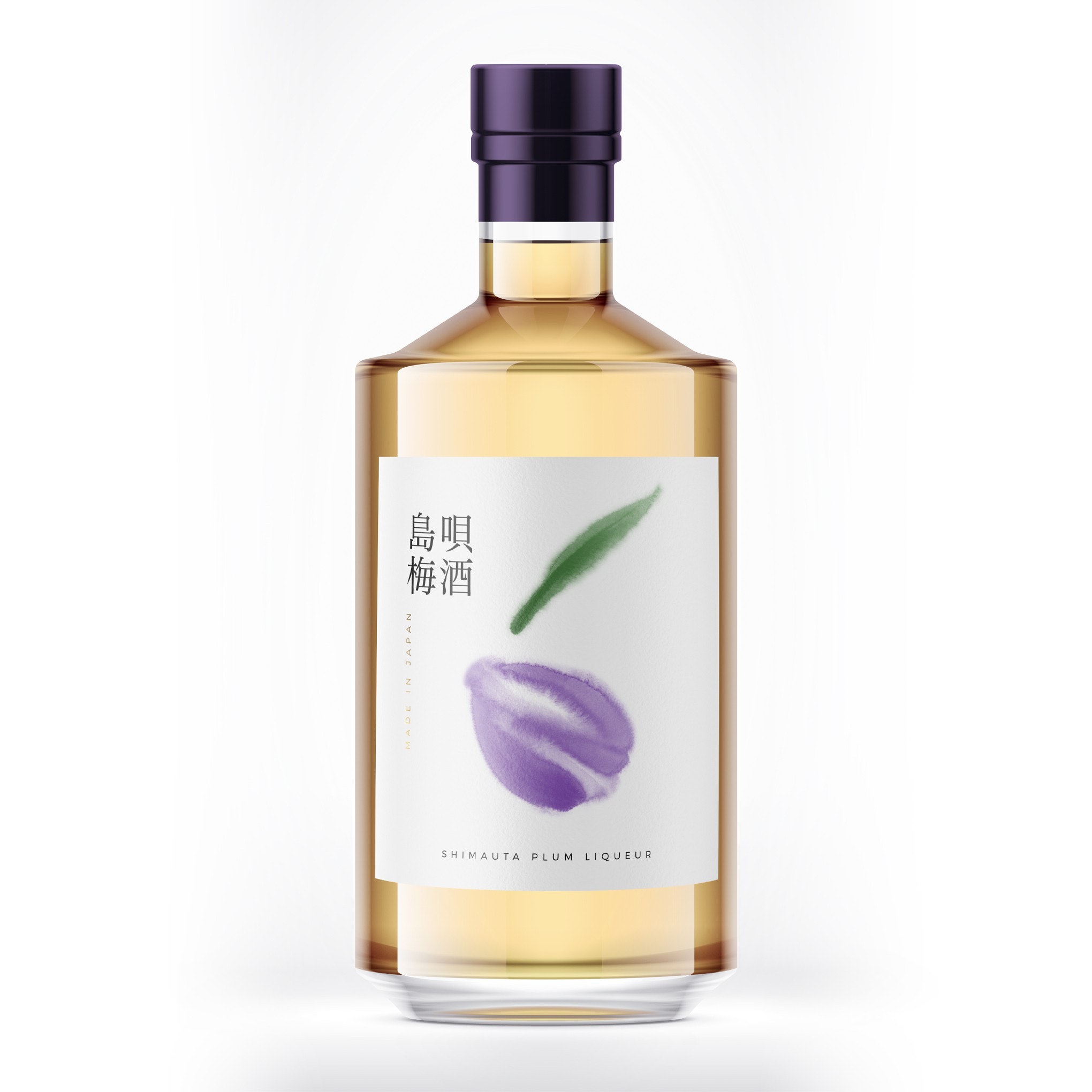
6. Jewel tones with neutrals
—
Jewel tones are bold colors derived from gemstones, like the deep red of garnet or a sapphire’s striking blue. While jewel tones are highly saturated, they have a different feel from other bold color categories like neons. They feel more subdued and even stately, largely because they’re associated with gemstones and traditionally, with royalty. To give your brand a sophisticated look in 2022, work with jewel tones.
These colors are bold, but they aren’t aggressive. By pairing them with more neutral tones, the jewel tones seem bolder and deeper, yet it takes it in a sophisticated direction, creating calm, stately designs.
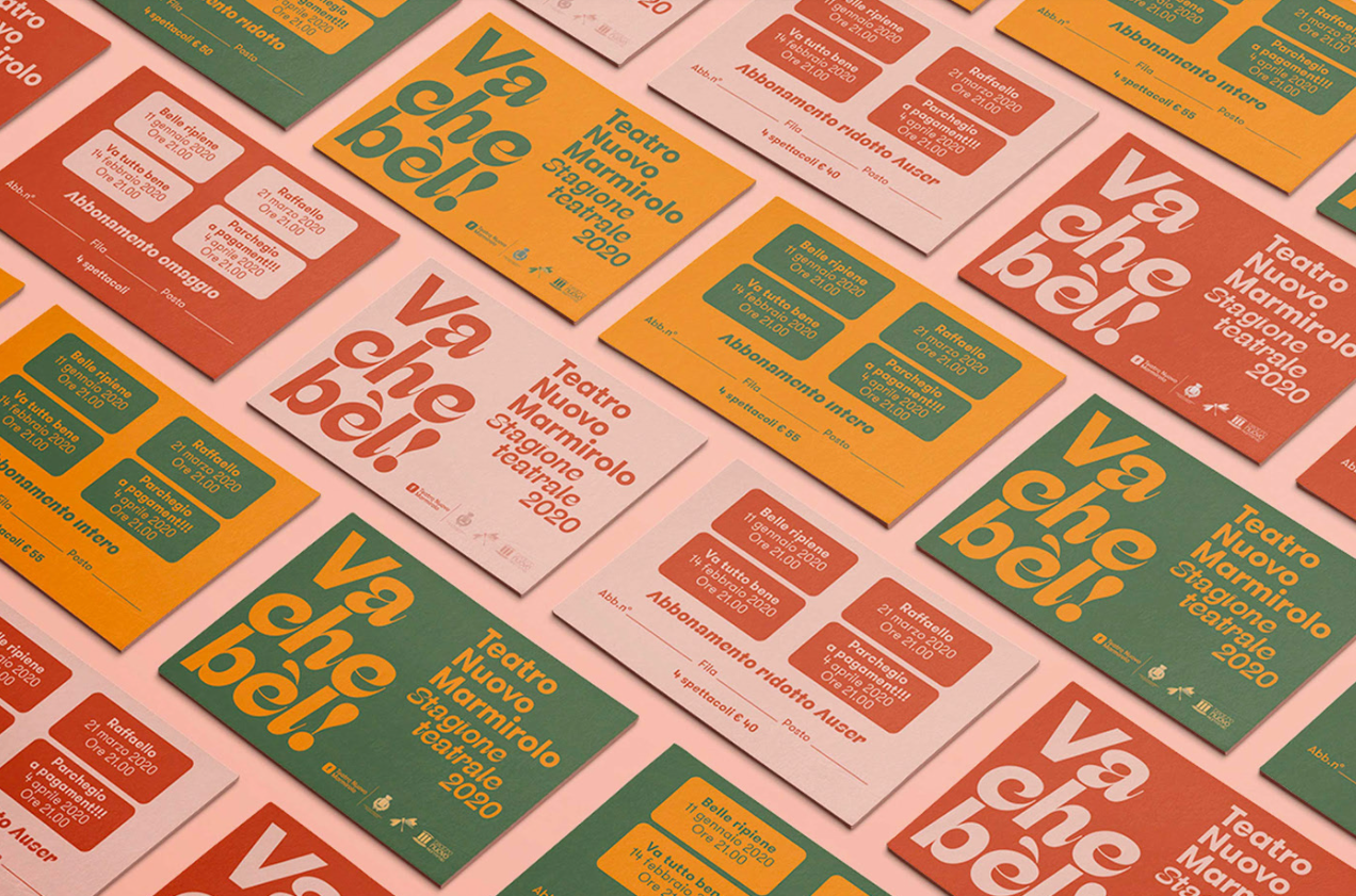
7. Retro 70s and 80s color schemes
—
In 2022, we’re collectively seeking calmness. As you saw from other color trends we discussed above, one way to create a calming design is to work with muted, soothing colors. Another is to take advantage of viewers’ nostalgia by evoking the “simpler times” of the past. Yes, of course there have always been crises and challenges keeping the world on edge…but in design, it’s all about perception. And when most people think of the past, they perceive it as being less stressful and less complex than the world we live in today.
So what does that have to do with 2022 color trends? Designers are leaning into that collective pair of rose-colored glasses and giving us designs that use color palettes straight out of the 70s and 80s:
8. Hyper-saturated color contrast
—
In any roundup of a year’s upcoming trends, there’s always one or two outliers. This is that trend. While all the designs embracing other 2022 color trends go for calming color palettes, these designs are loud and overstimulating, but when done well they create something that’s quite fun and interesting!
Similar to Brutalism and Anti-design, design styles that put aside traditional guidelines, these hyper-saturated colors are also putting aside traditional color combinations. These hyper-saturated color contrasts push the boundaries of typical color combinations. They don’t just demand attention, they compete with each other for it. What you get is a visual experience that is fun and captivating, and something you won’t forget any time soon.