Design is a science as much as an art, and UX design is one of the areas where that is, or at least should be, extremely apparent. UX design is about crafting experiences that work for users, with form subservient to that experience.
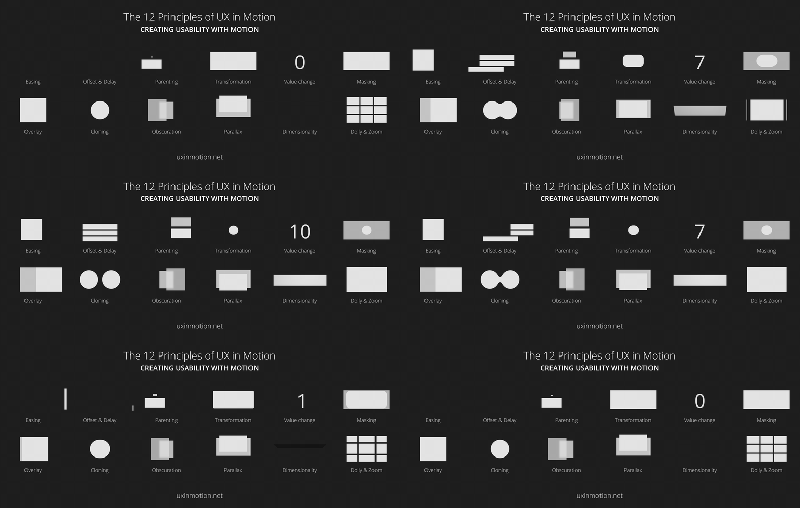
You might be familiar with Disney’s 12 principles of animation, which set out a kind of rule book for creating moving images, whether it’s for films and cartoons, CSS animations or UI design. The wonder cheatsheet below takes the concept but updates it for the scientific requirements of UX, providing 12 principles for UX design in motion.

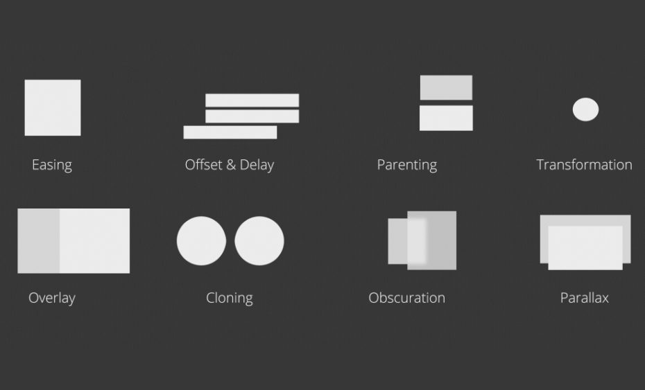
This motion UX design crib sheet was devised to accompany a manifesto drawn up by Issara Willenskomer back in 2017. Disney is dead, he claimed, proposing 12 principles for UX design in motion: easing, offset and delay, parenting, transformation, value change, masking, overlay, cloning, obscuration, parallax, dimensionality and dolly and zoom. In turn, he split these into four categories: timing, object relationship, object continuity, temporal hierarchy and spatial continuity.
Willenskomer was adamant that UX in motion is not UI animation. By that he meant, that it’s something more fundamental, not just a superficial afterthought intended to make an experience prettier or more engaging. It actually adds value to the underlying UX design and supports usability by creating continuity, narrative and relationships.
12 Motion Design Principles (mega thread)
