Nationwide has today unveiled its most significant rebrand in over three decades. The work by London studio New Commercial Arts is part of a drive to modernise the building society as well as hit home it being member-owned rather than owned by shareholders.
The modernised rebrand, its biggest since 1987, is set to be rolled out across Nationwide’s network of 605 branches and reinforces its promise to keep all of its hubs open to the public in an era when other banks are closing their doors.
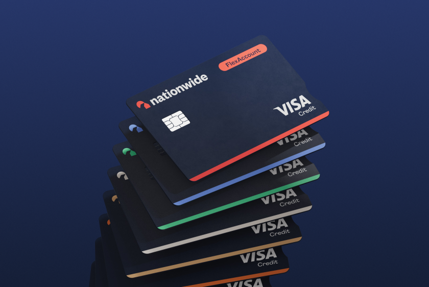
Alongside the updated visual identity, the new branding sees Nationwide promise to be ‘A Good Way to Bank’ after research revealed 63 per cent of people value their local branch, with face-to-face service given as the top answer as to why. Leicester, Leeds, Cambridge, Cardiff and Nottingham are among the first branches to showcase the new branding. This week will also see the new identity revealed across internet banking, its mobile app, and debit and credit cards.
The new logo modernises and simplifies the Nationwide icon. At the same time, the custom typography draws on the heritage of the building society, recalling Editorial New, a typeface used in Nationwide’s advertising during the 1980s.

Before & After

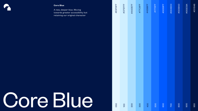
The logo and typeface sit beside an overhauled colour palette that remains recognisably Nationwide in its use of hero red and blue. Its set of secondary colours has been inspired by the colours that “make up community life in the UK”, according to the Society, “from the green of local parks to the blue of heritage plaques and letterbox red”, all offering a modern slant.
It is the latest move by Nationwide that challenges the shareholder-owned banks by demonstrating its difference. In June, Nationwide extended its ‘Branch Promise’, meaning it won’t leave any town or city in which it is based until at least 2026. In May, the Society announced it was returning £340 million of profit to 3.4 million eligible members through its inaugural ‘Fairer Share’ payment, each receiving £100.
“We’re incredibly excited to see this rebrand come to life across Nationwide’s physical and digital real estate,” says Rob Curran from New Commercial Arts. “The Nationwide brand is a special one, and it now has a look and feel to match – strikingly modern, refreshingly simple, yet still so familiar. We’ve gone through the design archives at Nationwide and recalled some beautiful elements from their history while at the same time creating a new brand that is fit for the future.”