Finger Lickin’ Good. Few fast-food brands have a piece of packaging as iconic as the KFC bucket. First introduced by Colonel Harland Sanders in 1957, the bucket has become one of the most recognizable packaging designs in the world—a symbol so synonymous with the brand that it transcends language and geography.
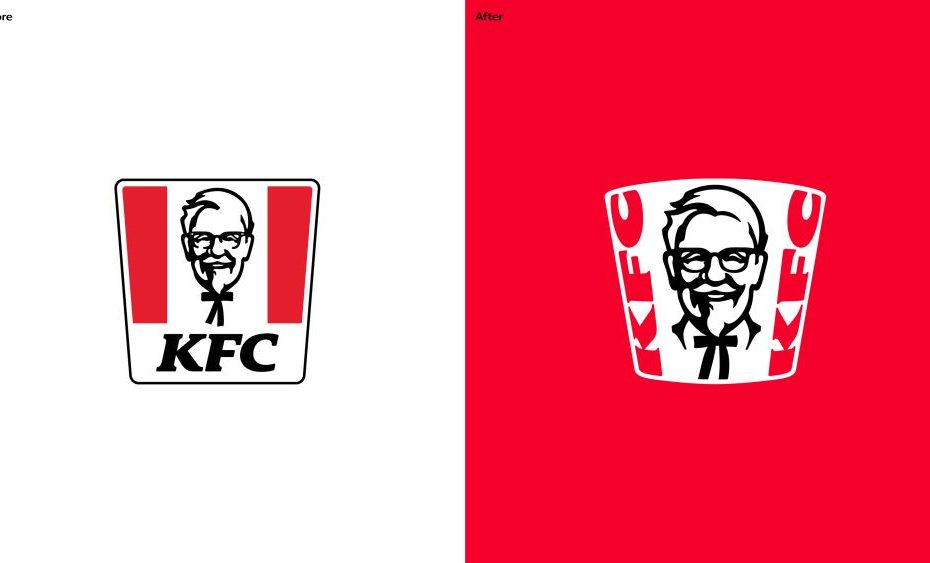
Now, KFC is giving that icon a starring role in a sweeping global refresh created by JKR. Rather than reinventing the brand, the redesign amplifies the elements that have always made KFC distinctive, placing the bucket at the center of an evolved visual identity and brand experience. As JKR describes it, the bucket became the “creative unlock” for the entire system, serving as both a framing device and storytelling tool that can flex across packaging, restaurants, digital platforms, and advertising.
In true JKR fashion, the refresh focuses on strengthening what already exists. The Colonel is brought front and center, typography becomes bolder and more expressive, and even subtle details have been thoughtfully refined. The “C” in KFC now curves to the shape of a drumstick, while packaging and sandwich wrappers feature oversized typography that feels energetic, confident, and unmistakably KFC.
But this evolution extends far beyond branding. The project represents what KFC calls a full 360-degree transformation, spanning visual identity, restaurant environments, digital experiences, tone of voice, and customer interactions. Every touchpoint has been reconsidered to create a more unified and immersive brand world. Digital screens become expressive brand canvases rather than purely transactional menu boards, while restaurant environments are designed to feel more connected, engaging, and experience-driven.
Every category has its leader. When you close your eyes and think about that category, you think of one, maybe two brands. Whether it’s jeans or soda, trucks or phones. When you think chicken, you should think KFC. Our job was to make sure the category leader was showing up like one. The best, the coolest, the freshest. As it should be.
Tosh Hall, Global Chief Creative Officer, JKR
Dining has become about much more than the food itself. In the years following the pandemic, consumers have increasingly sought memorable, experience-driven outings, prompting brands to invest in immersive pop-ups, themed activations, and entertainment-focused dining concepts. According to National Restaurant News, diners are looking for experiences that go beyond a traditional meal. The rise of hibachi catering, interactive dining concepts, and the enduring popularity of experiences like Medieval Times Dinner & Tournament all point to a growing appetite for dining as entertainment. With its new experimental restaurant concepts, KFC is tapping directly into this trend, creating destinations that offer guests a more immersive and engaging brand experience.
JKR has created a refresh that feels both contemporary and timeless. Sometimes the smartest redesign isn’t about changing everything. It’s about recognizing what people already love and giving it room to do even more.
Credits: The illustration system was developed with a group of international artists and
illustrators: Benardo Henning (Buenos Aires, Argentina), Eva Cremers (Amsterdam,
Netherlands), UV-朱 (Xiamen, China), Belén Díaz Guerra (Lima, Peru), and
Boomrangg (Mumbai, India).
Lifestyle photography was created in partnership with Reece James Morrison, and
food photography was created with Frankie Turner.
Typography was created in partnership with StudioDRAMA.
The ‘Finger Lickin’ Good’ mark was crafted with Tobias Hall.
Film music was worked on with Antfood.
The post KFC’s Latest Refresh From JKR Celebrates Its Most Iconic Asset appeared first on PRINT Magazine.