The latest Haymes Paint colour palette has dropped and, as with many things lately, it’s inspired by the pandemic. But rather than dwelling on the negative aspects it is rooted in a desire to leave uncertainty behind and move towards a new, more optimistic, chapter. Designed to reflect a fresh approach to life, and renewed energy, the latest colour forecast is aptly titled Energy Shifts.
“Everyone will have a personal preference for the energy in each palette. There is never a one size fits all approach to colour and our life experiences actually really impacts our colour preferences. So understanding why you are gravitating toward a specific colour will help when selecting colour for your home because it will give you insight into how that colour is going to make you feel and the energy it will bring to your home,” says Haymes Paint colour and concept manager, Wendy Rennie. The new collection is comprised of three palettes – Live Wire, Light Play and Carefully Nurtured.
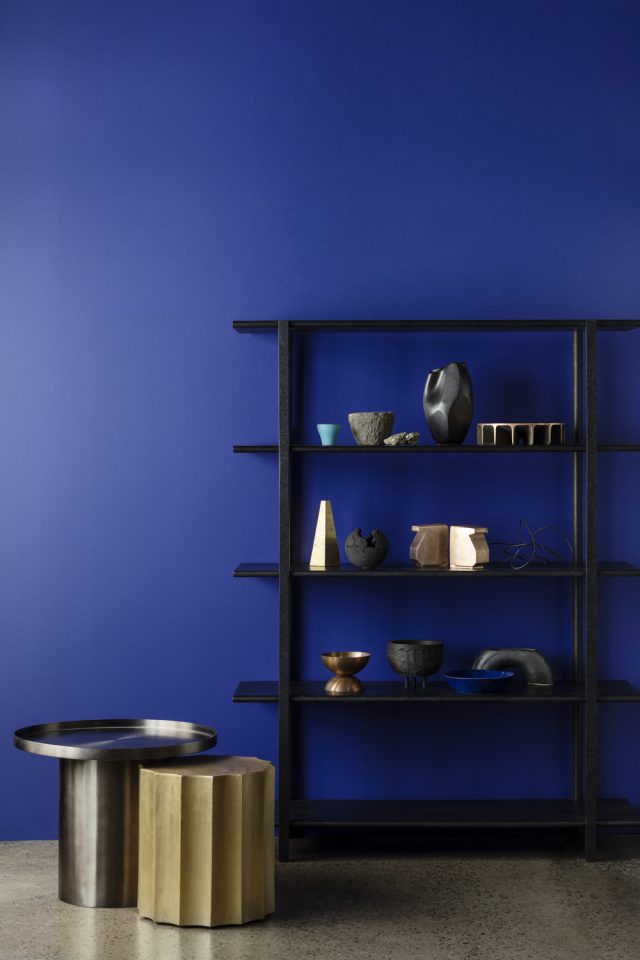
Live Wire
“This palette has a lively and bright energy to it. The colours are clear and vibrant, evoking a sense of joy and playfulness. The key to making these colours work in the home environment is to pair them with a crisp white to create a bright and cheerful contrast without overwhelming the senses with too much colour,” says Wendy of the Live Wire palette.
This palette also draws inspiration from the 60’s and 70’s making the colours the perfect choice to complement vintage or retro interior choices such as a feature vintage-inspired tile or vinyl flooring.
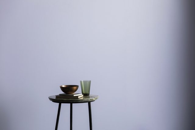
Light Play
The Light Play palette features deeply intense colours paired with lighter tones – a nod to light and shade and how they influence our energy. “Light Play is an exploration of how colour and texture can combine to create a considered atmosphere within the home space. The contrasts within this palette also show the way energy can shift throughout the home by the colour and texture choices within a room,” says Wendy.
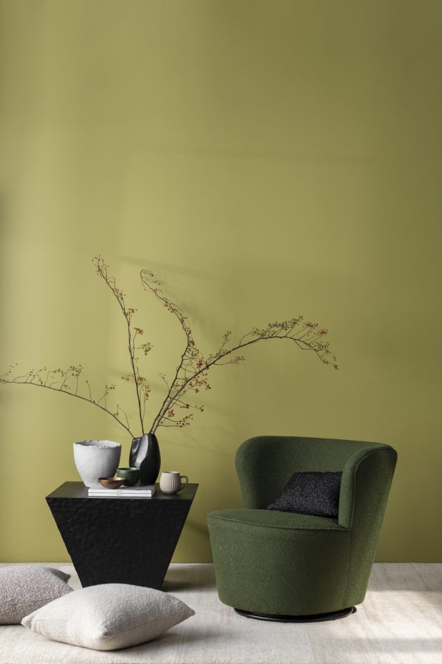
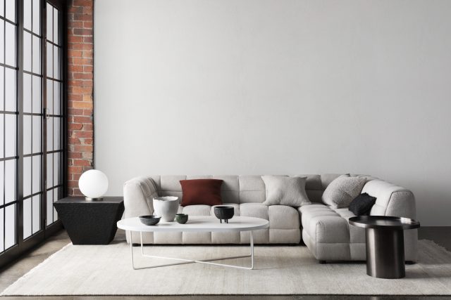
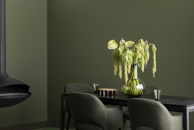
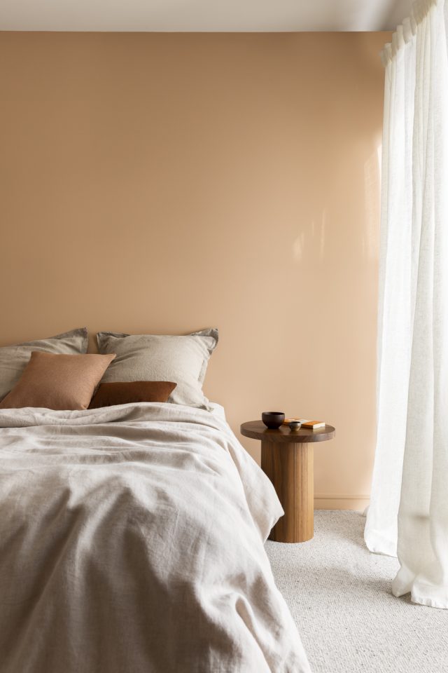
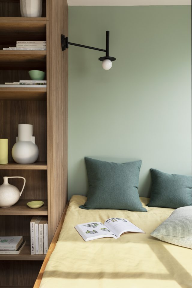
Carefully Nurtured
Carefully Nurtured is a harmonious colour palette that offers balance in tone, value and hue. “Each colour works with the other to create a perfect colour range that really feels calming for the mind. The colours chosen for this palette have a connection to the outside world, with soft greens and warm neutrals dominating this scheme,” says Wendy. Peach skin tones and pops of yellow add vibrancy the otherwise more subdued scheme.
Photography: Martina Gemmola
For more