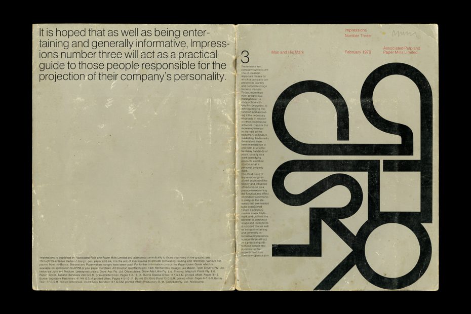

Man and His Mark was the title of Impressions Number Three from February 1970.
Each Impressions issue was given a specific theme, and some of Australia’s most revered designers were commissioned for the project. This issue featured trademarks and symbols designed by the late American graphic designer Les Mason (1924–2009) who moved from Los Angeles to Melbourne in 1961.
It’s an interesting read, with some content retyped below.

Man and his mark: Recently a TV panel show involved three husband and wife teams in a word association game designed to indicate a couple’s emotional compatibility. The MC would say a word, then each contestant had to immediately write down the first word that came to mind. Among the leads were the words ‘penguin’ and ‘shell’. When the former was mentioned three of the people wrote down ‘books’. The latter brought five responses reading ‘petrol’. This result may not have proved anything about compatibility but it was irrevocable proof of the imprint that trademarks can make on the public’s subconscious.

Ceramic marks
Excavations have shown that over 2,000 years ago clay bricks and roof tiles from areas in Mesopotamia and Egypt had marks impressed into them before they were baked. These declared the name of the artisan who made the products and the factory of their origin. Similar marks were also found on Roman terracotta tiles (5). They were usually made up of letters within a panel or a circle.
Ordinary household utensils such as oil lamps and amphoras also had these kinds of trademarks and other symbols stamped on them. Jars of the prized Thasos wine displayed signs showing dolphins and kneeling archers (20), while amphoras from Rhodes always carried a rose symbol.
One type of particularly good oil lamp, that was found over very widespread areas, had the name Fortis stamped above a sign of a wreath encompassing a palm leaf (1). It was obviously a big seller for many years until cheap copies from the provinces appropriated the Fortis trademark and flooded the market.
Other famous ceramic marks are those found on French Sevres porcelain of the 18th century and later. The king of France held a monopoly on Sevres porcelain as only factories belonging to him were allowed to manufacture it. Every piece was carefully marked with a sign that usually indicated the king in power at the time.
Stonemasons’ signs
The stonemasons of medieval Europe were renowned for the signs that they carved on their finished works (6). These signs can still be seen on many German cathedrals and buildings of the period. Masonry was a highly skilled art that required many years apprenticeship. Masons, perhaps because of their specialised knowledge in an age of illiteracy, founded powerful guilds or lodges that developed secret and ritualistic styles of communication to which their signs were allied.
It is interesting to note that in his A History of Aesthetic, Bosanquet says, “Symbols have for unlettered minds an extraordinary power of comfort and fascination.” The masonic lodges were strongly religious in nature and survived for several centuries. Signs were given to journeymen by their master on the completion of their apprenticeship. If a lodge disapproved of a member’s conduct he could be expelled and his sign taken from him. This virtually removed his identity as a mason and stopped him from working. Stone cutters’ marks were in evidence for a period ranging over six hundred years and were the prototypes of all kinds of later signs.
Many other guilds also had their marks and compelled members to use them as a proprietary mark so as to enforce their monopolies and control the trade. In guild economy these amounted to police marks. Examples were found in the gold and silversmiths’ guilds of the French and Italian states, the woollen and linen weavers in England, the Hammersmith’s in Austria, and most of the German guilds.

Coats of arms
Heraldry is a hereditary system of personal recognition that developed among the nobles of medieval Christendom when they began to paint their shields with colourful designs or “arms” of identification.
It evolved for a number of reasons. The feudal system of 12th century Western Europe enabled noblemen to be rulers of their own domain. Their serfs and private soldiers were invariably illiterate but they could recognise a coat of arms to which they had to pay homage. They, in turn, wore badges on their uniforms that were taken from their lord’s arms.
The coats of arms were used as identifying marks at the great tournaments of the period and in times of warfare. They came into special prominence during the Crusades when armies from many countries and principalities combined to march on Jerusalem.
The wearing of colourful symbols on shields also befitted the pomp and ceremony of the day and indicated precedence at assemblies. Later these arms were adapted to seals to give authentication to documents.
Although coats of arms were common by the end of the 12th century and had become indispensable to feudal society throughout Europe, it was not until several centuries later that the strict laws of inheritance and complex rules of design became under a central authority of control.
In England the final authority is the College of Heralds that was made a corporation in 1484 by Richard III. Only the college can grant new arms.
As trading practices expanded over the centuries arms were needed more and more as seals on documents and, but he 15th century, companies were frequently granted arms to facilitate business transactions. The practice has continued to the present time and many banks, insurance companies, and corporations have coats of arms.

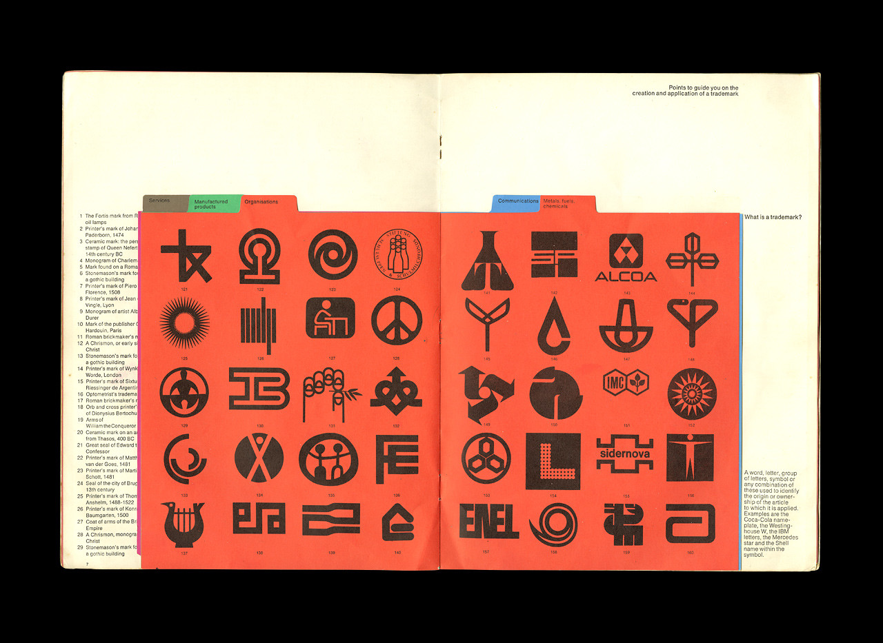
What is a trademark?
A word, letter, group of letters, symbol, or any combination of these used to identify the origin or ownership of the article to which it is applied. Examples are the Coca-Cola nameplate, the Westinghouse W, the IBM letters, the Mercedes star, and the Shell name within the symbol.
A trademark is created by a designer but made by a corporation.


How should a trademark be used?
A trademark may be used on letterheads and business forms, on packaging and vehicles, on plants and offices, on posters and advertisements, on signboards and neon displays, on films and television commercials, on matchbooks, menus, labels, cheques — in short, there is no limitation to the possibilities for using a trademark. The extent of its use will be governed by the nature of the service or product, the size of the company, its financial means, and other associated factors.
If the exposure of the trademark is limited then it is preferable to use a nameplate, initials, or pictorial mark, rather than an abstract symbol, or to use the latter in conjunction with the former.
With intelligent use a trademark is more than an identifying sign. It services as an effective advertisement, creates good will, sells products, and keeps the company in the public eye.
What makes a good trademark?
It must set the company apart from other companies. It must present the desired image of the company to the public. It should be simple in form because (a) simple forms make the strongest impression on the eye and mind (b) it must be identifiable instantly under the unfavourable conditions in which it will be viewed: from a passing train, among other communications on flipped pages, a brief glimpse on a TV spot, etc. (c) it must retain its form when reduced to its smallest size.
It must be designed for its widest range of applications. It may be required for large neon signs as well as for extreme reduction and it may be intended for use in varying colour programmes.
An up to date symbol is essential, therefore current and datable design fashions should be avoided. The mark may need occasional modification to keep the company’s image progressive.

Art direction: Geoffrey Digby
Text: Rennie Ellis
Design: Les Mason
Type: Helvetica Light and Medium
Studio: Les Mason Graphic Design
Date: 1970