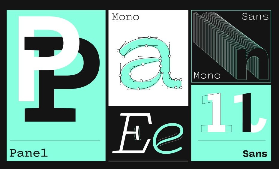
Mark Caneso, a graphic designer, type designer, and lettering artist, wondered: Can something with a rigid, fixed width also feel relaxed? The founder of design studio pprwrk and type foundry PSTL, began his exploration of this question by kicking around a monospaced design that allowed expression within a fixed-width design space.
I love looking for the tension between conflicting ideas. Panel exists because I wanted to play with the idea of ‘constraint vs restraint.’
Panel Mono is the result of his experimentation, and it played a pivotal role in shaping the design that influenced all four styles of the Panel family. To enhance open forms, specific letters like ‘c’ and ‘s’ shed their serifs, creating an ambiguity that allowed for a harmonious relationship between the serif and sans-serif designs. A shared set of glyphs also tie the mono styles together. Introducing italics pushed the fluidity of the forms even further, with cursive influences in the lowercase letters infusing the fonts with liveliness.
Once Mark had dialed in the monospaced designs, it made perfect sense to introduce a proportional set to complete the family. He adjusted key glyphs that often struggle within the constraints of a fixed-width format—letters like ‘M’ and ‘W’ were allowed to breathe. Mark’s goal for the proportional sets was to retain many of the distinctive attributes of the monospaced designs and make adjustments only where necessary.
The complete family now includes four unified styles, offering a versatile collection of 40 fonts. Each style consists of a reliable range of weights, from light to black, and over 500 glyphs covering nearly 200 Latin-based languages, making Panel highly adaptable for various uses. License the Panel family directly from www.pstypelab.com or conveniently activate them through your Adobe Creative Cloud account via AdobeFonts.