In March of 1966, Paul Rand finished his Ford logo presentation book. It was a proposal to Ford Motor Company for a new house mark. I’ve always found it intriguing to read the words Rand used in his logo presentations. The story, the confidence, the rationale, the salesmanship. The presentation has been transcribed here for reference.
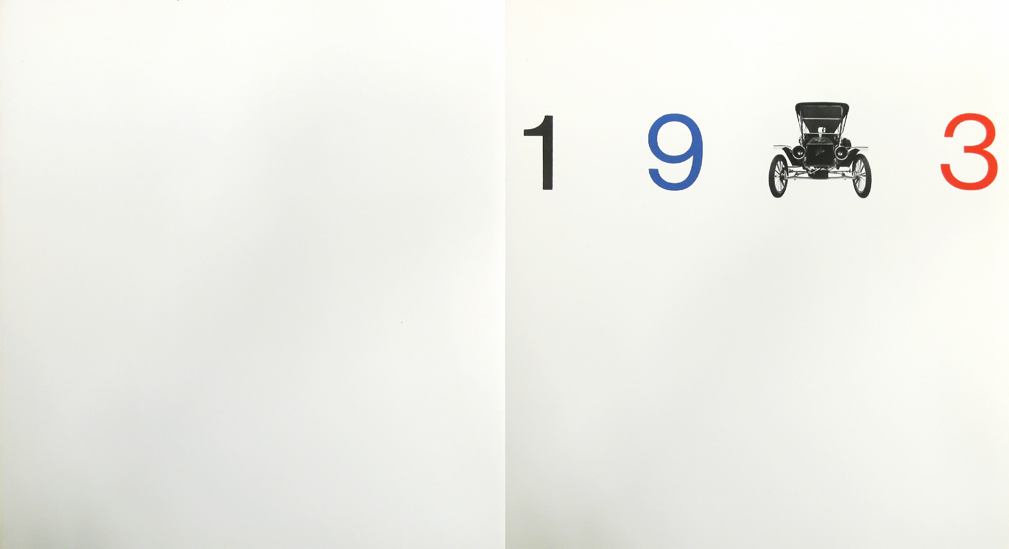
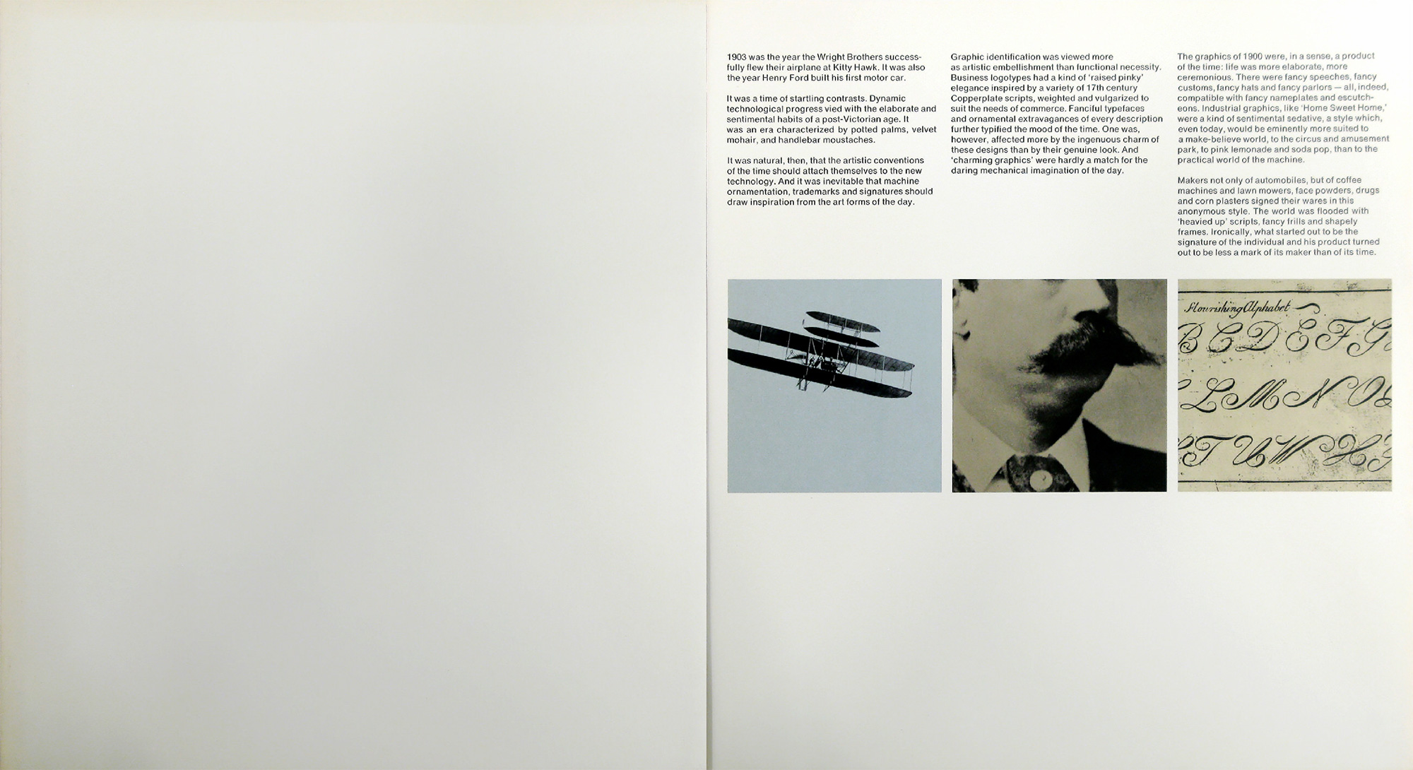
1903 was the year the Wright Brothers successfully flew their airplane at Kitty Hawk. It was also the year Henry Ford built his first motor car.
It was a time of startling contrasts. Dynamic technological progress vied with the elaborate and sentimental habits of a post-Victorian age. It was an era characterized by potted palms, velvet mohair, and handlebar moustaches.
It was natural, then, that the artistic conventions of the time should attach themselves to the new technology. And it was inevitable that machine ornamentation, trademarks and signatures should draw inspiration from the art forms of the day.
Graphic identification was viewed more as artistic embellishment than functional necessity. Business logotypes had a kind of “raised pinky” elegance inspired by a variety of 17th century Copperplate scripts, weighted and vulgarized to suit the needs of commerce. Fanciful typefaces and ornamental extravagances of every description further typified the mood of the time. One was, however, affected more by the ingenuous charm of these designs than by their genuine look. And “charming graphics” were hardly a match for the daring mechanical imagination of the day.
The graphics of 1900 were, in a sense, a product of the time: life was more elaborate, more ceremonious. There were fancy speeches, fancy customs, fancy hats and fancy parlors — all, indeed, compatible with fancy nameplates and escutcheons. Industrial graphics, like “Home Sweet Home,” were a kind of sentimental sedative, a style which, even today, would be eminently more suited to a make-believe world, to the circus and amusement park, to pink lemonade and soda pop, than to the practical world of the machine.
Makers not only of automobiles, but of coffee machines and lawn mowers, face powders, drugs and corn plasters signed their wares in the anonymous style. The world was flooded with “heavied up” scripts, fancy frills and shapely frames. Ironically, what started out to be the signature of the individual and his product turned out to be less a mark of its maker than of its time.
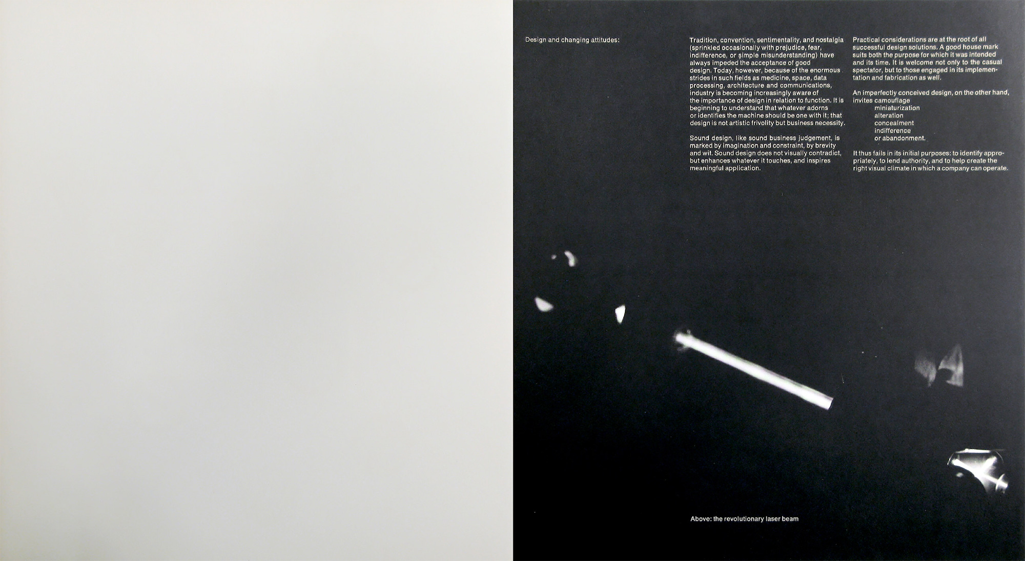
Design and changing attitudes
Tradition, convention, sentimentality, and nostalgia (sprinkled occasionally with prejudice, fear, indifference, or simple misunderstanding) have always impeded the acceptance of good design. Today, however, because of the enormous strides in such fields as medicine, space, data processing, architecture and communications, industry is becoming increasingly aware of the importance of design in relation to function. It is beginning to understand that whatever adorns or identifies the machine should be one with it; that design is not artistic frivolity but business necessity.
Sound design, like sound business judgement, is marked by imagination and constraint, by brevity and wit. Sound design does not visually contradict, but enhances whatever it touches, and inspires meaningful application.
Practical considerations are at the root of all successful design solutions. A good house mark suits both the purpose for which it was intended and its time. It is welcome not only to the casual spectator, but to those engaged in its implementation and fabrication as well.
An imperfectly conceived design, on the other hand, invites camouflage, miniaturisation, alteration, concealment, indifference, or abandonment.
It thus fails in its initial purposes: to identify appropriately, to lend authority, and to help create the right visual climate in which a company can operate.
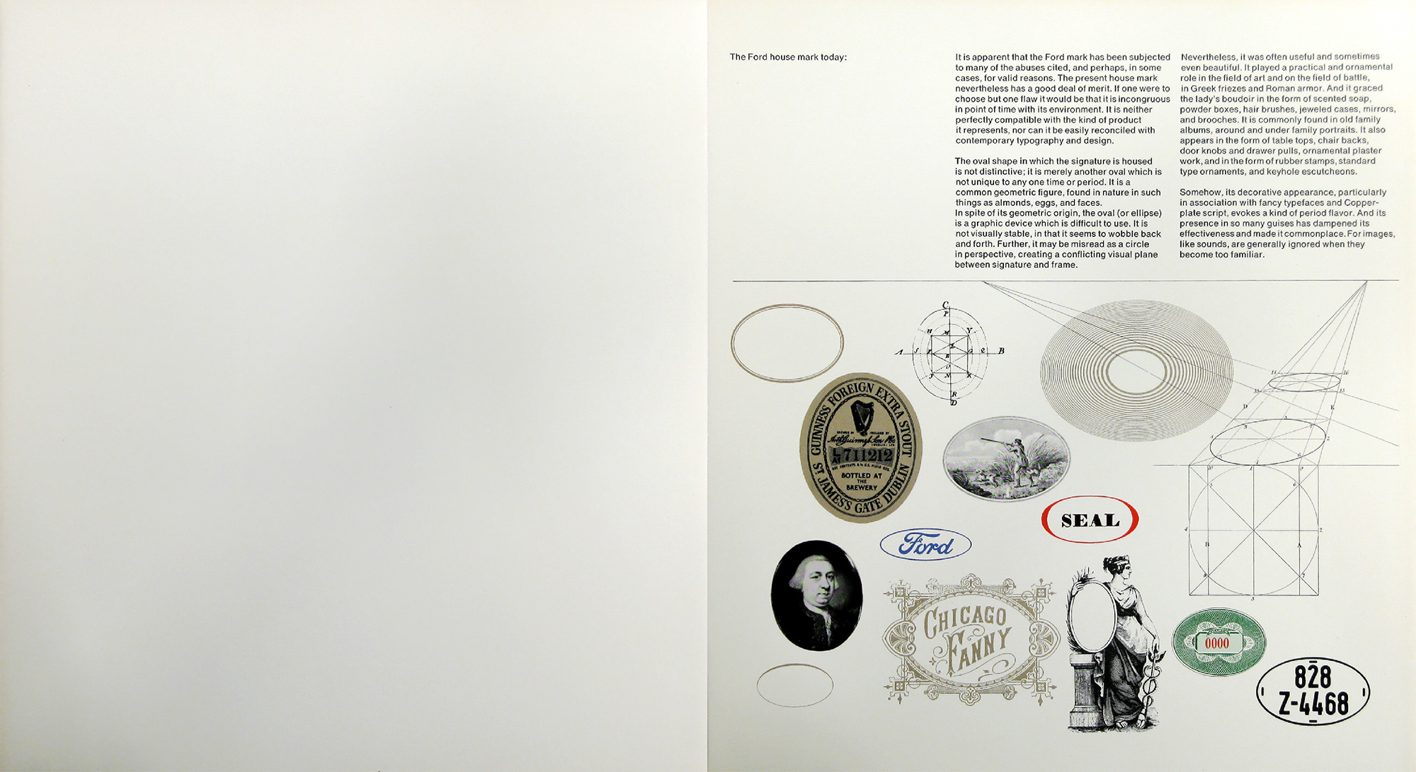
The Ford house mark today
It is apparent that the Ford mark has been subjected to many of the abuses cited, and perhaps, in some cases, for valid reasons. The present house mark nevertheless has a good deal of merit. If one were to choose but one flaw it would be that it is incongruous in point of time with its environment. It is neither perfectly compatible with the kind of product it represents, nor can it be easily reconciled with contemporary typography and design.
The oval shape in which the signature is housed is not distinctive; it is merely another oval which is not unique to any one time or period. It is a common geometric figure, found in nature in such things as almonds, eggs, and faces.
In spite of its geometric origin, the oval (or ellipse) is a graphic device which is difficult to use. It is not visually stable, in that it seems to wobble back and forth. Further, it may be misread as a circle in perspective, creating a conflicting visual plane between signature and frame. Nevertheless, it was often useful and sometimes even beautiful. It played a practical and ornamental role in the field of art and on the field of battle, in Greek friezes and Roman armor. And it graced the lady’s boudoir in the form of scented soap, powder boxes, hair brushes, jeweled cases, mirrors, and brooches. It is commonly found in old family albums, around and under family portraits. It also appears in the form of table tops, chair backs, door knobs and drawer pulls, ornamental plaster work, and in the form of rubber stamps, standard type ornaments, and keyhole escutcheons.
Somehow, its decorative appearance, particularly in association with fancy typefaces and Copperplate script, evokes a kind of period flavor. And its presence in so many guises has dampened its effectiveness and made it commonplace. For images, like sounds, are generally ignored when they become too familiar.
Criteria for a new Ford house mark
A new logotype is not a passing fashion, but a permanent and enduring symbol, to be used again and again on countless objects, for countless people, and for countless years. Faced with the problem of designing the new house mark, the question arises, if a change is desirable, to what degree?
One may:
- modify the old mark without changing its basic style and feeling
- make a new design without any reference whatsoever to the old mark or
- make a significant change in style while retaining meaningful identifying characteristics of the old house mark.
The first of these choices would simply be a 20th century variation on a 17th century theme, a half measure which might do little but emasculate the original by stressing meaningless stylistic eccentricities while possibly eliminating essentials. The second choice would be conjecturable, since it could jeopardize certain benefits accumulated through the years.
The best alternative, it seems, would be the third, for it gets at the heart of the matter: attempting to interpret the essential qualities of the old mark not by slavish imitation but in a style which would make it both a product of the present and a reflection of its past. Common sense dictates that the principal characteristics which give the mark its familiar silhouette should somehow be retained and, if possible, transformed in a new and significant way. This transformation, hopefully, should be accomplished without doing violence to the visual impression created by the old one.
The degree of change, however, must be carefully weighed. If changes are slight and superficial, then the effort and expense involved in such a vast undertaking would be sheer waste. If, on the other hand, they are so drastic that any similarity between the old and new images is no longer apparent, then it is conceivable that whatever benefits have been accumulating over the years will be impaired. Obviously, then, there must be an interaction between the two: the new house mark must be sufficiently reminiscent of its predecessor to have a familiar ring, and yet different enough from it to look fresh, timely, and timeless.
The house mark of Ford Motor Company should reflect the authority and confidence the company and its products merit. It should look functional and it should be functional. It should not be characterized by melodramatic swirls and theatrical flourishes, but by a frank and unpretentious, almost disarming simplicity, achieved by means of geometry and ordered relationships, with simple lines and forms that are measurable and manageable, and which reflect the precision of the machines they help to identify. It should suggest strength, speed, efficiency and utility. It should be clear and concise, with a kind of beauty and precision which flow not from the quill but from the compass and ruling pen. It will then emerge an integral part of the machine design, rather than decorative decalcomania.
In the design of a house mark, it is difficult to overemphasize the importance of simplicity. Simple things are obviously easier to remember, often easier to fabricate, and always easier to apply. Simplicity gets to the heart of a problem. It generates awareness by its brevity, inspires confidence by its understatement, believability by its frankness, and memorability by its uniqueness. It is the embodiment of form and content.
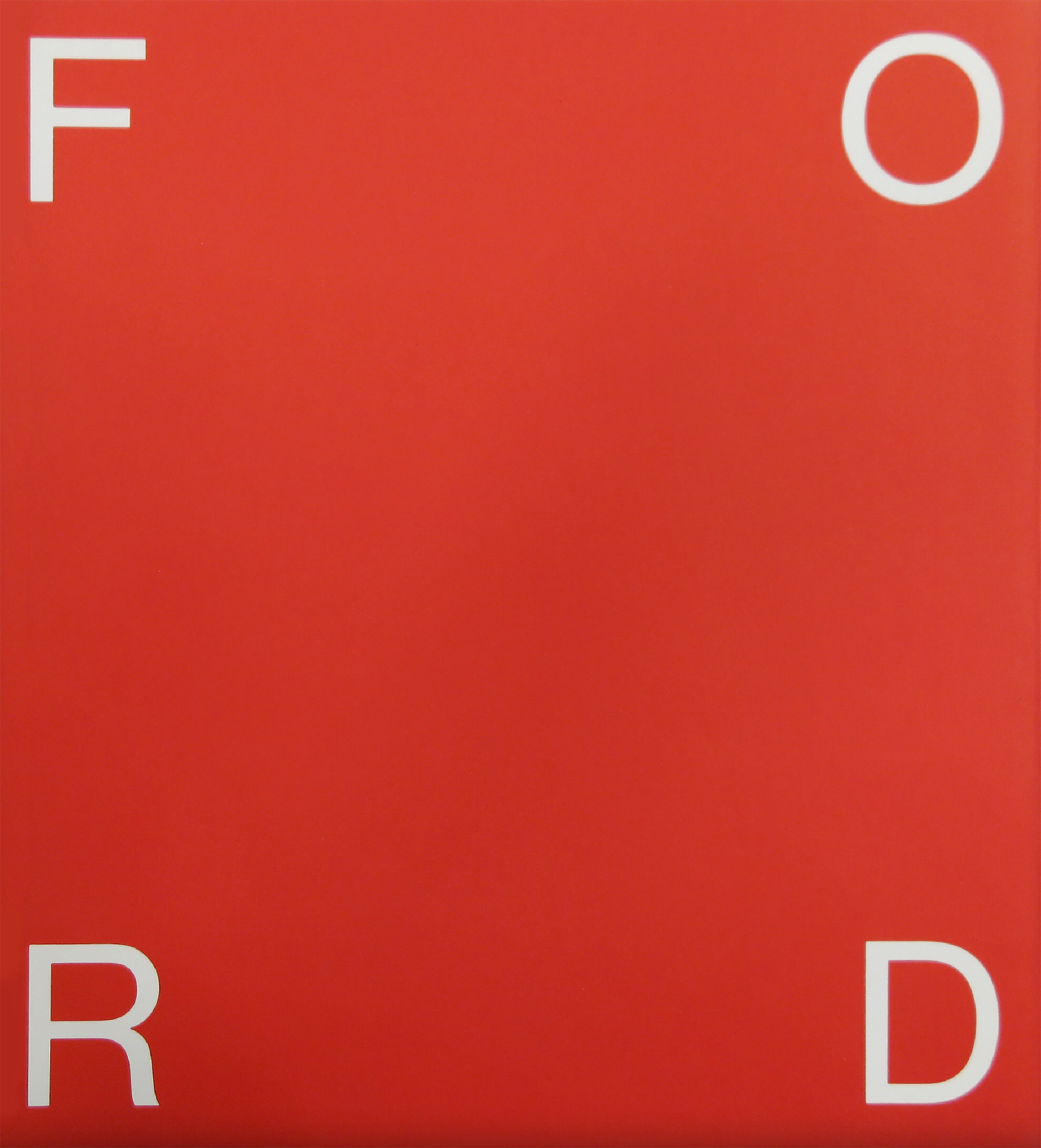
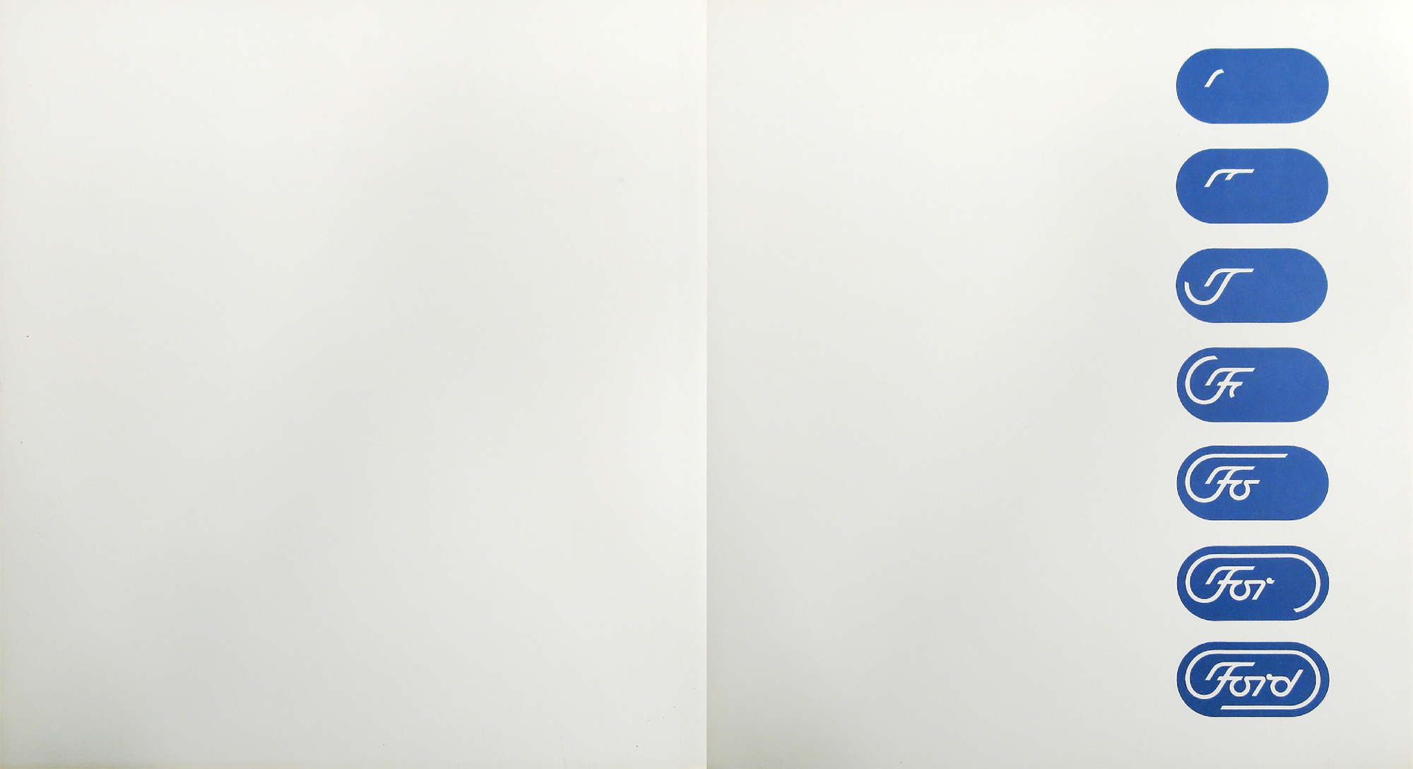
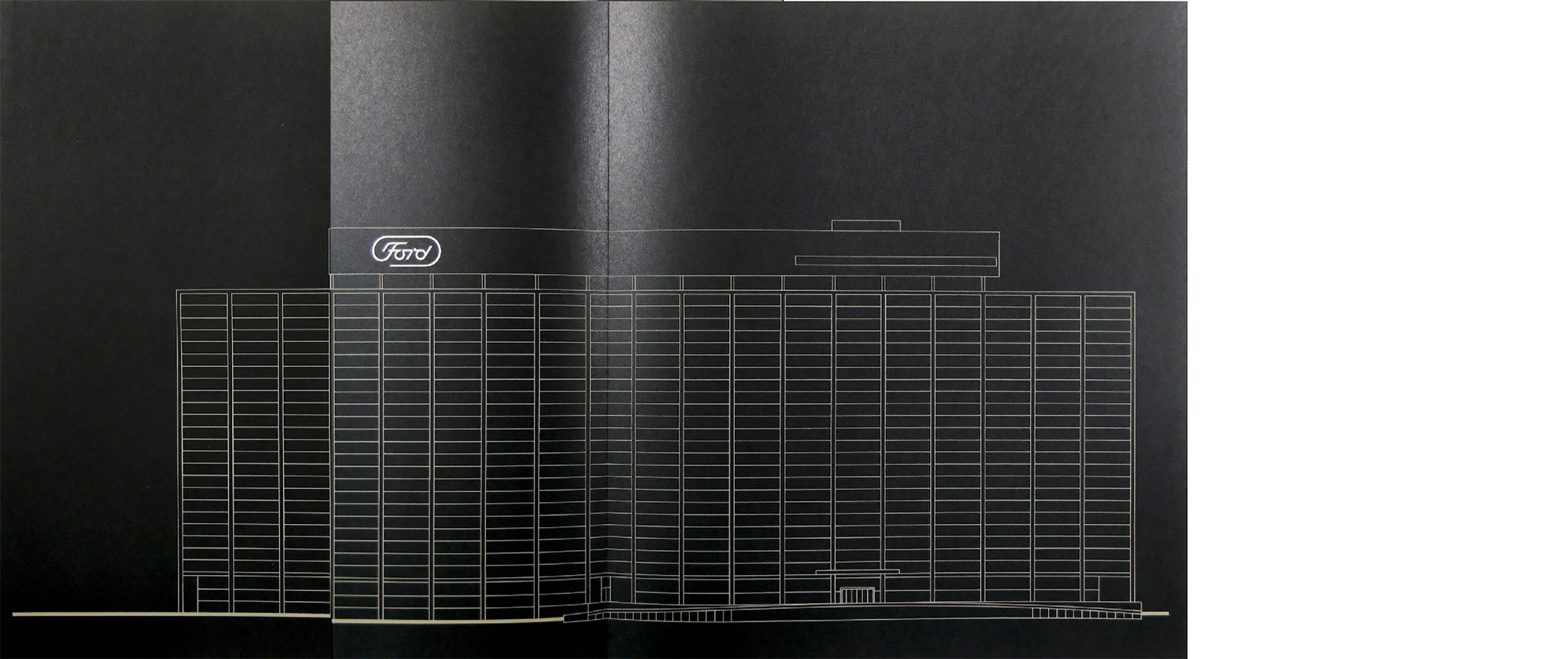
The proposed house mark for Ford Motor Company has been designed with these thoughts in mind. It is shown on the following page in animated form…
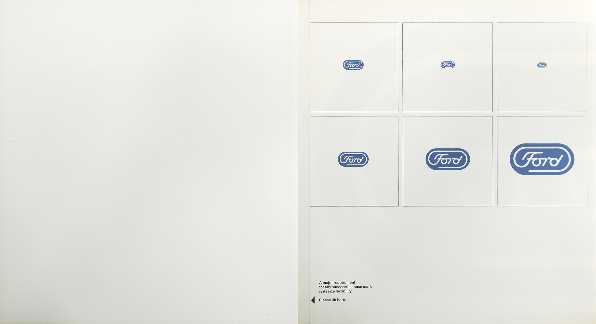
A major requirement for any house mark is its size flexibility.
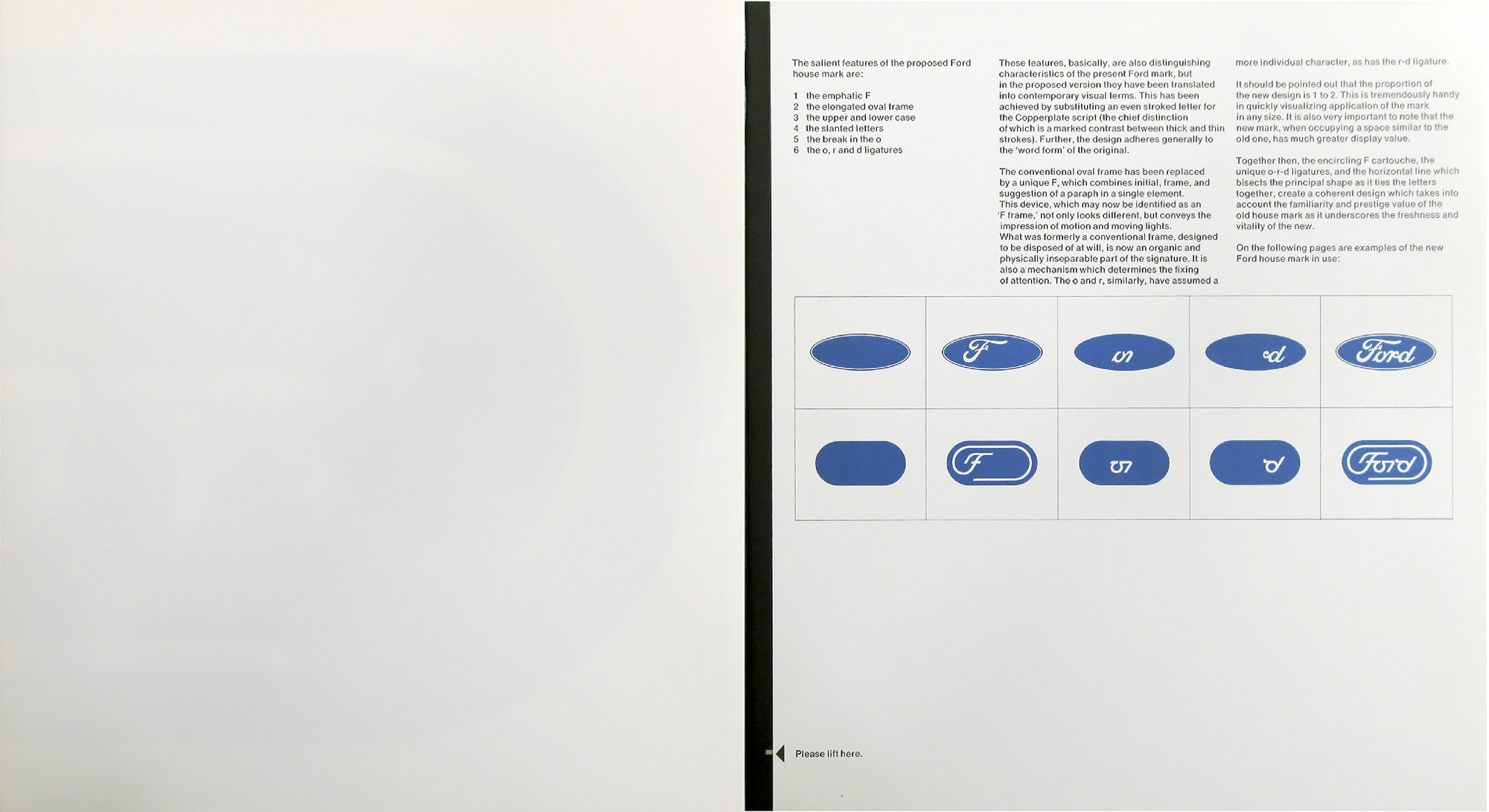
The salient features of the proposed Ford house mark are:
- the emphatic F
- the elongated oval frame
- the upper and lower case
- the slanted letters
- the break in the o
- the o, r and d ligatures
These features, basically, are also distinguishing characteristics of the present Ford mark, but in the proposed version they have been translated into contemporary visual terms. This has been achieved by substituting an even stroked letter for the Copperplate script (the chief distinction of which is a marked contrast between thick and thin strokes). Further, the design adheres generally to the “word form” of the original.
The conventional oval frame has been replaced by a unique F, which combines initial, frame, and suggestion of a paraph in a single element. This device, which may now be identified as an “F frame,” not only looks different, but conveys the impression of motion and moving lights. What was formerly a conventional frame, designed to be disposed of at will, is now an organic and physically inseparable part of the signature. It is also a mechanism which determines the fixing of attention. The o and r, similarly, have assumed more individual character, as has the r-d ligature.
It should be pointed out that the proportion of the new design is 1 to 2. This is tremendously handy in quickly visualizing application of the mark in any size. It is also very important to note that the new mark, when occupying a space similar to the old one, has much greater display value.
Together then, the encircling F cartouche, the unique o-r-d ligatures, and the horizontal line which bisects the principal shape as it ties the letters together, create a coherent design which takes into account the familiarity and prestige value of the old house mark as it underscores the freshness and vitality of the new.
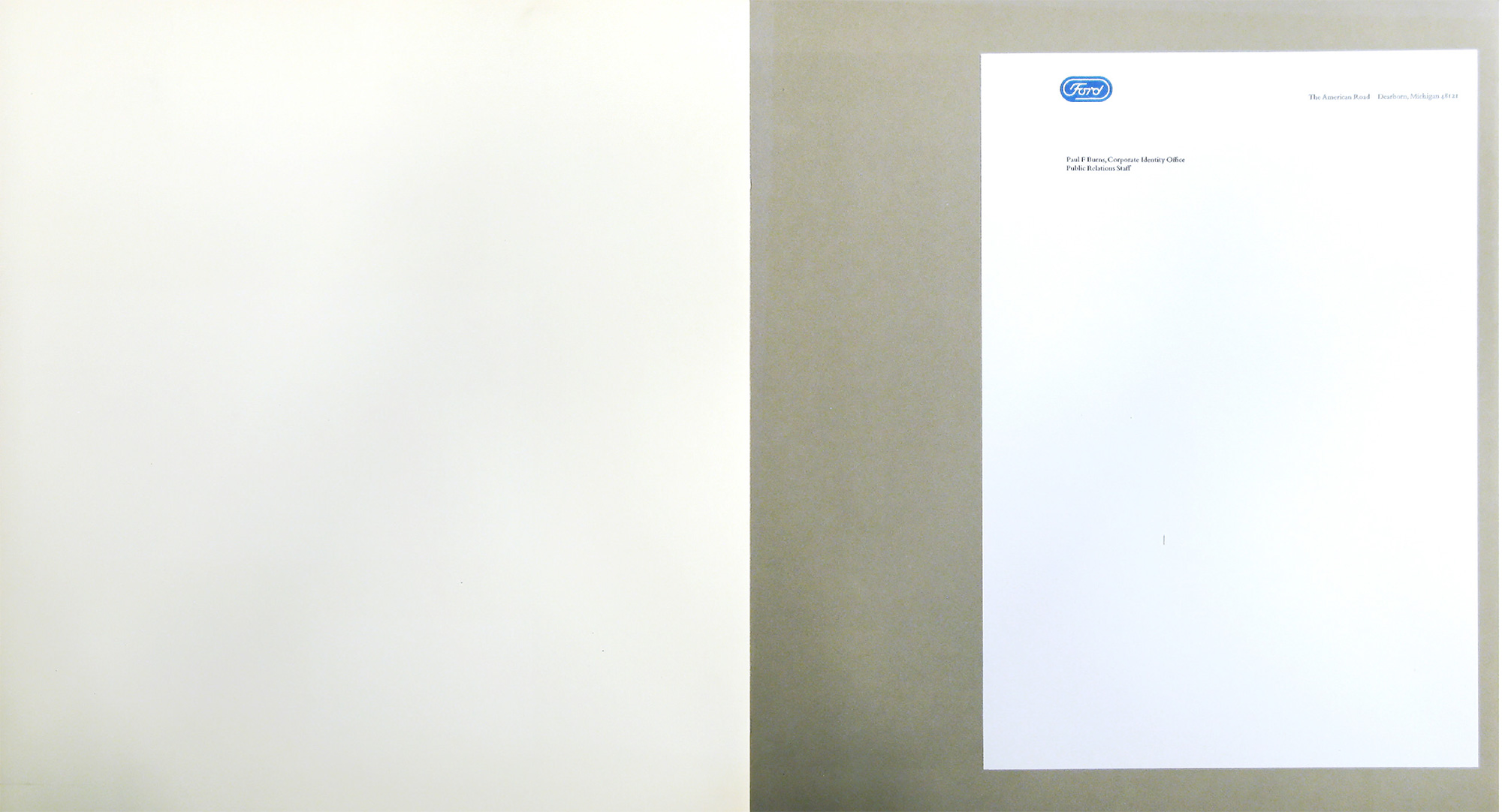
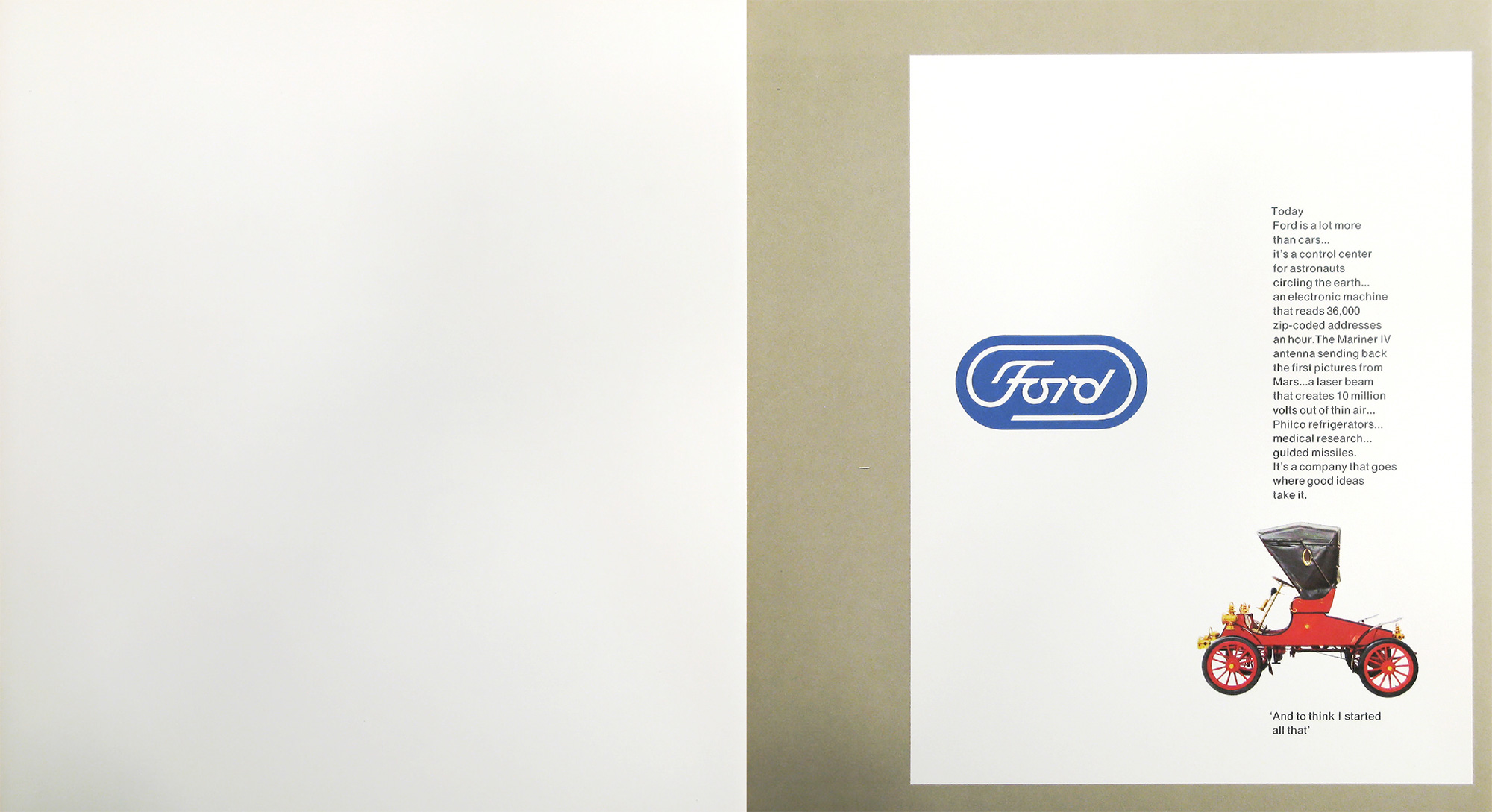
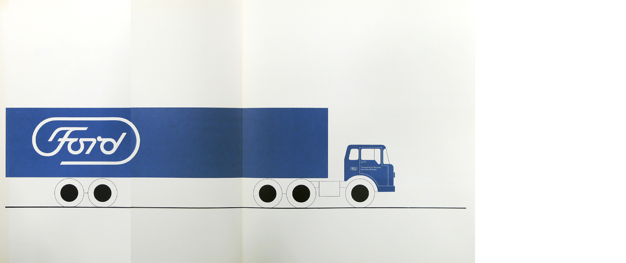
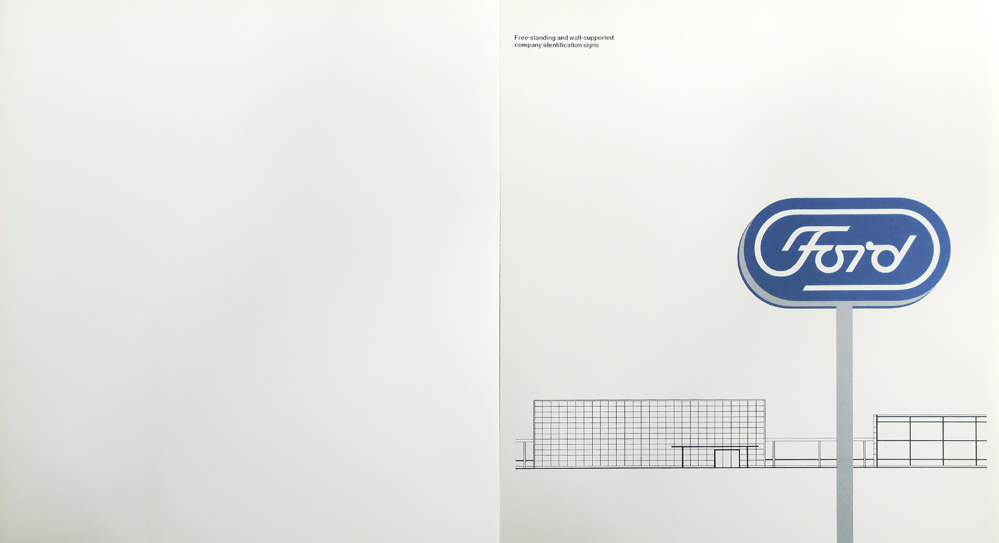
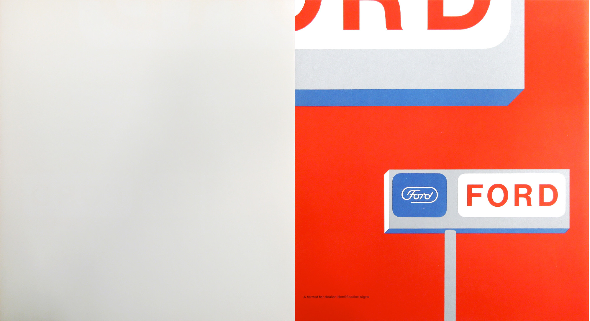
On the following pages are examples of the new Ford house mark in use:
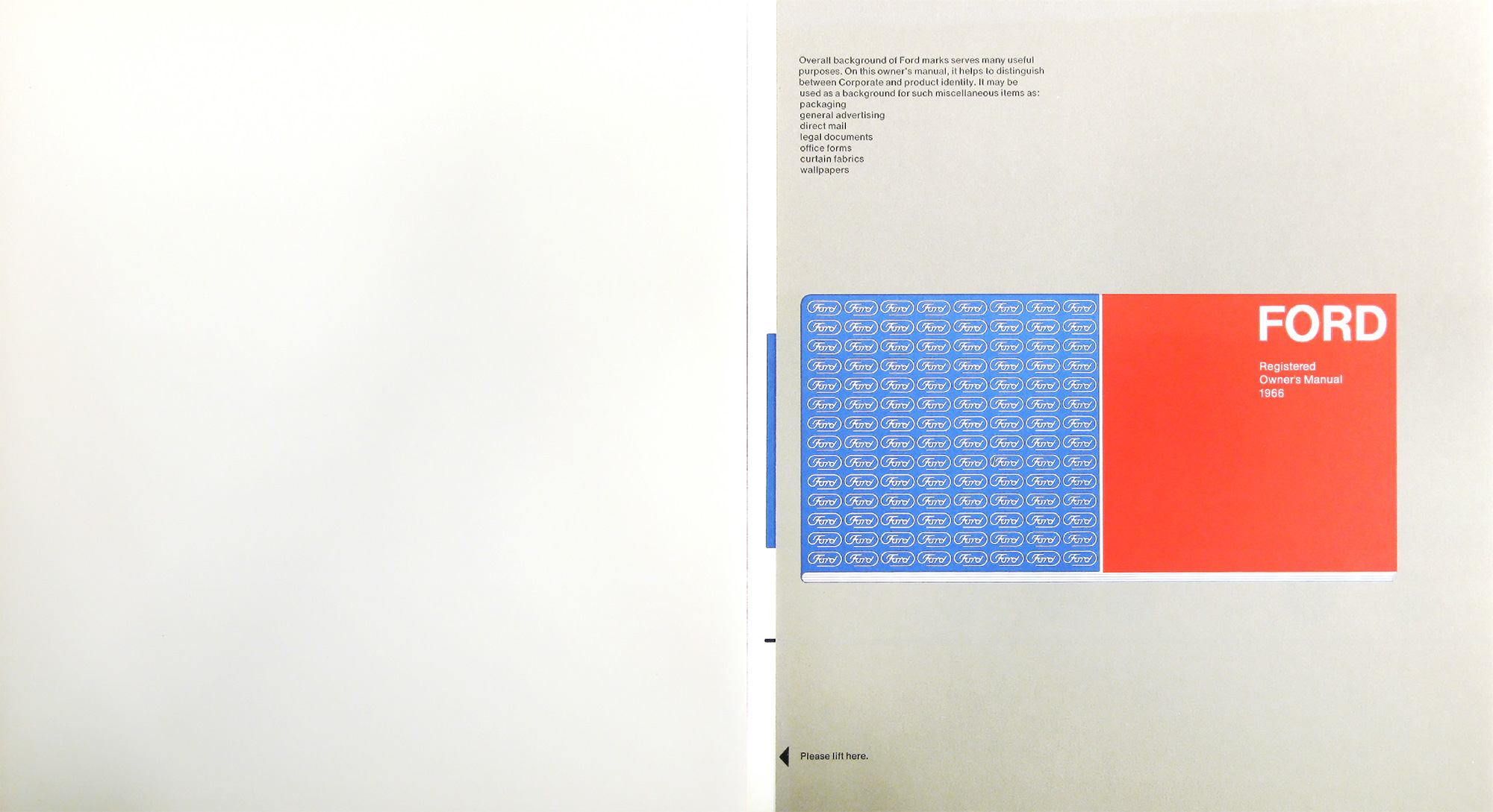
Overall background of Ford marks serves many useful purposes. On this owner’s manual, it helps to distinguish between Corporate and product identity. It may be used as a background for such miscellaneous items as:
packaging
general advertising
direct mail
legal documents
office forms
curtain fabrics
wallpapers
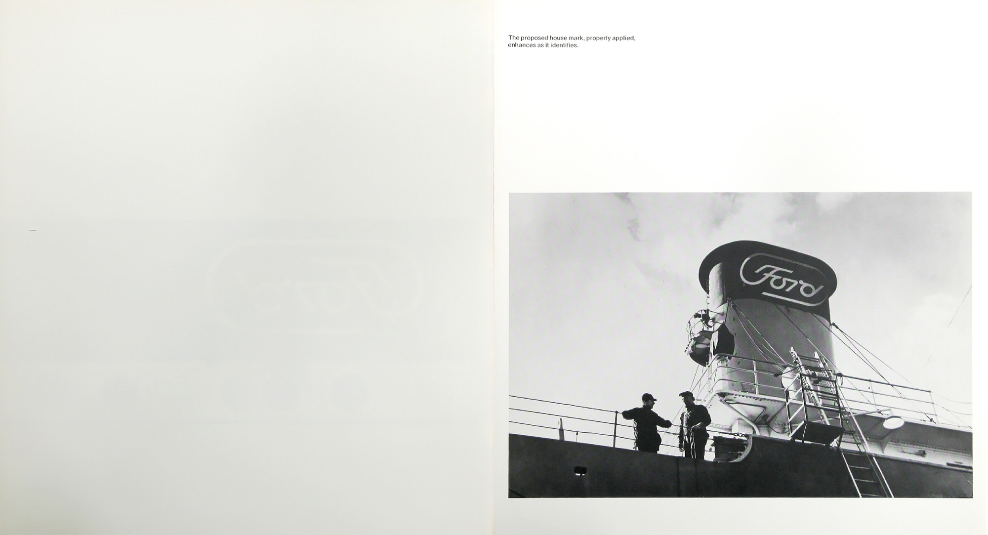
The proposed house mark, properly applied, enhances as it identifies.
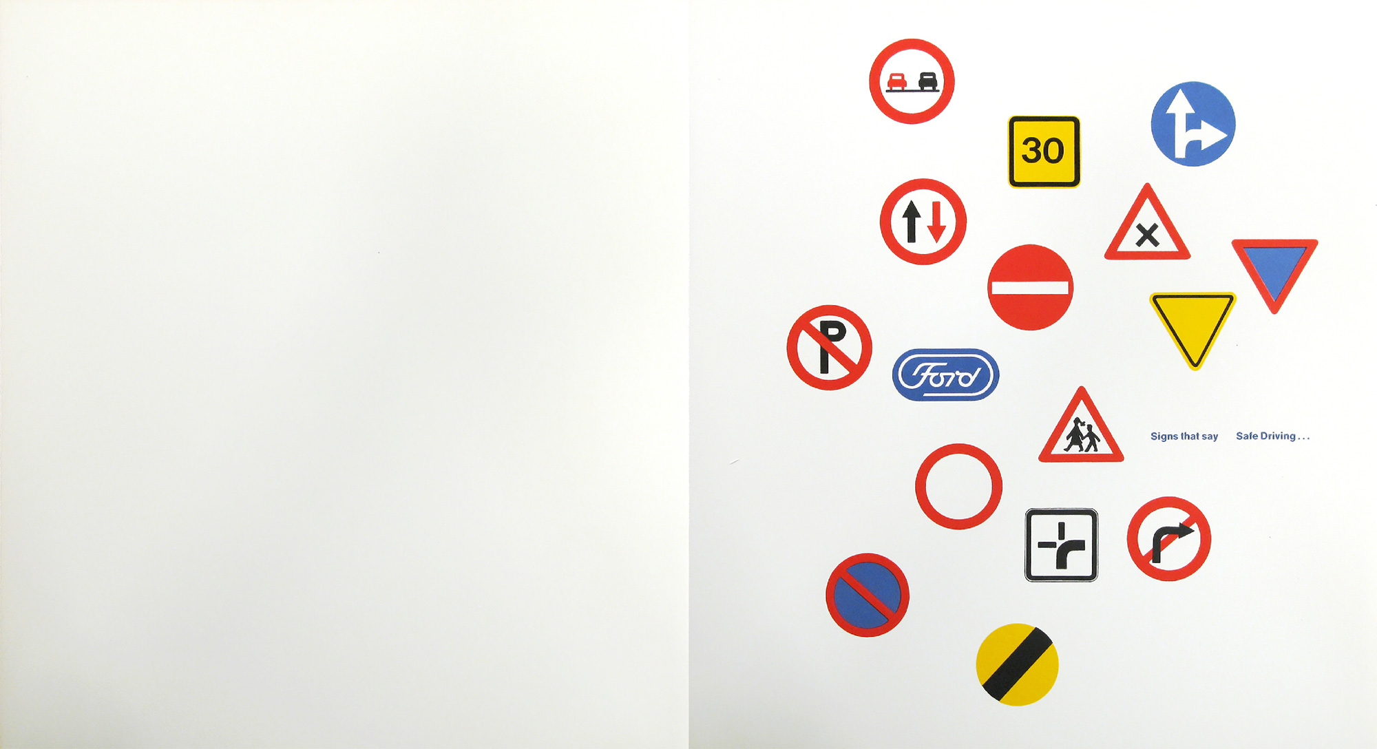
Signs that say… Safe Driving.
The Paul Rand Ford logo presentation is archived on paulrand.design, along with various other logo books from the renowned designer.
Related, from the archives, how Paul Rand presented logos to clients.