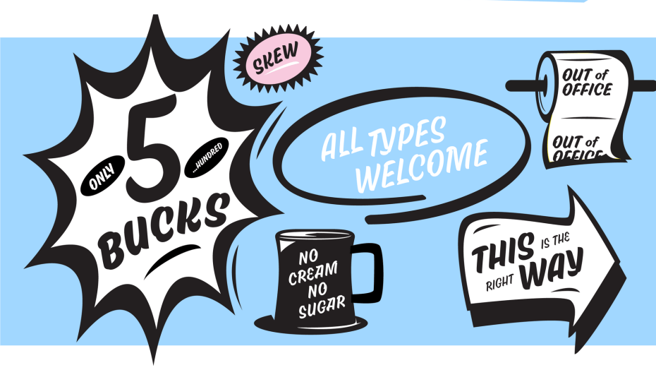
If you were recently perusing Behance’s ‘best of’ graphic design, you might have noticed a quirky and effervescent brush font gracing the tiled gallery. Skew, one of a handful of new type projects designed by Mark Caneso, was released earlier this summer.
The type designer, lettering artist, and graphic designer is known for bold forms and designs infused with his sense of humor, and Skew makes itself comfortable in this oeuvre.
We love a good origin story!
In 2018, Caneso designed event branding for the TypeCon conference theme, “Nice,” which featured an “energetic” brush logotype and an early version of Campaign Slab. He also created conference merch as part of the branding packaging, giving him the opportunity to play around with the theme letterforms (below).
His “No Space for Hate” poster is another example of Caneso’s experimentation with looser brush expressions.
However, the inspiration for Skew didn’t fully coalesce until 2022, when Caneso was working on a guide to help designers “push the ideas of emphasis, embellishment, and exaggeration” in letter designs. As part of the guide, Caneso wanted to showcase the letter ductus (the combined speed, angle, and pressure) responsible for the specific design (below). This exploration turned into the early designs for Skew.
Unlike many brush lettering predecessors, Skew’s variability gives you room to maneuver in complex typographic projects. Rather than leaning into the one-solid-movement of brush letterforms, Caneso describes Skew as a brush-like display font that “doesn’t shy away from the individual strokes that construct the forms.”
You can see how the shapes come together to form letterforms, imbuing the font with plenty of handmade distinction, like the exaggerated pinching between strokes.
Caneso has also recently released a vector bundle with 250 fun illustrations and icons that complement Skew’s unique personality or add a little life to projects featuring other fonts.
Skew is available in six weights from Light to Super, and an additional Rough version is available in those same weights. The wide array of available alternates and ligatures will make any designer feel like a lettering artist.
Caneso, the founder of design studio pprwrk and type foundry PSTL, has been featured in PRINT over the years, most recently in our Type Tuesday column for Panel. Check out the designer’s other summer 2024 releases: Hegante Display and Snug Sharp.
