At PRINT, we love highlighting our favorite projects, and there’s nothing more exciting than an inspired redesign.
However, this is most certainly not that.
Sometimes, for whatever reason, things go wrong in the design process, and companies end up with something scarcely better—or perhaps worse—than what they had before. Not every redesign will hit the mark, but some of them will leave you scratching your head in bafflement.
Here are my picks for the five most questionable redesigns of this year.
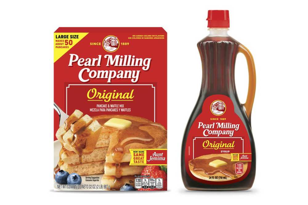
Pearl Milling Company
The circumstances of this necessary and inevitable redesign were far from ideal—last year, a handful of food brands opted to remove their branding images of Black mascots originally derived from racist tropes and stereotypes, including what was then known as Aunt Jemima.
The newly-named Pearl Milling Company was left with a design conundrum—how to keep the branding similar enough to retain customer recognition while veering far from anything that could trigger an association with the traditional Aunt Jemima image? The result looks kind of uncanny, like a generic brand copy-cat of itself. I think a bolder redesign would have played into Pearl Milling’s favor—a new name, new look, same great taste?
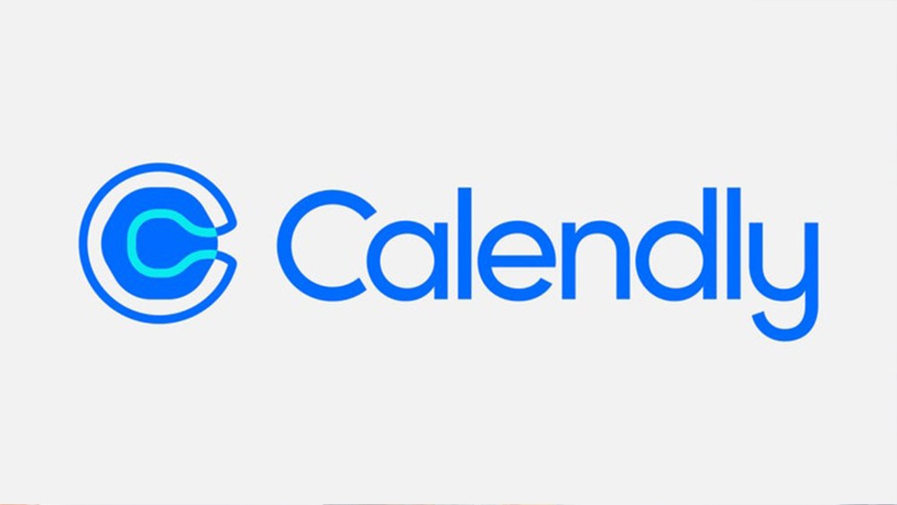
Calendly
When scheduling app Calendly unveiled its new branding this spring, the mockery came swiftly and brutally; why, people on social media wanted to know, did the logo look like an aerial view of a toilet bowl? That aside, there is much more to gawk at when it comes to this execution—the combination of colors and the use of an irregular, slightly blob-like shape within a circle feels incredibly awkward.
Calendly undoubtedly paid an absurd amount for this redesign, having enlisted a team at Pentagram for the job. On its website, Pentagram expends many paragraphs about the creative process, their case study littered with designer-y phrases like “sense of confidence and presence,” “holistic visual language,” “space for interaction,” and “organic visual rhythm.” Which is all well and good, but how much does “organic visual rhythm” matter if the product whose appearance you’re in charge of revamping just…doesn’t look good? Sometimes it’s easy to miss the forest for the trees in the world of design, and I think that’s what happened here.
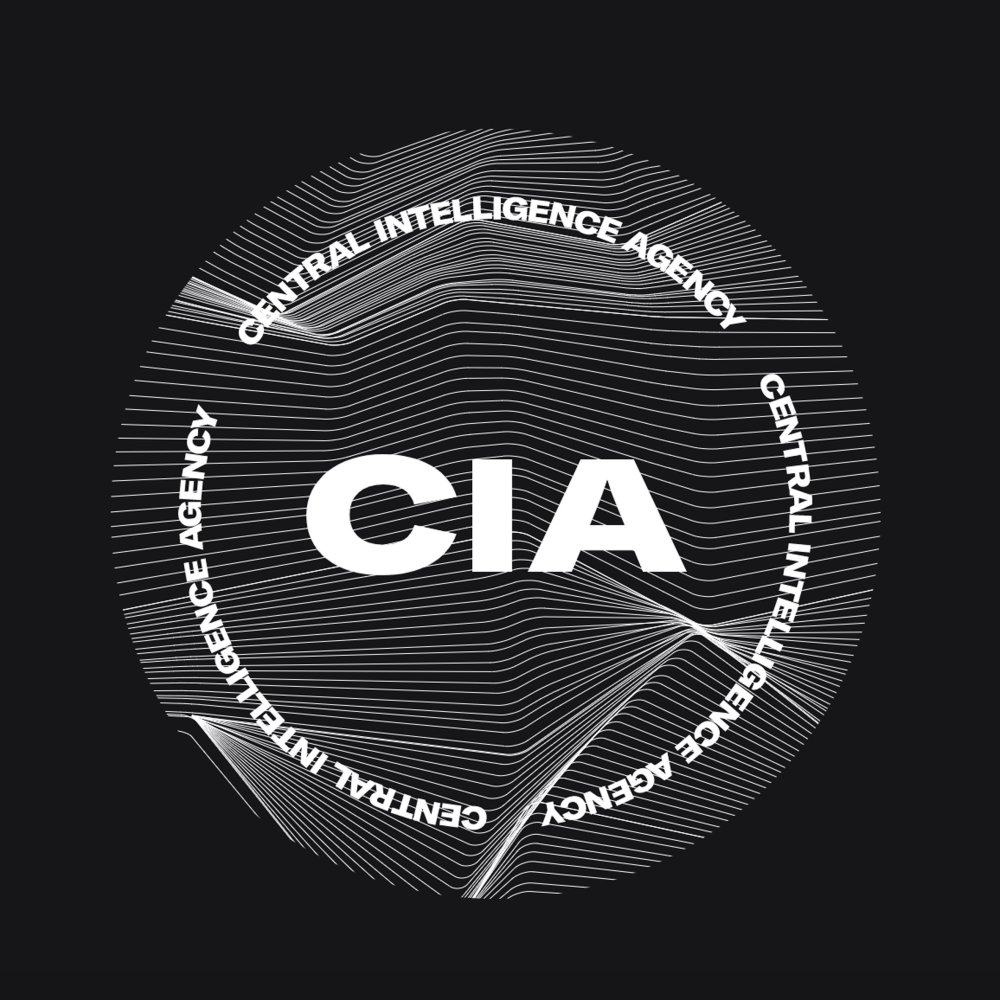
The CIA
In January, the CIA unveiled new branding, complete with a website making use of seemingly every design trend currently in vogue—wide, blocky sans-serifs, a slick black, white, and red color scheme, and vaporwave-like line elements. I was baffled by this, as were designers on Twitter in the wake of the redesign going public. When most government agencies’ websites look like they haven’t changed since 2007, why does the CIA feel the need to look like a rave poster?

I can’t provide insight into the designer’s mindset because no one knows who they are—though designer and creative director Ryder Ripps jokingly took credit for it on Instagram. But it seems like a ham-handed attempt to market the agency in a “hip” way for younger millennial and Gen-Z job-seekers. Whether or not the new branding will prove successful toward that end, I have no idea.
KIA
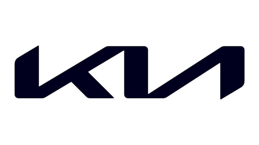
Here’s a situation I believe everyone has been in at least once: a catastrophically bad idea gets floated within a group—of colleagues, friends, whatever—and rather than shoot it down yourself, you wait, assuming that someone else will voice your concerns. But somehow, no one does, and before you know it, it’s too late to say anything: the plan is in action, and raising alarms at this point will only implicate you for not having said anything sooner.
That is what I imagine happened in the case of Kia’s new logo, which the company unveiled early this year. There’s nothing I wouldn’t give to have been in the room for the final development meetings on this logo. I can only presume the designers involved desperately avoided eye contact with one another, each painfully aware that the logo was completely indecipherable at a glance, recognizing that it was too late to pull the plug. Looking at it is like staring into an optical illusion that doesn’t quite work; even knowing full well that I’m supposed to be reading “KIA,” all I can see is the letter “K” followed by a backward “N,” a la Nine Inch Nails.
Facebook / Meta
If there’s one thing I hate, it’s when someone treats me like I’m stupid; I’m sure you feel the same. So why does the company-formerly-known-as-Facebook continually insist on doing so?
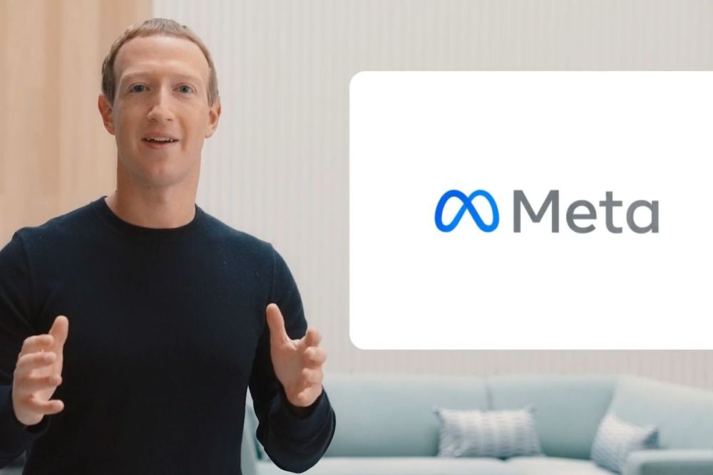
Last fall, Facebook announced a name and brand change: it will now be known as Meta, as in “metaverse,” a virtual-reality project the company believes will revolutionize modern work and commerce. Of course, Facebook still exists as one of their flagship products, along with Instagram and WhatsApp, but the company itself has changed its focus.
There’s also a new logo, which looks like a saggy infinity sign—sagging, perhaps, with the weight of the company’s many crimes against humanity. (apparently, it’s supposed to double as an abstract “M,” but the golden arches, it is not; I wouldn’t have made the connection were it not pointed out to me). They even replaced the famous thumbs-up sign in Menlo Park with the new logo, which feels cold and oddly sinister in comparison.
To me, this represents visual branding at its most cynical: a company screws with elections, fuels genocide in Myanmar, collapses the digital media industry by lying about its viewership, and so much more, then dusts itself off, gives itself a new name and shiny new logo, and expects us to pretend that you can now trust them as a force for good in the public sphere. Sorry, Meta—I’ll call you whatever name you say you are, but you’re still evil!
