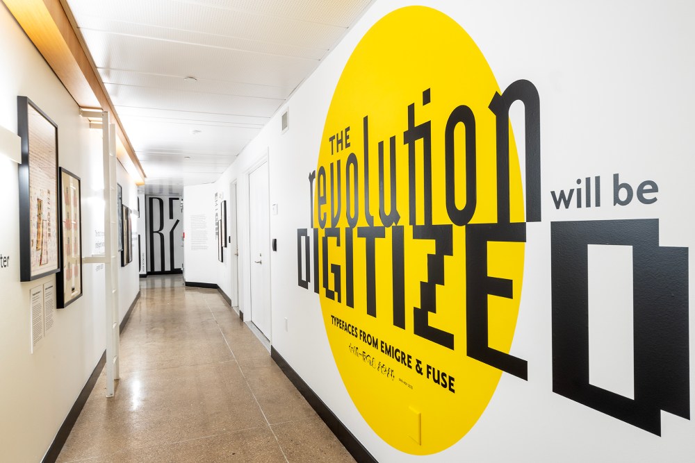
Two new exhibits have launched in Poster House’s Hallway Galleries: The Revolution Will Be Digitized: Typefaces From Emigre & FUSE, curated by Steven Heller and Angelina Lippert, and Advertising Type: Women in Digital Design, curated by Lippert and Ksenya Samarskaya. Both are currently on view through Nov. 5. I wrote the texts below to accompany the former.
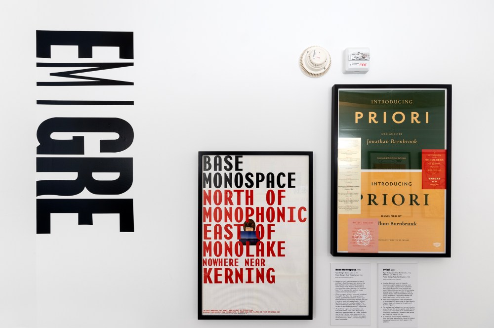
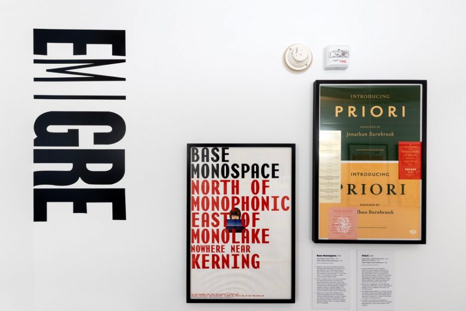
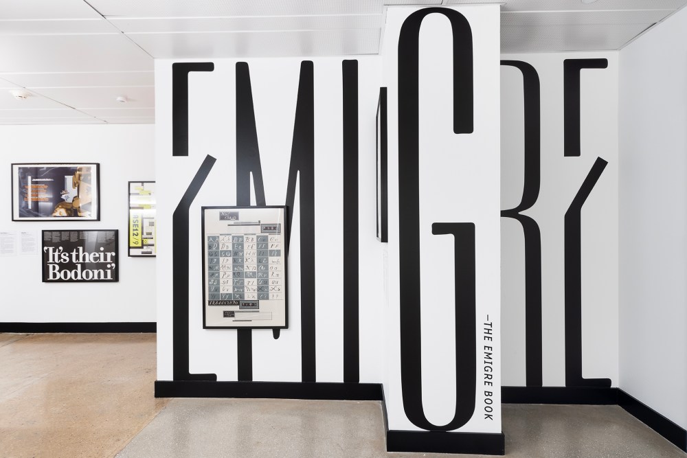
EMIGRE
In 1984, the year the Apple Macintosh computer was introduced, Rudy VanderLans and Zuzana Licko—husband-and-wife émigrés from the Netherlands and Czechoslovakia, respectively—founded Emigre Graphics in San Francisco. Within a few years, the typeface foundry and its magazine, Emigre, became the late 20th century’s wellspring of experimental digital typography and graphic design.
As an early adopter of the Mac, Licko designed custom-bitmapped typefaces (letters made from squares or pixels on a grid, similar to filling in boxes on graph paper) for the magazine. VanderLans used them in layouts that rejected Swiss modernist rigidity in favor of improvisation, with a touch of reactionary postmodern eccentricity. By exploiting the limitations of the computer, they also developed a typographic language that challenged many established tenets of typography, including readability and legibility.
VanderLans and Licko effectively realized the power of the computer and the ultimate shift from photo-typesetting (where images of letterforms are projected onto light-sensitive paper and then printed) to digital type, dedicating their business to showcasing original typeface designs specifically made for computer technology. Some Emigre typefaces were promoted on posters sent through the mail. Of these, some had complete samplings of fonts, while others showed how the type was composed as typography in phrases. It was an era of typographic audacity, reevaluation and risk. The desktop computer made it possible for designers not trained in the intricacies of typeface design to be playful with custom fonts. Emigre magazine was considered controversial in the 1990s due to its denial of the standards established by an older group of modern designers, and provided inspiration for the breaking of those standards by younger postmodern acolytes.
Emigre Graphics (later called Emigre Fonts) became a touchstone for progress in the field, inspiring many imitators. Used in every issue of Emigre magazine’s pages, the foundry’s typefaces established new standards for experimental digital typography. Not content to follow tradition, Emigre created a tradition of its own.
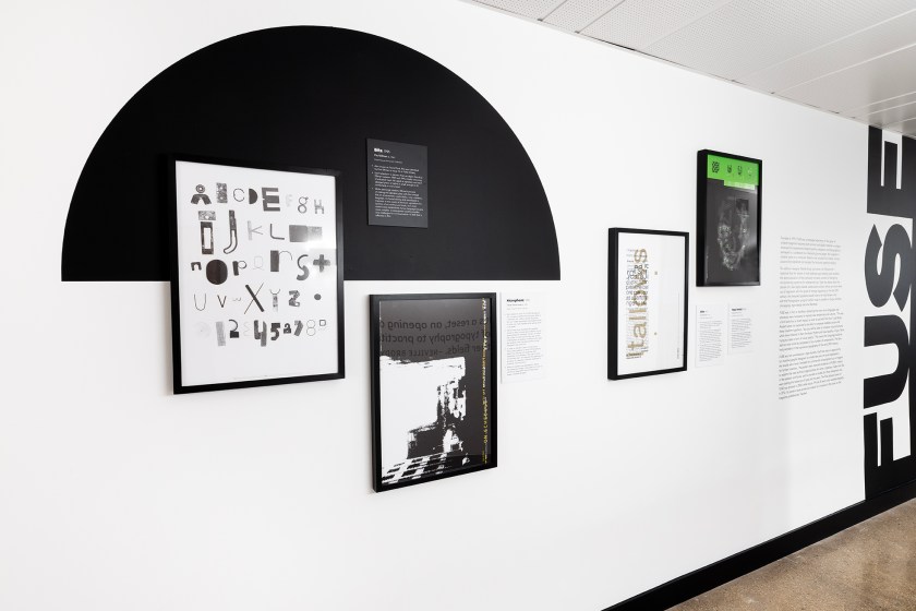
FUSE
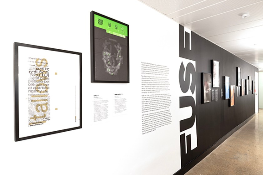
Founded in 1991, FUSE was a language laboratory in the guise of a hybrid magazine featuring both printed and digital material—a unique showcase for experimental digital typeface designers and typographers, packaged in a cardboard box. Replacing bound pages, the magazine’s content came on a computer diskette and included five folded, printed posters that explained and sampled the featured typeface designs.
The editors—designer Neville Brody and writer Jon Wozencroft—observed that the advent of early desktop type drawing tools enabled the democratization of the previously monastic practice of designing and producing typefaces for widespread use. Type had always been the domain of a few highly trained, conservative artisans whose practices were out of alignment with the speed of change happening in the late 20th century. Any bespoke typefaces would have to be hand-drawn until, with the Fontographer program (which made it possible to forgo primitive bitmapping), type design became liberated.
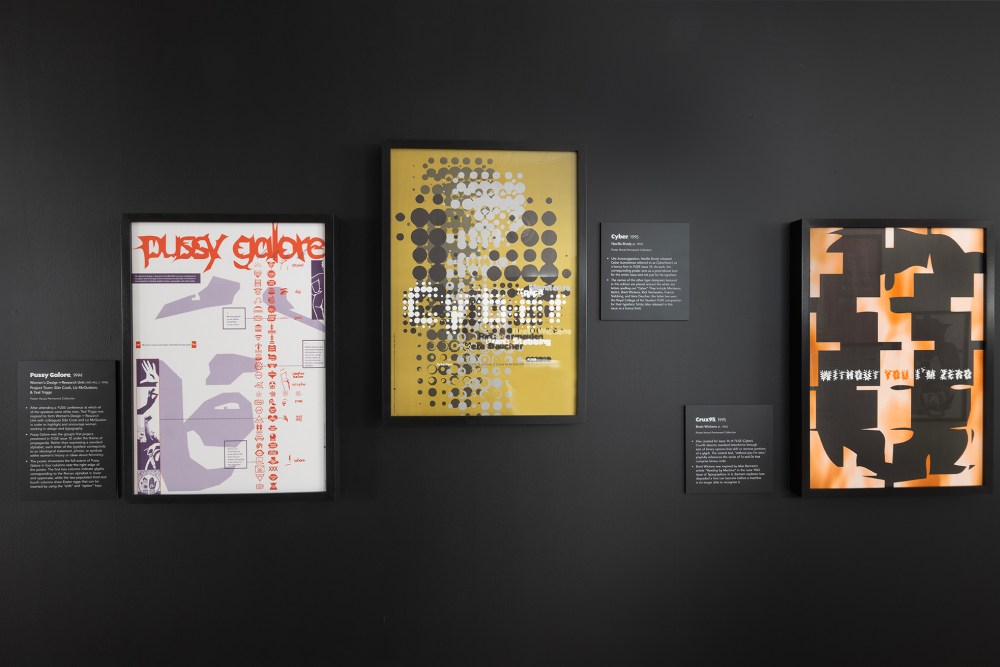
FUSE was, in fact, a manifesto declaring that new visual languages and structures were necessary to express new tendencies and cultures. “The way a font looks has as much impact as what is said with that font,” said Brody. Readers were not expected to be able to compose readable words with these freeform typefaces, “but you will be able to compose visual structures which have inherent in them the basic rhythm and visual quality of type. We’re trying to create a form of visual poetry.” This means the language could be abstract and could be composed of any number of components. This idea had precedent in the expressive typography of the early 20th century.
FUSE was not conceived as a type foundry. Each box was an opportunity for inventive graphic designers to create new sets of social expression; the results were never intended for commercial consumption but as triggers for further invention. The posters were concrete evidence of FUSE’s mission to explore the new technical opportunities for what a typeface might look like in the present and future, and to provide an outlet for those designers who were testing the tolerance of type and its users. The final physical issue of FUSE was printed in 2000, while issues 19 and 20 were only available digitally. In 2012, its posters were printed as inserts for inclusion in the book on the magazine published by Taschen.