
It finally happened.
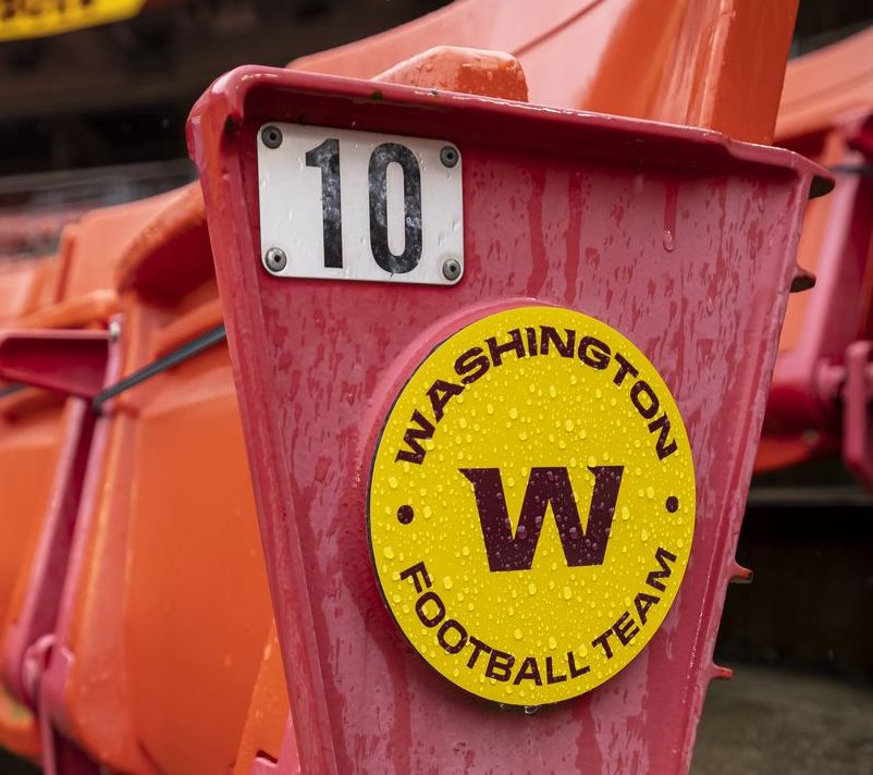
The NFL franchise formerly known as the Redskins—and now formerly known as the Washington Football Team—officially has a new name and brand identity to boot: The Commanders.
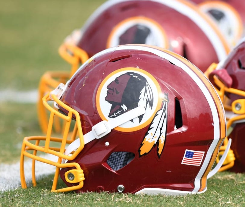
With the incredibly offensive “Redskins” and laughably uninspiring “Washington Football Team” as its predecessors, the bar was set painfully low for this new iteration of D.C.’s NFL squad. That said, all eyes have been on this revamp of the team, as debates surrounding tradition versus not turning an entire ethnic group into a mascot have been raging for years.
But let’s get right down to it, shall we?
In short, I think the new name and branding are perfectly adequate.
Personally, I’m not one for overtly militaristic branding, and, well, that’s exactly what The Commanders is all about. Call me crazy, but I don’t think we should be glamorizing war or bayonets or cannons with our beloved sports teams. But, hey, that’s just me.
To help us all make sense of the various elements of The Commanders brand, I enlisted the expertise of three sports design pros to get their hottest takes. Here’s the line-up:
Todd Radom: Radom is one of the foremost authorities on sports design, having designed the official logos for Super Bowl XXXVIII, the 2009 NBA All-Star Game, and the 2014, 2016, and 2018 MLB All-Star Games. He’s even designed a handful of graphic identities for professional sports franchises himself, including the Washington Nationals and the Los Angeles Angels of the MLB.
Britt Davis: As a self-described “Creative QB,” Davis is the co-founder of the Atlanta-based sports design agency LCKR ROOM and the Digital Media Manager for The Home Depot Backyard, where the Atlanta Falcons and Atlanta United fans tailgate.
Charles Nix: Nix is a Creative Type Director at Monotype. He also led the design teams behind the fonts for the English Premier League and MotoGP. We spoke a few months back about the resurgence in retro sports design.
Radom, Davis, and Nix’s reactions to The Commanders were all relatively lukewarm.
“Everyone hates everything new, especially in the world of design of sports,” Radom prefaces. “It’s important to see all of this in context, on athletes in actual games, with wins and losses and accrued equity at some point.” That said, he finds The Commanders brand system pretty sparse. “All in all, it seems lacking,” he says. “Sports identities require a robust series of assets—interestingly, most NFL teams keep things pretty spare. The crest represents a bit of an outlier but in a good way. That said, I would love to know why there’s so little in terms of local flavor in the overall package beyond the D.C. flag featured on the team’s alternate uniforms.”
“It feels like it could be uprooted and used anywhere,” offers Davis, “and I’m not sure that’s the best when it comes to the fan base adapting to it. But I’m glad they stuck with the original colors as that’s definitely an iconic part of the team.”
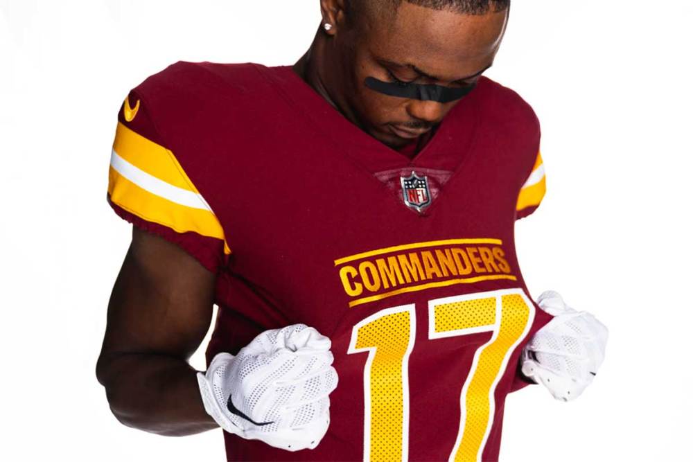
Radom and Nix agree with Davis on the color palette choice, saying it was critical to keep the original brand colors for continuity and to ground a franchise that’s necessarily changing in so many other ways. “Job one: they got the colors right,” says Radom. “Retaining the very signature burgundy and gold was a no-brainer.”
The choice to go the militaristic route was met with some skepticism.
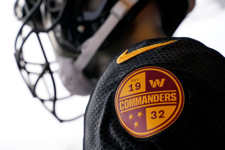
“‘The Commanders’ says, ‘we’re in charge,’” says Nix. “It’s militaristic, of course—a jumped up collegiate team the likes of Army or Navy—an idea echoed in the spareness of the uniforms and the stencil-like W on the helmets.” But he says he would have done things differently had he been in charge.
“I would have taken every opportunity to move the conversation away from military themes (because it’s too obvious—and because it will probably end up there eventually anyway).”
“I understand their connection between the military vibe and Washington as the Capital, and how that can also translate to dominance on the field,” says Davis, “I just think there are so many other rich visuals and language in the area that could have been included in the rebrand. Something that speaks to the fans, the players, and even the front office.”
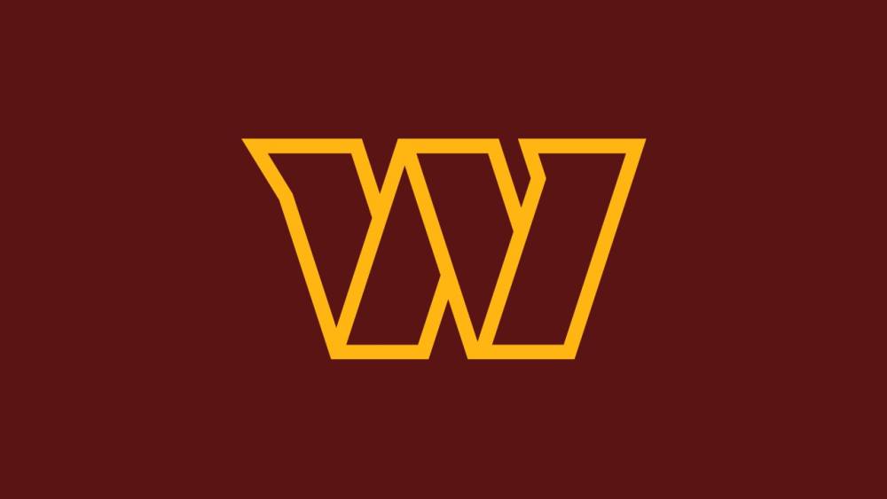
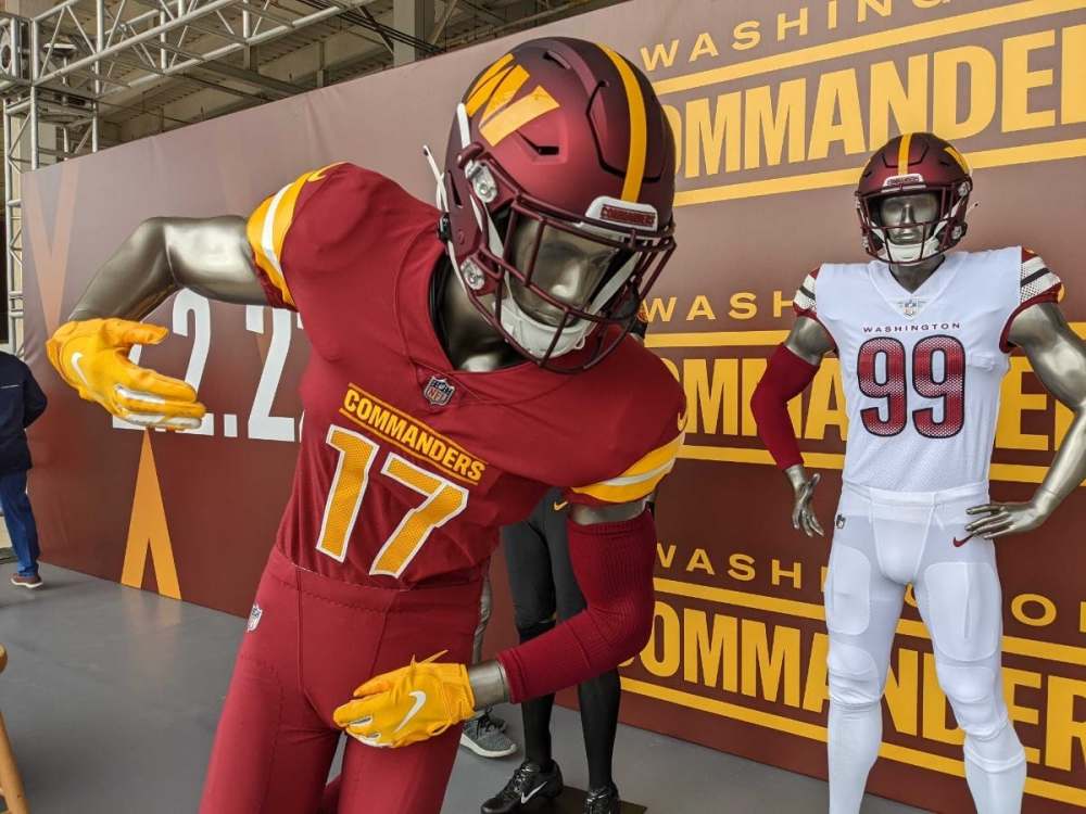
The new logo is a barebones, stencil-style depiction of a “W.” It’s inoffensive, but will it really get the people going?
“It serves as the most visible component of the overall brand, but it seems kind of vanilla and corporate,” says Radom. “There’s nothing that speaks to the franchise’s home region or name or sport; it really could be the symbol for a bank, a transit system, or just about anything.”
Sure, other sports franchises have beloved single-letter insignias, such as the Green Bay Packers’ “G” and the Philadelphia Phillies’ “P.” But those guys also have the luxury of history on their side. “The best of them have generations of equity attached to them,” explains Radom “This ‘W’ may well be elevated to lofty status, but it’s going to take a while and a whole lot of luck.”
Radom isn’t in love with the new wordmark either. “It seems flat and ‘off-the-rack’ in terms of its letterforms. Whatever the merits, the primary ‘W’ does contain some dynamic properties and visual interest, but the wordmark is decidedly uninteresting.”
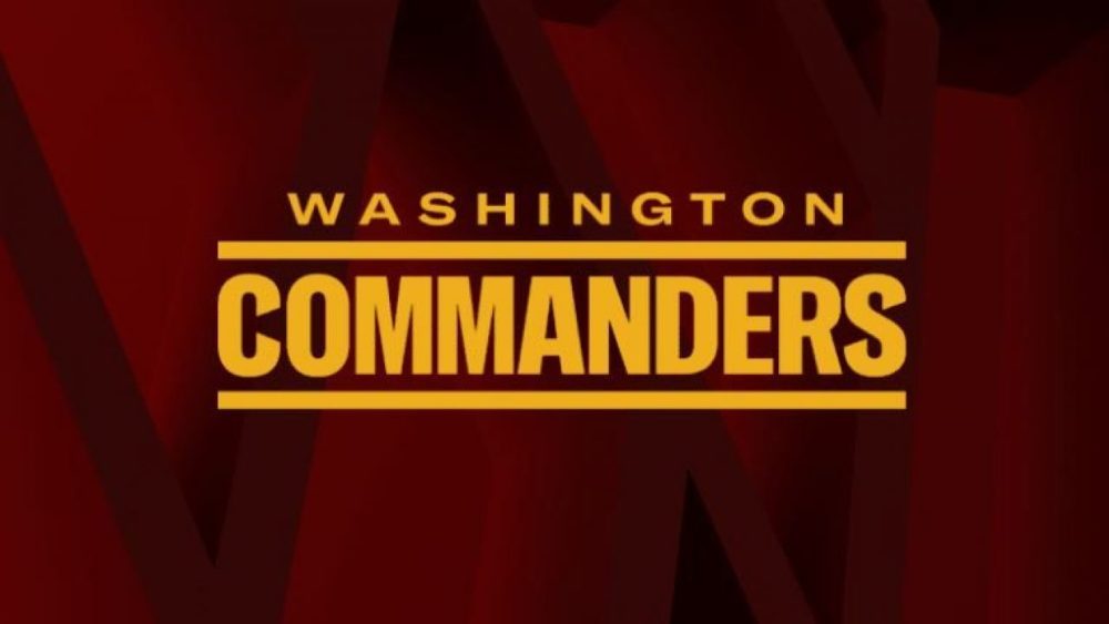
And Davis is right there with him. “I was a little disappointed in the wordmark. I would have liked to see elements of the stencil treatment in the primary helmet mark applied to ‘Commanders.’”
Type expert Nix was a bit kinder in his assessment. “The name is long, hence the condensed type (carefully modified to be slightly less generic). It will fill an endzone fully and nicely. I’m not a fan of the blank ‘logo sandwich’—bars above and below a simple typographic lockup—but it does play nicely on the black uniform as a mock military dress.”
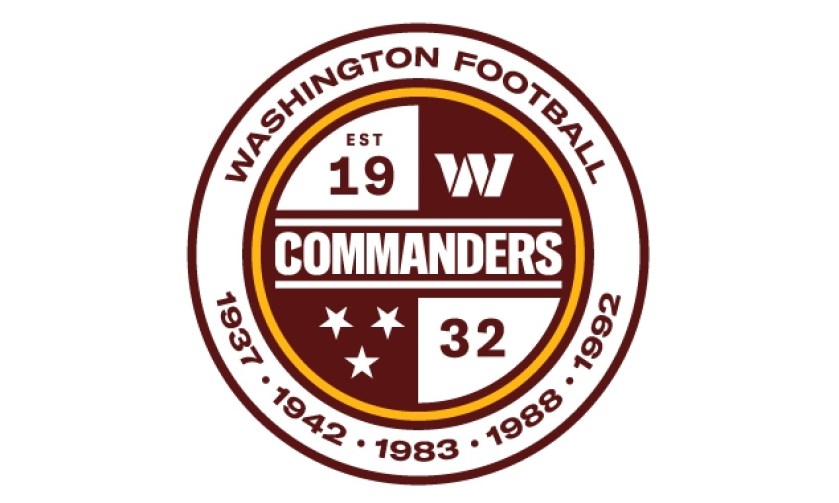
While Davis and Radom point out that the busyness of The Commanders’ crest sets it apart from those of other NFL teams, other aspects of it nevertheless elicit a furrowed brow.
“There is a LOT going on here, which is not the problem—lassoing everything in a circular retaining shape helps to tie everything together, but I can’t help but wonder why the championship seasons are called out—look at us, we haven’t won in thirty years!” Radom says. “The three stars refer to the military and the D.C. flag, but they sure do remind me of the Tennessee state flag and the Tennessee Titans’ logo, especially in this particular configuration. The team’s jersey numbers emulate stenciled digits—why don’t I see that here? All in all, the look of this could be dated quickly, but we shall see.”
Of course, a sports team’s branding will never please everyone, and this particular team was destined for scrutiny. So what would our experts have named The Commanders if given the task? Nix weighs in.
“I’d think about what is it about the region that is rugged and worth celebrating? Historical political figures? The seat of our democracy? The cynical side of me wants to say The Lobbyists, but if I’m being serious, I want something that says ‘unity’ or ‘out of many, one’—something more frank, idealist, and earnest. The Soldiers? Still military, but more germane to a rugged, unified group. The Faithful? I love the idea of The Washington Faithful—with its oblique religious overtones and the undertone of hope against the odds.”