Over the long history of typography, we have used pretty much everything to make our texts beautiful and legible: swan feathers, brushes, carved woodblocks and even metal. We’ve developed our technology and invented printing presses to make it reproducible. And whilst styles and designs may come and go, modern technology such as the internet and smartphones means that typography is continually and dramatically changing.
We explore the history of typography to provide some context to today’s designs and find out how we got where we are.
The history of typography: where do we begin?
—
- What is typography?
- Early typography
- Signwriting
- Printing and moveable type
- Styles and themes
- Digital typefaces
- Typography today

What is typography?
—
Typography is the art of arranging type to make written text readable and aesthetically appealing for the reader. Once we started using symbols to represent an idea, we had invented writing. As the style of writing evolved over time, it became an art form and—with different letter shapes and spacing—produced text that was both beautiful and full of meaning.
Most associate typography with digital fonts but hieroglyphs, calligraphy and signwriting are all forms of typography. The important aspect of all writing is that others can understand it easily. Unlike codes or sacred symbols meant for only a few people to understand, written text is for the masses, which means the design and style of the text should be legible and consistent.
First, a few quick definitions:
- Typefaces are the design or style of the letterforms;
- Fonts are the size or style version;
- Points are what most fonts are measured in.
So you could have a Roman typeface in 12 point italic font. However, many designers now use the terms font and typeface interchangeably these days and indeed, when I was at art school, the term “font” was reserved for the digital version of a typeface.
Early typography
—
Hieroglyphs & cuneiform
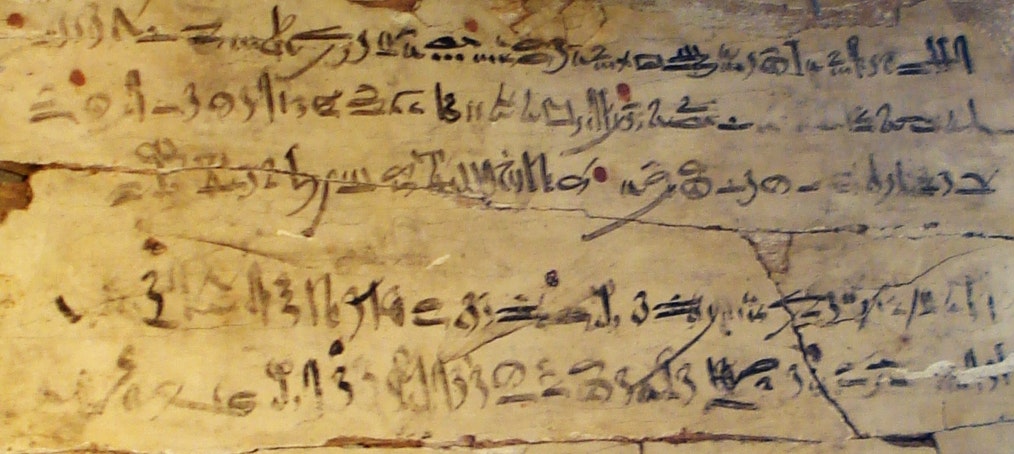
In terms of style, early typography styles existed due to the methods used to produce the text. Egyptian hieroglyphs first appeared around 3000 BC, painted onto plaster and then carved in relief, but these were used in religious or royal settings. Later on, a simplified version called hieratic script was developed for official documents. Hieratic script was written in ink with a reed brush.
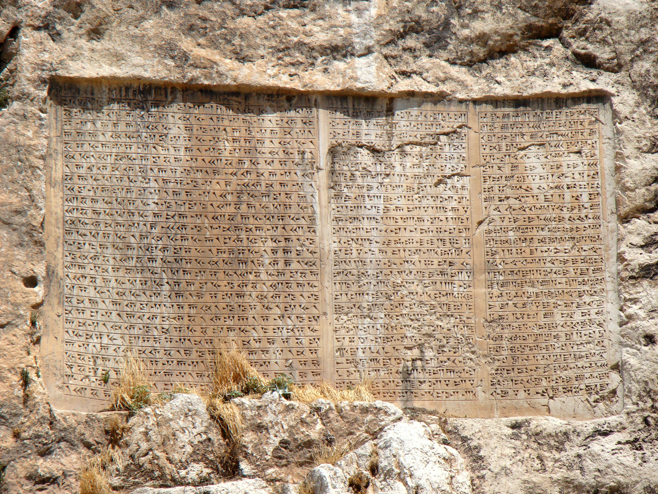
Overlapping the use of hieratic writing was cuneiform, which was developed by the ancient Sumerians of Mesopotamia (3500-3000 BC) and thought to be some of the earliest writing used by merchants. Its distinctive wedge-shaped features were made from the edges of a reed pushed into a wet clay tablet. Later adapted and used throughout the middle east, this form of writing was still in use when the Roman Empire was emerging, with the last known example made in 79 AD.
The emergence of serifs
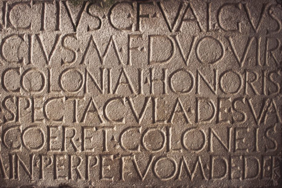
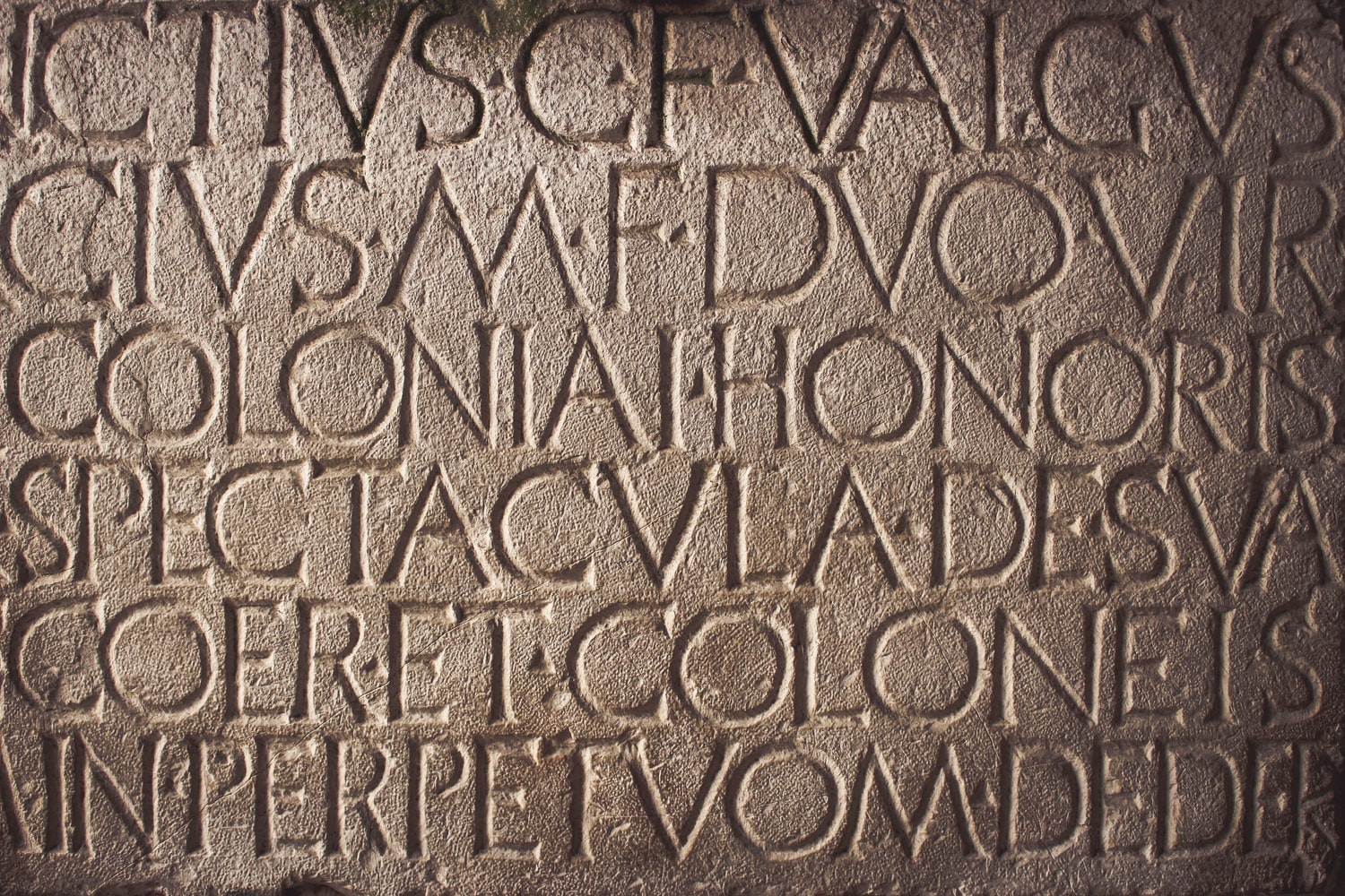
In the Roman Empire (27 BC–476 AD) text on stone plinths or columns was painted on by a signwriter, then chiseled out by a stonemason. This resulted in serifs—the bits that stick out at the edges of letters—that formed from the use of the chisels.
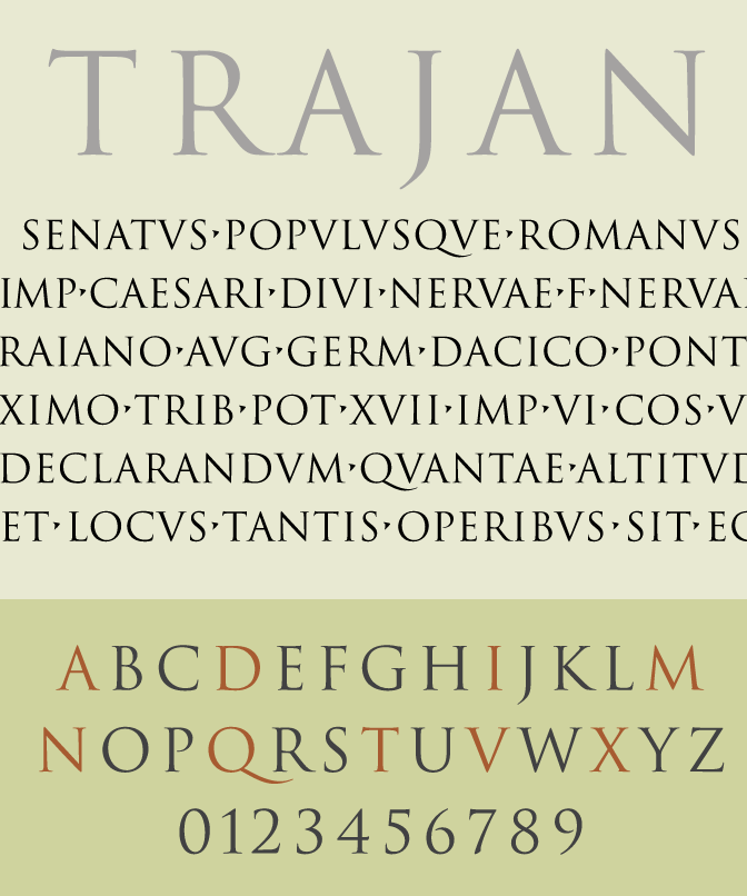
Modern typefaces known as Roman are derived from this style of text, with the most famous being the Trajan typeface, designed in 1989 by Carol Twombly and based on the inscription of Trajan’s Column in Rome, which was inscribed around 113 AD. The Roman typeface’s classical origins gave it an authoritative style and meant the font is often used for official documents. Original Roman texts only used capital (uppercase) letters.
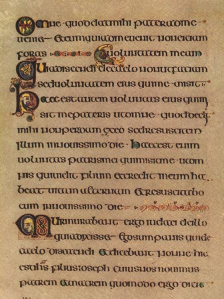
Writing on smooth vellums or parchments allowed for more cursive scripts and uncial scripts developed around 600 AD. This included flourishes, ascenders, descenders and overlap of the characters.
From 715-800 AD, lowercase or minuscule writing was being used by monks when writing their scriptures.
Using feather nibs cut at an angle, their calligraphy was interspersed with colorful images and hand-painted illustrations, often drawn by different individuals for each chapter.
By around 800 AD a more simplified version had evolved. The Irish Gospel, the Book of Kells, has a distinct look and local variations, due to one monk copying the text of another, were exaggerated until a distinct and individual style formed.
Signwriting
—
Signs are everywhere, on street corners, shops, in factories and on advertising hoardings. Some are elaborate and decorative, others just informative, but for thousands of years, all were hand-painted by signwriters.
Signwriting as an ancient art form
Using brushes and paint, often with gilding in gold, the art of signwriting is an ancient one, beginning with the rise of towns. Once shops and services had to be found amongst many different rows of streets, identification of each premise and its particular services became necessary.
I have witnessed ancient signwriting for myself in the Roman town of Pompeii, which (near modern-day Naples) was buried by the volcanic eruption of Vesuvius in 79 AD. The sign relic was an artful symbol showing the direction of the nearest brothel painted onto a street corner.
The prominence of the British pub sign
Indeed such pictograms continued until the industrial age in western towns and cities due to the level of illiteracy. Heraldic shields on gates conveyed family names and ownership of property throughout Europe and although signs had been used on inns since the Roman era, the pub sign was officially introduced into England by King Richard II in 1393. This happened when a Royal Act made it compulsory for ale taverns to have a sign outside for the official Ale Taster to identify them.
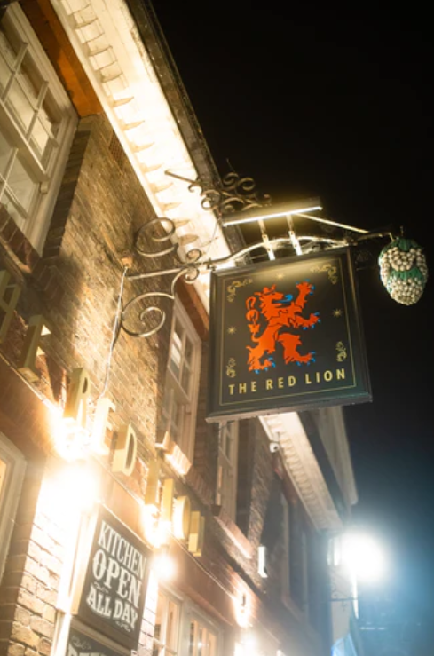
In 1603, James I and VI of Scotland ordered that his red lion of Scotland be displayed on all buildings, including taverns, making The Red Lion the most popular pub name overnight! Pub signs are an art form in itself and although I have only ever painted one, it was quite a task.
When literacy increased in the 18th century, copybooks—a signwriters’ showcase portfolio—made choosing the typeface for your shopfront easier.
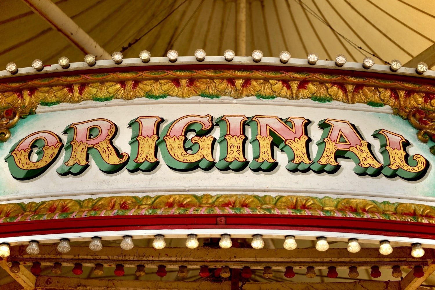
In Great Britain, the Victorian age saw signwriting at its height, with shopfronts, hoardings and canal boats advertising their services with text that was highly decorated with swashes and swirls.
Signwriting followed its own trends and with no restrictions on color or style. And became more elaborate and artistic, especially with the rise of paid advertising hoardings alongside new railroad stations.
The digitalization of signwriting
Signwriting is an everyday art form that continued well into the 20th century, but by the beginning of the ’90s, the age of computer graphics and sticky-back plastic sheets overtook this venerable occupation.
I was a signwriter myself for a time in the ’90s, although it was definitely already in its last hurrah. Whilst I was making hand-drawn safety signs on the factory floor, the first desktop publishing software had arrived in the office. Combined with the reduced costs of leasing a Xerox machine, hand-painted signs (and my job) would disappear within months.
Printing and moveable type
—
When all texts had to be copied out by hand, it took months for a single copy of a book to be made and was so expensive that only Royalty and the Church could afford it. However, with the rise of the mercantile classes throughout Europe in the 13 to 14th century, came a demand for more books as literacy increased. Gathering information and knowledge was part of business, so a method for mass-producing text quickly and cheaply was required.
From block printing to the first letterpress
In China, woodblock printed characters on paper (originally used to print floral patterns onto silk) first appeared during the Tang Dynasty (618–907 AD). Korean printing dates from at least 751 AD, as shown by archaeological evidence found at the Seokgatap Pagoda, South Korea.
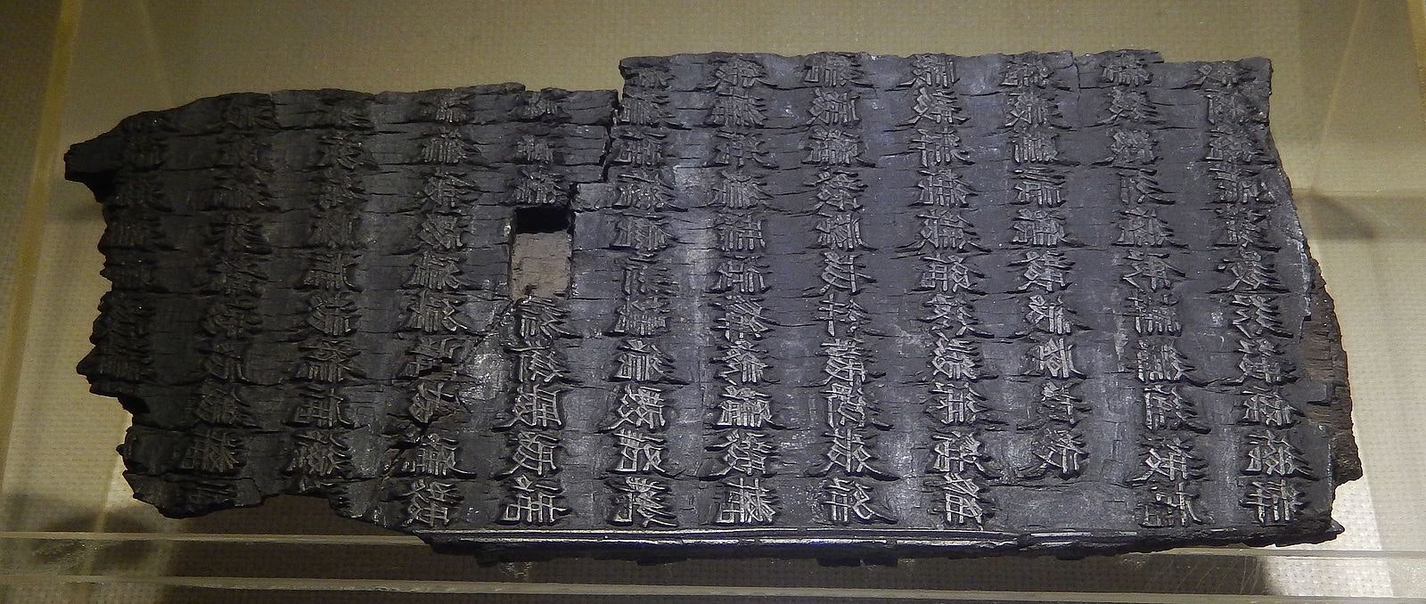
It was thought that a high degree of literacy in the population meant there was such a demand for Buddhist texts. To fulfill this demand a method of mass production and a version of a letterpress, using clay tablets of characters as moveable type, was used. The clay was later replaced with wood carved blocks and in China, bronze metal versions later emerged.
Though, one issue was the number of necessary characters required in Chinese and Korean texts. Several thousand different characters were needed, compared to the 26 letters in the English alphabet. However, by 1234, movable metal type was being used to print ritual books in China and by 1377 in Korea.
These texts were all printed with water-based inks and therefore only suitable for printing on just one side of the paper.
In the West, mechanization of the process in Europe would have to wait until the 1400s and the invention of the letterpress by Johannes Gutenberg.
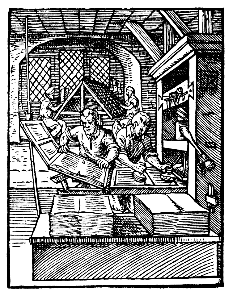
He adapted a wine screw-press to make a printing press. His method of pressing paper on the type and his oil-based inks meant he could also print on both sides of the paper (although not in one pass).
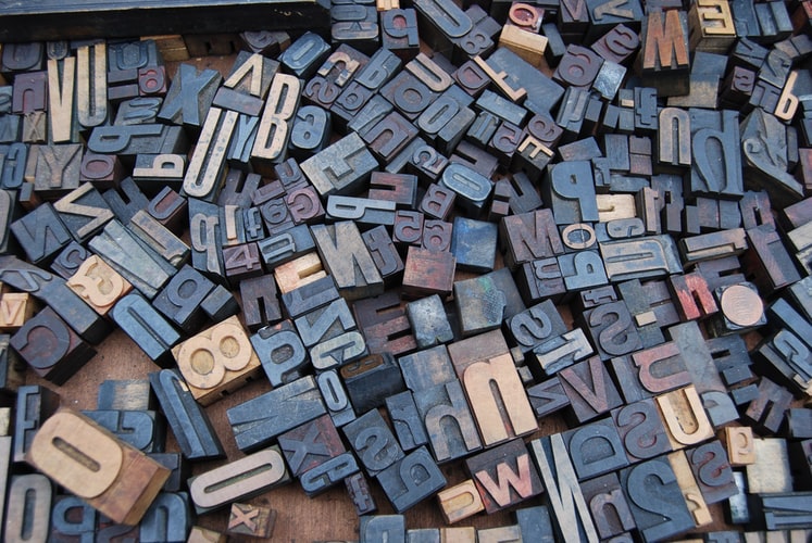
Gutenberg used his previous skills as a goldsmith to make his metal type characters from a mixture of lead, tin and antimony, which allowed him to make his type from molds quickly and precisely. He is also thought to be the first to use a type case, containing around 290 characters. This was an actual box containing the type in sections. The upper type and lower type each had their own case. This was where terms such as uppercase and lowercase came from. The type was composed by hand for each page by compositors, who are people who set type, as known as a typesetter.
Once assembled, the words and lines were made into pages by placing letters together and using thin slivers of lead called leading to create spacing between words. It was all held tightly together in a frame or form. The form was placed in the letterpress, inked up using a pad and finally the paper laid over the top. Then the press lowered to make the print. This new invention took off fast and by 1480 there was evidence of hundreds of printers active all over Europe.
Standardizing typefaces and spacing
This use of moveable and reusable type and mass reproduction now made standardization of typefaces and size essential.
As print was expensive, small type was typically used for pamphlets. And in 1501, Aldus Manutius created italic fonts to enable more text per page. Columns, justification and hyphenation also allowed more text to be fitted into the space. Flourishes, icons and extravagant serifs were mostly removed.
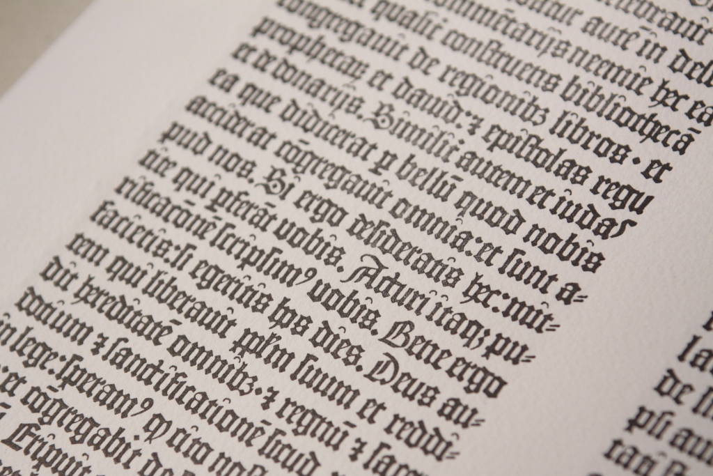
This need for tight text and legibility led to several typefaces being designed for compositors to use. Blackletter typeface was made by Gutenberg and used for the famous Gutenberg Bible, which was printed around 1455. By 1470, Nicolas Jenson created Roman type based on the ancient texts on Roman monuments.
Styles and themes
—
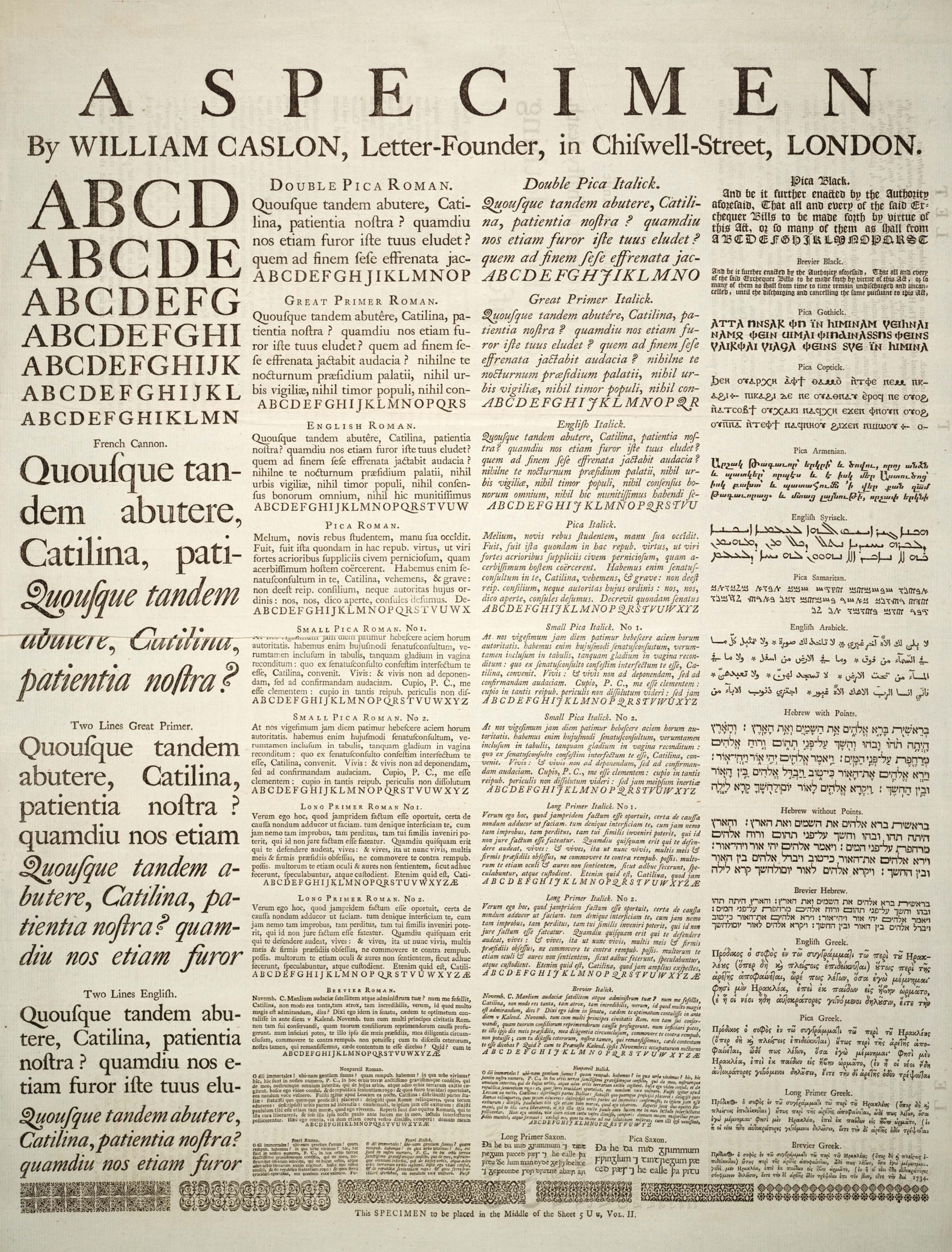
As printing spread, so did the desire for different typestyles. By 1728 when William Caslon set up his type foundry, a company that designs or distributes typefaces, he had produced several typefaces and specimen sheets, which showed the font and range of characters available. Most of the typefaces he produced were based on Roman or Gothic styles. He also had some middle eastern typefaces available, including Hebrew and Armenian. Caslon’s typefaces were known for their clarity and elegance and many that bear his name are still in use today.
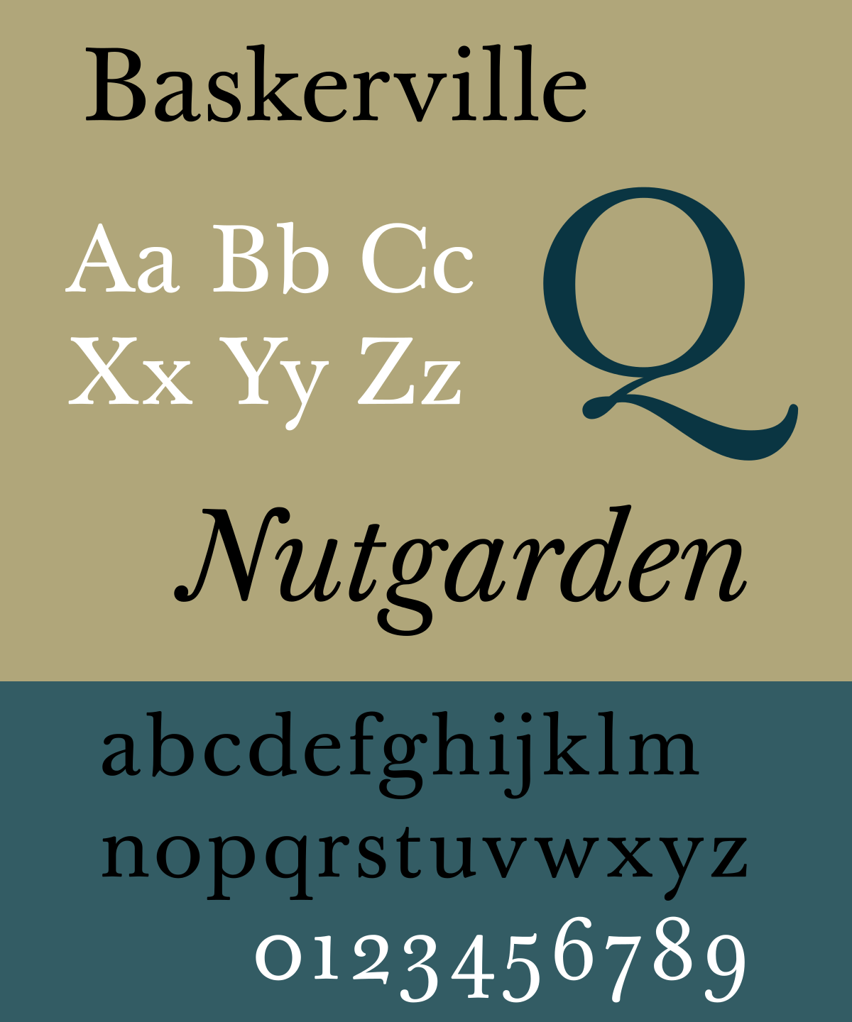
Some notable types, foundries, or designers that followed Caslon were John Baskerville, who created a Roman-style type with thick lines, Firmin Didot (1780) and Giambattista Bodoni, who created a modern style Roman typeface. The typefaces that these designers created, or at least their modern digital versions, are still available today.
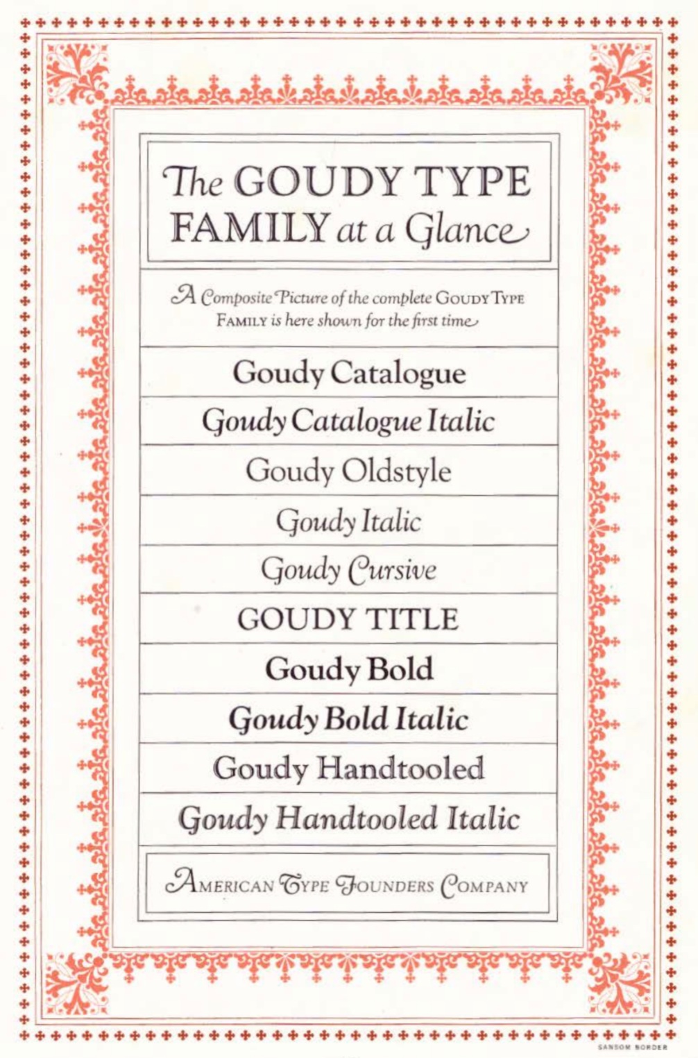
By the turn of the century, themes and styles from the art world would be spilling over into typography. The Art Nouveau movement of the previous century, with its floral motifs, was giving way to the much more geometric Art Deco that would symbolize the ’20s. The last hurrah came with Frederic Goudy in 1915 and his Goudy Old Style typeface. Goudy was a full-time type designer and created many different typefaces including Copperplate Gothic and Kennerly Old Style with swashes and curls.
The pre-war ’30s saw Brutalist Modernism with the typeface Bauhaus, which was a sans serif type, which meant the type didn’t have the traditional curl at the end of the letters. Bauhaus typeface was created in the Art School of the same name (1919 to 1933). Based on Herbert Bayer‘s 1925 Universal typeface, Bauhaus typeface followed the modernism ethos of simple form and function. Bauhaus professor, László Moholy-Nagy, said in 1929, “Typography must be communication in its most intense form. The emphasis must be on absolute clarity.”
After the Second World War, a new optimism arrived both in Europe and the US. Better printing methods and the tabloid era of newspapers and magazines saw futurism as a style. This return to minimalism resulted in type designers Matthew Carter, Max Miedinger and Edouard Hoffmann creating Helvetica for the foundry Linotype. Other sans serif typefaces such as Futura also started to emerge.
By the ’60s space-themed futurism was everywhere, popularized by real-life Moonshots and TV’s Star Trek and new technology opening up the printing industry.
By the beginning of the ’70s, computers had arrived big time and so had Bob Newman’s Data font, which was based on computer readouts. Newman also designed Frankfurter and Pump Bold, all notable fonts in the early ’70s, with their thick, round exuberant shapes. Cheap, full-color printing inspired the colorful ’70s with their theatrical flair and er, some psychedelic styles.
The dawning of digital typefaces
—
The late ’70s and early ’80s saw a major change in how types and fonts were created. The analog age of typesetting was about to move into the digital age.
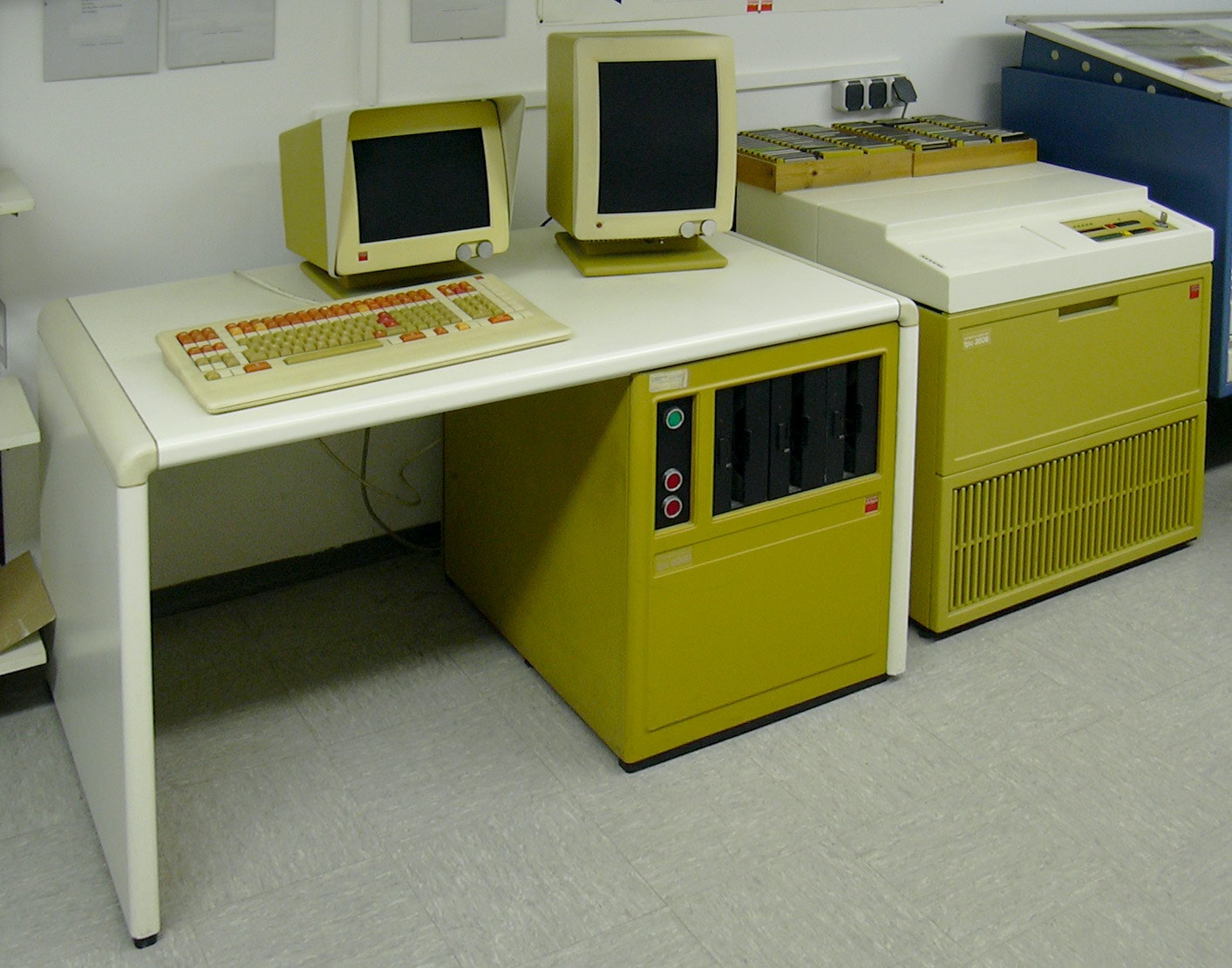
When I started at art college in the eighties, all typography still had to be hand-drawn using type-scale rulers and there was no computer-assisted design at all. The Letraset book contained printed copies of all available typefaces and was a must-have for all graphic design students, mainly used for tracing. At the college, the one Compugraphic typesetting machine, which created type for printing, was allowed only for your final show work because of the expense of using it.
The Compugraphic machine was an analog system for making fonts—it used a photographic method. An image of the font was attached to a carousel mechanism before the light was projected through it onto photographic paper. This was then processed like a photograph using chemical baths. The result was a long strip of text.
Each typeface included different fonts: italic, narrow, expanded, upper, lower and emboldened. Each of these had different sizes, from 4.5 to 72 point size. Only a few typefaces were available: a sans serif for headings, such as Helvetica; two or three body copy typefaces, such as Garamond, Times Roman, Caslon; and then a script typeface for fancy stuff such as wedding invitations.
The tiny availability of fonts was because the typefaces were expensive to buy. Copy was entered via a monochrome Visual Display Unit (VDU) screen and keyboard but was rarely WYSIWYG (What You See Is What You Get). That is, you couldn’t actually see on the screen what the font looked like, it was just entered as codes.
You wouldn’t actually see your text until it was returned to you a day later as a photographic print, on a long strip of thick paper. You had to paste up the text, using blue-penciled lines to align your text, then use a large camera to make a negative of your work and create a printing plate.
The first digital system I remember using was just two years after I left art school in 1991. The program was called Ventura Publisher, running on an office PC. I remember using it to make signs and notices for a factory by printing the text out on a dot matrix printer. It was basic by today’s standards, but this tiny PC already had more fonts available in it than the massive Compugraphic machine at the college.
It was around this time that the development of the Apple Macintosh and programs such as PageMaker and QuarkXpress finally heralded WYSIWYG typesetting. Digital typefaces are drawn (rendered) using mathematical vectors—points in space where lines start and finish—and this meant that they could be stored and retrieved more easily by computers and scaled to size. TrueType and Postscript are vector fonts and can be scaled up without losing quality.
Once desktop publishing (DTP) became more affordable for print and design companies, text started appearing in ads and posters. There was text curved around a logo, drop shadows, lots of typefaces in the same design and bright colors. You could say the eighties and nineties were all about digital design and typefaces.
Modern icons
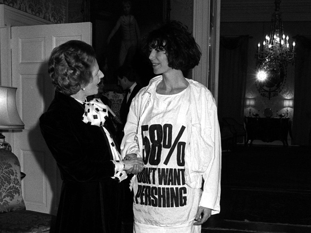
In 1982 the iconic Arial font was designed by Robin Nicholas and Patricia Saunders for Monotype, a company that specializes in digital typesetting and typeface design. Along with Helvetica and Verdana, Arial continues to work well on small screens. At the opposite end of the spectrum, the ’80s also saw new trends in typography intersect with fashion and politics, as the designer and activist Katherine Hamnett used the large, bold, Impact type for her infamous collection of slogan T-shirts.
In 1996 Microsoft created “Core fonts for the Web,” which was a standard pack of fonts for the internet in TrueType (vector) format. So, if you’re using Windows, you’re probably using one of these! If you’re on a Mac, they have their own set of fonts installed, which include fonts like Helvetica and Calibri.
Typography today
—
The most recent development in typography includes the creation of variable fonts, developed by Apple, Microsoft and Adobe. These use a single typeface as a template and the computer manipulates them into different font cases, which is something that’s now possible because of the computing power of our everyday devices.
It’s not only the output, but the design process as well that has evolved. Although some type designers do still use pen and paper in the early design stage, it’s more common to construct letterforms using illustration programs such as Adobe Illustrator. Software like this offers a quick, precise method to mirror and duplicate curves and perfect straight lines at any angle.
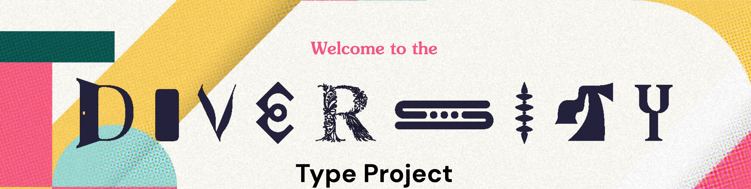
Like any other kind of art, type designers seek inspiration and purpose from all facets of life. The Diversity Type Project was created in 2021 via crowdsourcing. It presents letters and numbers from the Latin alphabet reimagined through artists’ different identities, cultures and expressions as a celebration of diversity and a conversation starter about inclusivity.
Modern typefaces can be quite subtle and the fat lines of the garish eighties and nineties have matured, although there are certainly many retro-inspired and revivalist typefaces out there. The rise of the internet, social media and the use of smartphones mean that more and more exciting, innovative typography is being designed and shared all over the world.
Typing up loose ends
—
Given the amount and variety of fonts available today and how cheap they are to buy, it’s perhaps surprising that professional designers usually keep their font usage to just three or four typefaces per design. It goes to show that no matter how advanced typography becomes, it’s important to find your look and stick to it. Your audience’s ease of reading always comes first alongside a strong, unique brand identity.