As your trusted reporters on all of the redesigns worth knowing about throughout the year, we knew it was our duty to bring our readers this list of the top 10 rebrands we identified throughout 2021. From museums and stationery brands to a bunch of fast food heavy-hitters, 2021 saw a slew of savvy redesigns we will be carrying with us well into the new year.
Burger King by Jones Knowles Ritchie

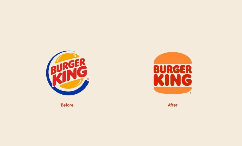
2021 saw the first Burger King brand refresh in over 20 years, executed with a clean and retro pizzazz by Jones Knowles Ritchie. The comprehensive rebrand launched a new logo, packaging, merchandise, menus, uniforms, signage, decor, and digital assets. Like so many legacy brands, Burger King wanted to stay true to its heritage and what its fast-food-faithful know and love about the brand while indicating a forward-looking vision to the future.

The new flat logo follows a hot-button design trend playing out across many industries, allowing for easier use across digital touchpoints. This first new logo since 1999 is confident, simple, and fun. The new color palette found inspiration in the chain’s signature flame-grilling process and ingredients. The resulting hues are rich and bold, imbued with a homey nostalgia.

The rebrand included an entirely new proprietary brand font called “Flame” that harkens to the rounded shapes of Burger King’s menu items.
Meanwhile, the new packaging prominently features the new logo, new color palette, and playful illustrations of the ingredients.
Tribeca Festival by Pentagram

The Tribeca Festival also saw its first rebrand in two decades this past year, honoring the festival’s 20th anniversary and as a way of evolving to changes due to the pandemic. The poppy redesign comes courtesy of Pentagram, with partner Emily Oberman at the helm.
The new brand identity features a reimagined logo and typography infused with a celebratory spirit that nods to coming back together after a year-plus spent apart.
“We wanted to express the joy of being back in the city and physicality, and it wasn’t necessarily reading the words for exactly what they were,” Oberman recently shared with us for our 2022 PRINT Typography Report. “It was about the emotion and joy of people being together. And that was more important to me than the actual reading of the words.”

The new bright and upbeat color palette gets dominated by red, yellow, turquoise, and pink, brought to life with flamboyant motion graphics that dance about digital assets like guests gathering at a long-overdue party.

Papier by Ragged Edge

The London-based stationery brand Papier got a snazzy rebrand this year with the help of Ragged Edge. The agency’s goal was to breathe new life into an old-school category, highlighting the transformative power of stationery and the possibilities of the blank page.

The new Papier logo is the crowning achievement of the new branding, depicting an energetic fan of rippling lines that alludes to the pages of an open book. Complimented by a soothing color palette of neutral hues and gestural illustrated elements, the brand system is classy, clean, and refreshing.
McDonald’s by Pearlfisher

Burger King was far from the only fast-food giant that saw a brand refresh this year. McDonald’s was tight on their heels, launching a new global packing system in March courtesy of Pearlfisher that’s all about universally communicating joy.

Pearlfisher selected an assortment of some of the most iconic aspects of each McDonald’s menu item to use as the backbone of the new packaging. They looked to a strikingly simplistic visual language easily understood across cultures, countries, and languages.
The packaging uses a bespoke font called Speedee Bold and a color palette inspired by their food. “The Egg McMuffin packaging was my favorite because that’s when the lightbulb went off,” Hamish Campbell, vice president and executive creative director at Pearlfisher, told us. “It was just so simple. It’s not a perfect circle—it’s a little wobbly—which reflects the yolk. That design was the keystone to the whole system we built out of, which was amazing.”

As a brand whose emblem (M-blem?) is as iconic as it comes, it stands to reason that the greasy conglomerate would look to establish a simple and immediately recognizable shorthand of symbols for their new packaging.
HYPEANDHYPER by Miklós Kiss

Designer Miklós Kiss churned out a killer redesign for the lifestyle magazine HYPEANDHYPER this past May, including a new visual identity and printed magazine design. HYPEANDHYPER covers innovation, urban life, and creative ecosystems across Central and Eastern Europe, and they needed an elevated look and feel to reflect their prowess in this space.
Kiss’ design was launched in honor of HYPEANDHYPER’s first-ever printed magazine issue written in English.

Poppy pastels are central to the new design, with green and light pink headlining. Kiss says his work took inspiration in not only retro photos and interiors but Central and Eastern European design, too. The austerity of the sans serif logotype and “&H” ligature gets offset by vivid illustrations that add a dash of levity—and spunky pops of fun—to the system.


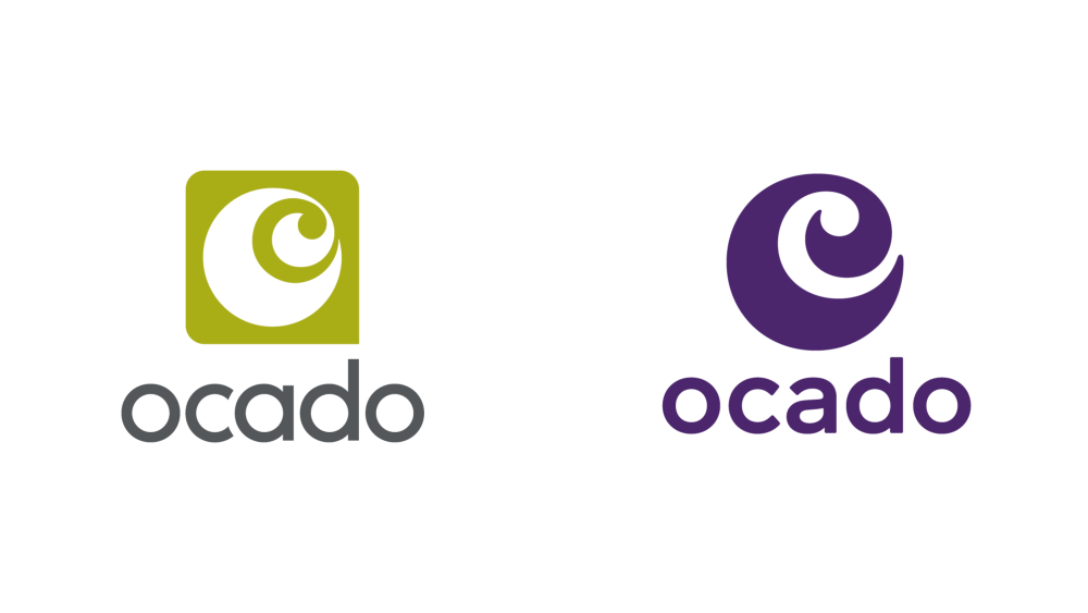
Ocado by JKR

The UK online ordering and delivery service Ocado underwent a growth spurt this past year that called for an elevated design to keep up. With JKR running point, Ocado got an invigorating new visual language that evokes modern freshness and ease.

The digital-first rebrand needed to be flexible and accessible, with an identity that would sing across the entire brand ecosystem. JKR achieved this through a splashy color-blocked color palette, geometric illustrations, and using the ocado.com search bar as a sort of north-star motif for the rest of the brand system.
Grape was selected as Ocado’s new brand color to differentiate the company from a category overcrowded with green hues. They also reworked the original Ocado swirl logo and wordmark, opting for a double-story “a” for heightened legibility across screens. Additionally, JKR partnered with F37 Foundry to develop the brand’s new typeface, Ocado Full Fig, which brings continuity to the brand universe.
This new brand identity needed to extend to the packaging of the Ocado Own Range product line in a way that would stand out on both the digital and pantry shelves. The packaging designs needed to be cohesive across individual categories, items, and sub-ranges, yet still distinctive and with each product easily identifiable.
The finished product is just that, with a fun and graphic illustration style that compliments the rest of the brand identity.

The National Women’s History Museum by Pentagram

In honor of its 25th anniversary, The National Women’s History Museum sought a redesign that would propel them forward into their next era and mark the launch of their first physical exhibitions and programs in Washington, DC starting in 2022. It currently has an exclusively online presence, with virtual exhibitions, programming, and educational materials.
The museum tapped Pentagram for the project, with partner Paula Scher steering the ship, to create a dynamic visual language with the ability to evolve with the institution as it grows.

The centerpiece of the bold and contemporary brand system is the folded “W” logo and emblem, meant to evoke a movable placard or display system. The symbol has endless flexibility, as it can get rotated to appear as an “M” for “Museum,” appear in flat color, be used as a frame, window, or overlay for photos and other imagery, or even positioned to form graphic patterns.

The museum’s new brand colors are vibrant and celebratory, including a purple hue inspired by the suffrage movement.
Realm by Mother Design

Podcast and audiobook company formerly known as Serial Box rebranded as Realm in 2021 and got a funky brand refresh courtesy of Mother Design to go along with their new name.
Fueled by a whimsical and mysterious color palette, they centered the redesign around orange and purple. The gradient effect used throughout adds to the hazy vibe, perfect for a platform built upon telling fantastical and surrealist stories.

Meanwhile, the brand’s “R” icon gets anthropomorphized with two dots as eyes and doubles as their new mascot, Ruby, a spiritual guide for listeners using Realm.

Prospect Refuge Studio by Stitch Design Co.

Stitch Design Co. brought unexpected color combinations and a delicate touch to a rebrand for Minnesota-based interior design studio Prospect Refuge last month, informed by their commitment to craft.
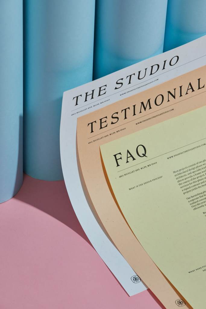
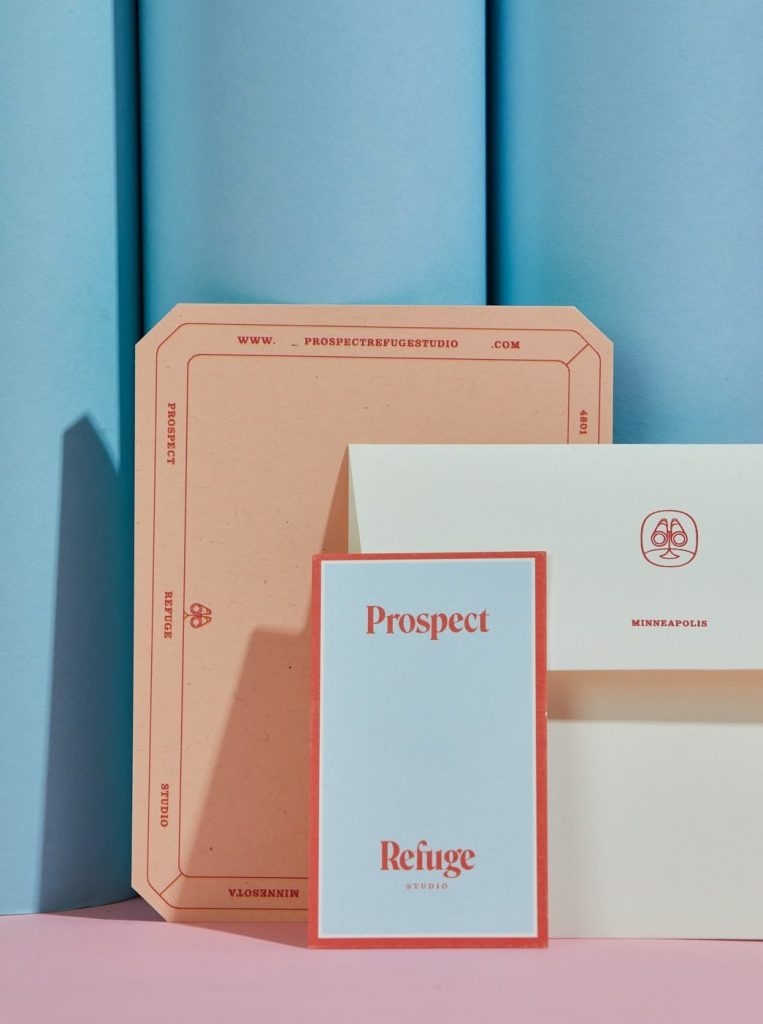
Class and sophistication rule the day with this redesign, thanks to thoughtfully illustrated iconography, including a primary mark inspired by a looking glass that nods to Prospect Refuge’s vision. The soothing color palette features muted neutrals punctuated by accents of bright red, sage, muted marigold, and soft blue.
Stitch Design Co. developed a new website for the studio, along with an assortment of printed collateral in the form of letterhead, notecards, business cards, and matchbooks to reflect the brand’s narrative approach and visionary spirit.
KFC by Wieden+Kennedy Portland

Last but by no means least on our list is yet another fast-food juggernaut, KFC, who got a nostalgia-slathered packaging refresh from Wieden+Kennedy Portland that’s all about their talisman, Colonel Sanders.
The new packaging sees modernized boxes, wrappers, cups, and fried chicken buckets, heavily featuring the gregarious face of Colonel Sanders in a retro-style illustrated portrait. The paper elements of the new packaging come certified either by the Sustainable Forestry Initiative or the Forest Stewardship Council, and four of the packages even get the How2Recycle stamp of approval.
For added utility, the packaging also features reheating instructions to achieve yummy leftovers status.

The KFC initials on the previous packaging get replaced by the full “Kentucky Fried Chicken” monicker, while the beloved “finger lickin’ good” slogan remains.