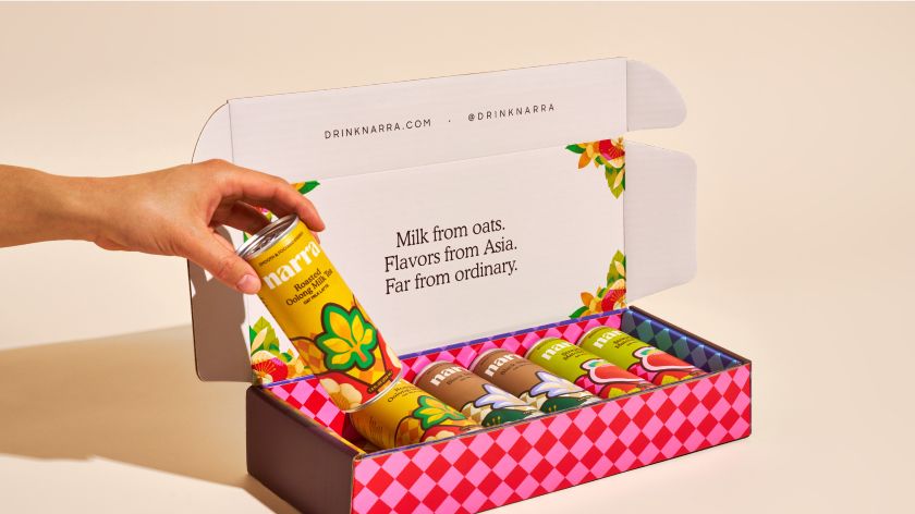
This summer sees the launch of Narra, a new Asian-inspired tea brand that brings the Filipino tradition of midday caffeine hit to a wider audience. To help the new line of drinks arrive in style, The Working Assembly has brewed up a striking identity that is as refreshing as the drinks themselves.
Founded by siblings Miggy and Victoria Reyes, Narra emerged from the pair’s love for Merienda – a traditional reprieve from the hustle and bustle of the working day where people in the Philippines took the time to slow down, sip on a drink, indulge in a snack and recharge. With their range of dairy-free, naturally caffeinated drinks that contain no added sugars or artificial ingredients, they hope more people will join them in a midday Merienda.
“What was a joyous childhood escape in the Philippines turned into a dreaded midday slump as we became working professionals later in life stateside,” explains Miggy. “Narra was born to refresh your daily ‘siptual’ and transport you to that joyous Merienda feeling with the most refreshing plant-based tea lattes created with Asian-inspired flavours.”


Crucial to the appeal of Narra is its Southeast Asian heritage, and it was this element the Reyes siblings prioritised when working with branding and creative agency The Working Assembly to create a distinctive look for their drinks. This resulted in a colourful and textural identity, brimming with fun illustrations, which stands apart from some of the more reserved graphics associated with tea companies.
“Narra is the national tree of the Philippines, both resilient and strong, so we wanted to encapsulate that into the branding,” says Jolene Delisle, Founder and Head of Creative at The Working Assembly. “We love working with emerging companies that have such clear vision right off the bat, and the Reyes are a perfect example of clients who are able to align their values with what they are trying to achieve with their brand in such a seamless, symbiotic way.”
Throughout the creative process, The Working Assembly team ensured that Narra retained a vibrant, clean and contemporary look. As well as being unique in the tea category, this approach also provided a powerful contrast to the nods to Filipino tradition, which were woven into the brand identity.


“We reinterpreted the ‘banig’ – a traditional handwoven mat – by creating patterns resembling the square tiles of the handwoven designs and combining them with modern illustrations,” explains designer Erika Erika Romanczuk. “We used these combinations throughout the brand system, from the can designs to the website.”
Speaking of the website, as well as incorporating these colours and illustrations, the platform also integrates fun hover effects. There’s also an entertaining unscrambling illustration game in the footer, which enables the site to engage with visitors and customers in a novel way. This is further backed up by copy that remains accessible by leaning into the playfulness of Narra’s central message.
“As soon as we tried Narra, we knew it needed a more playful voice to match its light and delightful flavour,” reveals senior copywriter Erik Poh. “The idea of the daily ‘siptual’ leans into that cheeky but inviting personality, making Narra feel like an easy-to-drink beverage that makes every day more energised and delicious.”


If you like what you see, then you haven’t got long to wait until you can try Narra for yourself. The brand launches this summer with its flagship line of Asian-inspired oat milk lattes made with tea for smooth and focused energy. It remains to be seen if a cheeky ‘siptual’ replaces the weary trudge to the office coffee machine, but one thing’s for certain, The Working Assembly has captured the spirit of the brand perfectly.
“The Working Assembly really got us,” concludes Victoria Reyes. “They understood us from a cultural perspective and brought our ethos to life in an exciting and fresh way.” We’ll drink to that.
