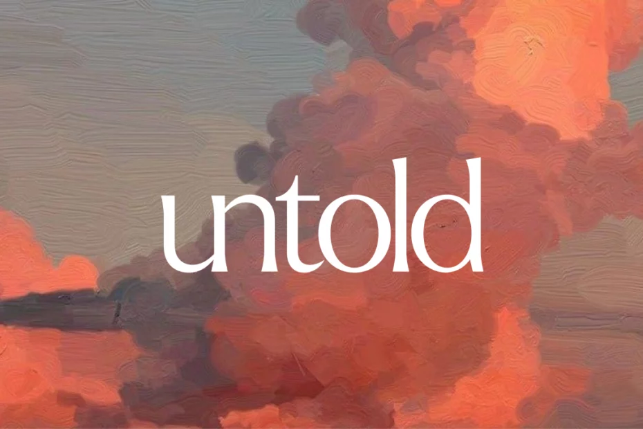
The Working Assembly’s new identity for Untold aims to avoid gen AI clichés, but still uses gen AI to create it.
It can’t have escaped your attention that AI feels like a dirty word right now. But generative AI isn’t the only flavour of AI around. There are a number of genuinely useful tools that use AI, and even the people who hate the former are potential users of the latter, if only the branding and marketing are done right.
Among them is the voice-first journalling platform Untold. This tool focuses on turning spoken thoughts into “deeper self-understanding, personalised insight, and lasting growth”. And for anyone who likes the idea of journalling, with all its therapeutic benefits, but has failed to turn that into a regular habit, it has a lot to offer.
Instead of needing you to type or handwrite your thoughts, the platform not only listens to what you say but also learns from it. Over time, it identifies patterns, surfaces emotional trends, and offers personalised insights into what you’re feeling through the lenses of psychology, philosophy, spirituality and art. It can then go on to generate custom meditations and help you explore recurring themes.
Aims of the rebrand
For their recent rebrand, Untold turned to The Working Assembly, a New York–based branding and creative agency that specialises in helping healthcare, wellness, beverage, and consumer brands through strategy, design, storytelling, and innovation.
The redesign followed Untold’s recent launch of Perspectives, a big expansion of the platform that introduces guided journal flows, visual emotional trend mapping, and the ability to ask questions about your life and receive answers based on everything you’ve previously shared. This evolution meant Untold’s original identity no longer fully captured its full ambition or the emotional depth of the experience it offered.
Together, Untold and The Working Assembly developed a strategic framework based on the concepts of speak freely, feel understood, and grow intentionally. This then formed the backbone of a completely new visual and verbal system.
Use of AI
The new identity includes a custom logomark, a refined voice and an expressive design system. And now I’ll share the exact quote from the press release, so I can’t be accused of misleading anyone. “At its centre is a bespoke AI illustration system developed by The Working Assembly, designed specifically for Untold and trained to create imagery that feels emotionally resonant rather than algorithmically generated.”
Jolene Delisle, founder and head of brand creative at The Working Assembly, adds this. “We built Untold’s AI image system the same way we built the logo itself, from strategy outward. Every visual expression starts with the same idea at the heart of the platform: your voice matters, and what it reveals has the power to shape who you become.”
But is an “AI image system” really capable of “emotional resonance”? I’ve got to be honest, I’m not so sure.
Visible brushwork
On first checking out these screengrabs, supplied as press images, I thought they looked lovely. They’re certainly a long way from the kind of slick generic AI images I’m used to seeing. The illustration system clearly takes its cue from visible brushwork, muted earth tones and small, intimate compositions: a hand reaching towards a sofa, a coffee cup and phone caught in afternoon light. Nice.
The out-of-home posters use the same painterly language at scale without losing any of its intimacy: a hand caught mid-gesture, a phone glowing on a kitchen table, a single line of copy doing the rest.
But on closer inspection, it’s still pretty clear these are AI-generated, even if they’re nicely generated. And while that might not matter, it will very much matter to a number of readers of Creative Boom.
Wordmark and symbol logo
As for the new wordmark and logomark, I’m more of a fan. Looping and slightly loose at the joins, they both reinforce the idea of emotional resonance the brand is trying to convey.
The lowercase “untold” is cast in a serif face with enough personality to feel handwritten, not corporate. The symbol, an interlocking ribbon shape that might read as a wave, a signature flourish or two overlapping figures, looks like it will stand out clearly across app icons, posters and social assets.
The in-app screens, meanwhile, combine functionality with elegance. Onboarding prompts and mood-tracking bars are rendered as brushstrokes of colour, and personalised reflections address the user by name.
Getting a single illustration system to flex convincingly between a 48-sheet poster and a small mobile screen, without either version looking like an afterthought, is a pretty darned impressive achievement when you think about it.
Finally, the mood-tracking screens in particular are an elegant solution to a tough design problem: how do you visualise something as slippery as emotional data? By rendering the mood metrics as loose, hand-painted strokes rather than clean digital bars, The Working Assembly has kept the whole experience feeling consistent and entirely in keeping with the feeling the app aims to evoke.
That AI illustration system, though? I dunno, man. Am I being oversensitive? Is every agency doing this stuff now? I’d love to hear your thoughts on the usual social channels.