It felt like just yesterday that Europe was in high spirits during the summer of football. And much to the excitement of fans, UEFA are already prepping for the 2024 Euros.
The European footballing event is set to take place in Germany in 2024, and EUFA is already teasing fans with its new logo. The design was revealed on social media accompanied by a spectacular light show at the Olympiastadion in Berlin. EUFA also released a colourful video about being united and inclusivity within the upcoming games to announce the logo redesign. Fancy having a go at making your own logo? Make sure you check out our 15 golden rules of logo design.
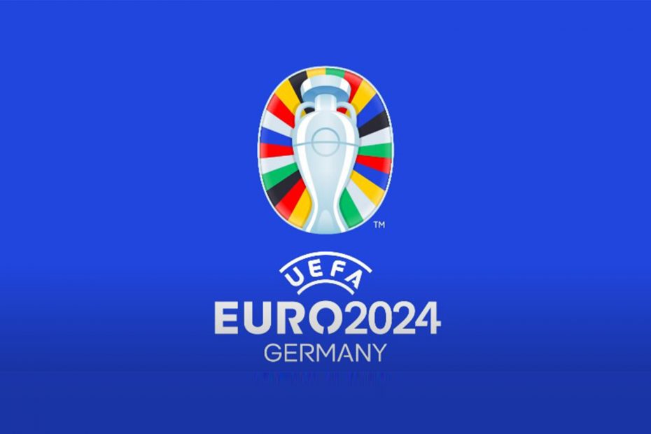
The striking new logo (see what we did there?) plays on the colours of the flags in Europe, as well as the shape of the Olympiastadion in Berlin, where the games will be held. And while the logo still features the Euro Cup like the previous two logos, we think that its use of bold colours and new oblong shape is a refreshing take on the logo. We can already imagine it plastered across sticker books and football shirts.
In a video that UEFA posted, the bold logo is revealed with a number of illustrations and colours. The video reads ‘everyone is invited to bring their colours’ which makes sense as to why the new logo is so vibrant. UEFA also go on to say in the video “For all generations, all voices and all of us, united by football.” Partnering this with the diverse characters in the video, it’s obvious that UEFA is trying to create a sense of diversity and inclusivity in the games – which we think is great.
The animated video has racked up over 350k views on YouTube and people have been sharing their thoughts in the comment section. Most of the comments were positive with everyone sharing their excitement for the tournament, but some were quick to critique the logo. One user commenting “It’s a good logo but I would have liked it to represent Germany a bit more” and another said that “I like it but it doesn’t feel themed to Germany at all.” We can see where they’re coming from with the colours of the logo appealing to every nation in Europe instead of solely German’s black, red and yellow.
Fans also took to Twitter to share their thoughts on the new logo, and one beady-eyed fan spotted that the ‘O’ in Euro, represents the Olympiastadion – how cool is that?
A lot to like about this version of the Euros logo. The Olympiastadion Berlin in the O of Euro I really like. https://t.co/ewaMxRLKPhOctober 6, 2021
The UEFA EUROS 2024 logo stands for more than just a soccer festival. It represents a EUROS for ALL. A celebration that connects people. Community, compassion, diversity and integration, let’s live this vision together! #unitedbyfootballOctober 5, 2021
Following yesterday’s logo launch for the UEFA Euro 2024 in Germany, here’s a look at the comparison with the previous UEFA Euros. First with Poland/Sweden 2012, then France 2016 then 2020 and Germany 2024. The Germany 2024 logo look a lot better than the previous editions. pic.twitter.com/TVI3ZEfpysOctober 6, 2021
If you fancy trying your hand at some logo design yourself, make sure you have a look at our roundup of the best logo maker. Or perhaps you’re up for a bit of challenge, can you name the world’s top 10 most memorable logos?