The 200-year-old RSPCA, a UK animal welfare organization, recently unveiled its new identity with the launch campaign “For Every Kind.” JKR‘s London team created the new identity, which features a vibrant color palette, flexibility for use in digital spaces, and a charming illustration style.
The new identity also features Wilberforce Sans, a custom typeface designed in collaboration with Studio DRAMA.
Studio DRAMA’s Chris Nott (creative director) and Will Richardson (co-founder and creative director) drew inspiration from the RSPCA’s history of activism, specifically protest signage in the organization’s archives. The typeface got its name from this history: one of RSPCA’s founding members was the great abolitionist William Wilberforce. Nott and Richardson also wanted to invoke a different kind of provenance— the country’s Grotesque typographic tradition. For Wilberforce Sans, the team added a few unique deviations. Subtle stroke-weight contrasts deliver a hand-drawn quality, while ligatures embody togetherness and community.
Not wanting to shy away from the brand’s 200-year-old heritage, the bespoke font [designed in collaboration with Studio DRAMA] takes cues from protest placards found in the brand’s archive, designed to really get everyone to join the movement, and features echoes of the new illustration style.
Ellen Moriarity, Design Director, JKR
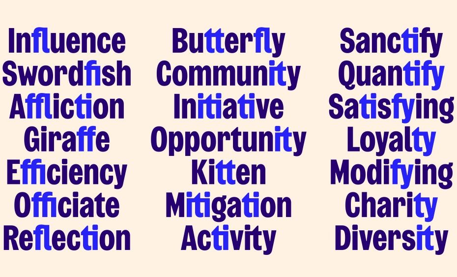
One of the more interesting aspects of Wilberforce Sans is that it works in concert with the new identity’s illustrated animal iconography. The Studio DRAMA team designed the typeface with soft ink traps that connect it to the accompanying animal icons, both visually and in its personality.
Borrowing from the RSPCA’s old logo, the “Octopunct” shape surrounding the word mark has been turned into punctuation and containers for the animal illustrations.
I was curious to get Studio DRAMA’s perspective on this project and more. My short Q&A with Chris Nott is below.
The RSPCA’s old brand has evolved from staid and somewhat cold into a bold and friendly identity. How does Wilberforce Sans help the larger brand communicate the urgency of the issue while also inviting people in?
Type plays a crucial role in shaping a brand’s voice, enabling it to communicate effectively with diverse audiences. For the RSPCA, the challenge for us was to craft a typeface that could convey both lighthearted and serious messaging, capturing the essence of their new positioning: ‘Rallying Humanity for Animals’.
The brief led us to the concept of a ‘Trusted Authoritarian’ voice. To delve deeper into this, we explored the typographic nuances of hand-drawn and woodblock printed protest placards and posters. Given the RSPCA’s rich history of activism and advocacy for animal welfare, this direction felt both natural and apt.
Our research into the RSPCA’s brand archives revealed typefaces that had also been used in protest contexts. This connection enriched the brand narrative, creating a stronger link between the RSPCA’s historical activism and its current branding.
A key aspect of our design approach was establishing two distinct typographic voices.
The primary voice for the core brand identity is predominantly uppercase, reflecting the brand’s bold, impactful, and urgent side. We ensured that the uppercase letterforms exuded authority through their bold and condensed structure, reinforcing the brand’s authoritative presence. Trustworthiness is conveyed by incorporating features inspired by the British grotesque style, such as enclosed apertures and terminals. These characteristics not only add a touch of playfulness to a rigid structure but also resonate with the brand’s serious yet approachable tone. Additionally, the softer details, like the ink traps, were inspired by the new illustration style, further infusing a more approachable and cohesive feel.
The secondary voice was designed to capture the lighter, more human and approachable side of the RSPCA. We developed a lowercase set featuring playful, almost ‘animal-like’ characters, such as the lowercase ‘g’.
This dualistic approach allows the RSPCA to communicate the gravity of animal welfare issues while also inviting the public to engage and connect with their mission.
A key aspect of our design approach was establishing two distinct typographic voices. This dualistic approach allows the RSPCA to communicate the gravity of animal welfare issues while also inviting the public to engage and connect with their mission.
Chris Nott, Creative Director, Studio DRAMA
In the last few years, we’ve seen many centuries-old institutions undertake major rebranding efforts, many of which lean heavily on iconography and type. Is this simply a trend? Or is there something more fundamental happening around the role of institutions and brands (or type) in society?
Both Will and I have over a decade of experience working in branding agencies. During this time, we’ve witnessed a significant shift in the role of custom type in branding, which led us to decide that it should be a core offering in our own business.
We’d go as far to say that type was often considered an afterthought in branding projects. However, it has now moved to the forefront, reflecting the evolving importance of typography in brand identity.
In today’s information-saturated landscape, brands are striving to be more distinctive and memorable. With the desire to own more than just a logo, the focus has expanded to include the very words they use. By crafting distinctive and recognisable typography, whether that’s through custom type or an ownable typographic approach, brands can establish a strong identity that resonates even when the logo is absent.
In this context, if a brand can own the very words in which they communicate, making them distinctive enough to be recognisable without the logo, does it not become a compelling strategy to pursue?
Can you talk about your ethos as a partner foundry? How does this differentiate what Studio Drama does?
Both sides of the studio go hand-in-hand, complementing and enriching each other.
With a background in branding, we bring a strategic mindset to every custom typeface project we undertake. We not only design typefaces but also understand how they should be utilised. More often than not, we assist in creating guidelines on the optimal use of the typeface, whether it’s a single style display font or a comprehensive super family.
On the studio side, we aim to incorporate some element of custom type, whether that’s a bespoke logotype or mark, or a full custom typeface family.
On the foundry side, we bring our brand-first approach to type design, ensuring that our custom typefaces are not only visually compelling but also strategically aligned and effectively utilised.
What’s your dream partner project? Or, what are your favorite projects you’ve done on the foundry side (besides working with JKR on RSPCA, of course!)?
When it comes to dream projects, that’s a tough question! We’re currently in the midst of bringing one to life as we speak…
We thrive on collaboration, especially with other agencies and creative teams. This enables us to leverage our expertise in type design, invigorating and enhancing the broader brand exercise. If any teams are on the lookout for a type partner, just drop us a line!
As for favourite projects, Vogue Brasil definitely stands out. It was a dream from start to finish, not only because of the compelling brief but also due to the exceptional client relationship. This small but impactful project has opened numerous opportunities for us. It’s amazing the doors that type can open!